David ChipperfieldŌĆÖs Turner Contemporary gallery in Margate is a perfect melding of the romantic and the practical
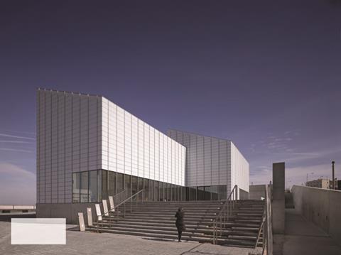
David ChipperfieldŌĆÖs ┬Ż17m Turner Contemporary gallery in Margate opens next Saturday, 16 April. Although Chipperfield has garnered huge critical acclaim for his designs for cultural institutions abroad, the Turner Contemporary - like his soon to open Hepworth Wakefield - provides a rare opportunity to showcase his work in this sector to a UK audience.
The Turner Contemporary aims to be one of the countryŌĆÖs most important cultural institutions outside London and celebrates the Kentish resortŌĆÖs rich associations with the iconic English painter. It is also hoped that it will be a key catalyst for the regeneration of a depressed seaside town. For all these reasons, the opening of the Turner Contemporary is a major architectural and civic event.
The building occupies a dramatic seafront setting on the north Kent coastline, facing out directly to the North Sea. On the site of the guest house Turner frequently shared with his lifelong paramour Sophie Booth, the gallery is sandwiched between Margate town centre to the south and a majestic panorama of sweeping sky and sea to the north. This compelling dual aspect immediately establishes a powerful and poetic visual composition.
The gallery comprises six interconnected two-storey boxes arranged on a staggered plan. Each has a mono-pitch roof with the incline facing south. Its concrete frame is uniformly clad in narrow panels of obscured, acid etched, laminated glass selected for its ability to withstand the stormy North Sea.
Window openings are sparse and relate only to internal public areas and not gallery spaces. Despite the crystalline shimmer emitted by the glazed panels, the effect is utilitarian and austere; the blocks resembling dour, shed-like pavilions incongruously encased in an opaque skin.
Inside, this same theme of stark simplicity continues. A severe and robust palette of white walls, ribbed concrete ceilings and smooth concrete floors is dispersed throughout the building and creates a cool, crisp interior defined by the precise geometric minimalism that is the hallmark of ChipperfieldŌĆÖs work. But this is not a building where the detailing dominates; the spatial experience it offers is memorably forged by natural light and the sea.
From the entrance foyer and ground floor gallery, large expanses of glazing plunge epic views of the North Sea - as they would have been seen by Turner himself - deep into the interiors.
But it is the first floor exhibition spaces that truly capture the subtle manipulation of light that Chipperfield himself explains is the galleryŌĆÖs ŌĆ£primary materialŌĆØ; he summarises the design concept as ŌĆ£light explains formŌĆØ. The Turner Contemporary is one of the few buildings in England to face the sea and also face north. What Chipperfield describes at this ŌĆ£privilege of orientationŌĆØ enables the top-lit galleries to admit cold, clinical north light and mix this with warmer, diffused light from the south.
The mono-pitch roofs are specifically inclined to optimise this arrangement. The result is that the gallery spaces benefit from an ambient luminosity that impressively enables the exhibits to be displayed without any artificial light. They also reveal a remarkable absence of shadows.
Chipperfield admits that a key aim of the project was to ŌĆ£de-institutionalise an institution.ŌĆØ Accordingly it is designed to be as open and accessible as possible, with flexible, informal spaces configured to resemble an artistŌĆÖs studio rather than a civic institution. Chipperfield explains that the building is ŌĆ£a modest local art centre that is not meant to be Bilbao. It is a good art space where money has been used in the most appropriate manner.ŌĆØ In the frequently pompous contemporary architectural arena of puerile ŌĆ£iconicŌĆØ preening, such rational diligence is refreshing.
The Turner Contemporary is not a spectacular or exceptional building but nor does it set out to be. What it is is a functional cultural amenity whose form practically - and at times prosaically - satisfies its function. Yet conceptually the gallery harbours grander visions, for at its heart it is a wistful ode to the same natural elements that inspired its namesake: the violence and romance of light, sky and sea.y Gallery in Margate opens next Saturday (16 April). Although Chipperfield has garnered huge critical acclaim for his designs for cultural institutions abroad, the Turner Contemporary - like his soon to open Hepworth Wakefield - provides a rare opportunity to showcase his work in this sector to a UK audience.
The Turner Contemporary aims to be one of the countryŌĆÖs most important cultural institutions outside London and celebrates the Kentish resortŌĆÖs rich associations with the iconic English painter. It also aims to be a key catalyst for the regeneration of a depressed seaside town. For all these reasons, the opening of the Turner Contemporary is a major architectural and civic event.
The building occupies a dramatic seafront setting on the north Kent coastline facing out directly to the North Sea. On the site of the guest house Turner frequently shared with his lifelong paramour Sophie Booth, the gallery is sandwiched between Margate town centre to the south and a majestic panorama of sweeping sky and sea to the north. This compelling dual aspect immediately establishes a powerful and poetic visual composition.
Although the gallery is rather awkwardly separated from the sea by a paved forecourt, required by the lifeboat station next door for access, its prominent position on the tip of Margate seafrontŌĆÖs broad curve enables the building - from certain vantage points - to appear like a solemn silo helplessly stranded at sea.
The gallery comprises six interconnected two-storey boxes arranged on a staggered plan. Each box has a mono-pitch roof with the incline facing south. Its concrete frame is uniformly clad in narrow panels of obscured, acid etched, laminated glass selected for its ability to withstand the hostile elements brutally expelled from the stormy North Sea.
Window openings are sparse and relate only to internal public areas and not gallery spaces. Despite the crystalline shimmer emitted by the glazed panels, the effect is utilitarian and austere; the blocks resembling dour, shed-like pavilions incongruously encased in an opaque skin.
Inside, this same theme of stark simplicity continues. A severe and robust palette of white walls, ribbed concrete ceilings and smooth concrete floors is dispersed throughout the building and creates a cool, crisp interior defined by the precise geometric minimalism that is the hallmark of ChipperfieldŌĆÖs work. But this is not a building where the detailing dominates; the spatial experience it offers is memorably forged by natural light and the sea.
From the entrance foyer and ground floor gallery, large expanses of glazing plunge epic views of the North Sea - as they would have been seen by Turner himself - deep into the interiors.
But it is the first floor exhibition spaces that truly capture the subtle manipulation of light that Chipperfield himself explains is the galleryŌĆÖs ŌĆ£primary materialŌĆØ. The Turner Contemporary is one of the few buildings in England to face the sea and also face north. What Chipperfield describes at this ŌĆ£privilege of orientationŌĆØ enables the top-lit galleries to admit cold and clinical north light and mix this with warmer, diffused light from the south.
The mono-pitch roofs are specifically inclined to optimise this arrangement. The result is that the gallery spaces benefit from an ambient luminosity that impressively enables the exhibits to be displayed without any artificial light. They also reveal a remarkable absence of shadows. Chipperfield summarises the design concept by simply stating that ŌĆ£light explains formŌĆØ.
The Turner ContemporaryŌĆÖs interior is also characterised by functional pragmatism and spartan efficiency. Both Chipperfield and Victoria Pomery, the Turner ContemporaryŌĆÖs director, are unequivocal in their insistence that the gallery is not a museum but a cultural amenity primarily for artists and the local community.
Accordingly it is designed to be as open and accessible as possible, with flexible, informal spaces configured to resemble an artistŌĆÖs studio rather than a civic institution. In an innovative move, the Turner ContemporaryŌĆÖs single lift doubles as a goods lift and a 100-capacity public lift.
Chipperfield admits that a key aim of the project was to ŌĆ£de-institutionalise an institution.ŌĆØ He goes on to explain that the Turner Contemporary is ŌĆ£a modest local art centre that is not meant to be Bilbao. It is a good art space where money has been used in the most appropriate manner.ŌĆØ In the frequently pompous contemporary architectural arena of puerile ŌĆ£iconicŌĆØ preening, such rational diligence is refreshing.
The Turner Contemporary is not a spectacular or exceptional building but nor does it set out to be. What it is is a functional cultural amenity whose form practically - and at times prosaically - satisfies its function. Yet conceptually the Turner Contemporary harbours grander visions, for at its heart it is a wistful and nomadic ode to the same natural elements that inspired its namesake: the violence and romance of light, sky and sea.
Project team
client Kent County council / Turner Contemporary
architect David Chipperfield Architects
structural engineer Adams Kara Taylor
services engineer Arup
landscape architect Gross Max
quantity surveyor Gardiner & Theobold
contractor R Durtnell & Sons







No comments yet