The developers of Las Vegas‚Äô latest casino resort wanted to give the city something it lacked: an urban core. But the $8bn CityCenter only pretends to be that ‚Äď in reality it‚Äôs just another place to lose a lot of money. Tim Abrahams spins the wheel
Las Vegas is designed to bamboozle and bewilder. In the Nevada gambling resort, architecture is used to deliberately confound the poor rube‚Äôs judgment. Sunlight is kept out of casino floors so you can‚Äôt tell how long you‚Äôve been gambling. Hotel lobbies are difficult to navigate because they are crammed with slot machines. The casino bosses want you lost. And sometimes they‚Äôre even more clever than that: Venetian canals, half-sized Eiffel Towers and urban pyramids ‚Äď they‚Äôre all intended to defeat the rational senses and keep you gambling. ‚ÄúIt‚Äôs crazy to bet any more‚ÄĚ ‚Äď yes, but look outside, the whole world is crazy.
So when you find yourself in the middle of Las Vegas trying to assess the architectural quality of the latest gargantuan addition to the Strip, an $8bn (£5.1bn) casino, hotel and residential complex called CityCenter, you are in a strange position. In a city whose whole raison d’être is to confound you out of your money, should you judge it using the same architectural criteria you would use for any other place? Or do you take this 18 million ft2 complex spread over 67 acres on its own terms? And does that mean anything when it stands next to New York New York, the hotel and casino complex formed from replicas of the Empire State and Chrysler buildings?
Well, the towers of CityCenter are at least originals. They are designed to be themselves rather than crazy copies of something else. But MGM Mirage, the developers, has made some huge claims for the complex. Its very name is the first clue. Bobby Baldwin, the chief executive of CityCenter, says that ‚ÄúCityCenter aims to transform Las Vegas with a new symbol at its core‚ÄĚ. The massive project team repeat in different formulations that the intention was to create an urban core to Las Vegas, which it had hitherto lacked.
It takes you about five minutes walking around the site to realise that this is arrant nonsense. Crystals, for example, Daniel Libeskind’s retail centre, hardly represents city centre shopping, part of the traditional social fabric. It is dominated by a huge Tiffany’s and top-end brands, like Louis Vuitton, Cartier, Tom Ford and Versace. It’s not where the city’s 2 million inhabitants are going to buy their clothes. Nor are the serviced apartment buildings intended for locals. They are for wealthy out-of-towners, high-rolling gamblers who visit the city several times a year.
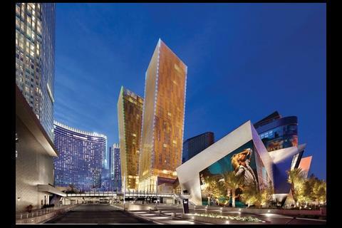
The scheme is seven different structures, designed by six different architects ‚Äď and one executive architect. The most bewitching are the projects to the north-eastern side of the site. The Veer Towers by Helmut Jahn are perhaps the most stunning: twin 37-storey residential towers that lean five degrees from the centre in opposite directions. Dramatic, and ingenious in the way they optimise the number of rooms with views, the towers have a gold-tinted, random patterning on their glass-and-steel facades that glistens during the day. At night, an LED system gives both towers a subtle neon outline. Jahn says: ‚ÄúUntil now, the memory of Las Vegas‚Äô skyline was graphic; our goal was to make it architectural.‚ÄĚ In other words, to render it three-dimensional. And the towers do add to a sense that the skyline is a collage, quite different, says Jahn, to the flat skylines of New York or Chicago.
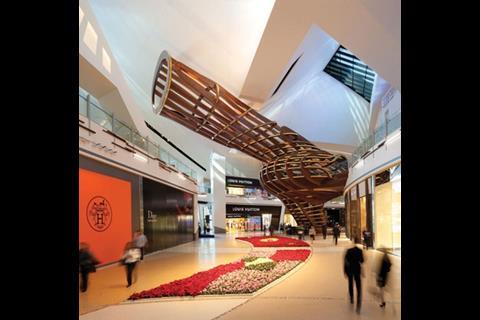
The towers rise out of Libeskind‚Äôs shopping centre, Crystals, one of the architect‚Äôs best buildings in a long while, or it would be were it not for David Rockwell‚Äôs frankly daft, curvy interventions for the interior ‚Äď like the two-storey wooden tree-house pictured above.
Then there is the Harmon, a classic modernist hotel tower by Foster + Partners that stands apart, and as yet unfinished, at the very corner of the site. Due to poorly poured concrete that proved too costly to fix, MGM Mirage was forced to lop 21 floors of apartments from the top of the building. Astonishingly, the tower is still a success: a slender volume in banded blue glass that owes more than a passing debt to the early 20th century German architect Bruno Taut.
Taken separately and on their own terms, the other projects are less successful. The Aria hotel at the rear of the hotel is perhaps the least attractive of the different blocks, but the architect Pelli Clarke Pelli has worked hard in breaking down the volume of a 4,000-room hotel with 15,000m2 of gaming and 30,000m2 of conference facilities by creating two interlocking curvilinear blocks, the further forward of which steps down as it moves round the curve.
Furthest from the Strip is Vdara, a ‚Äúboutique‚ÄĚ hotel of 1,500 rooms. Designed by Rafael Vi√Īoly, it is a bland curved tower that is articulated as three thin volumes.
The luxurious 47-storey Mandarin Oriental hotel is by Kohn Pedersen Fox. It has a W-shaped plan with an intricate system of interlocking metal and glass on the facade. These are all straightforward independent towers.
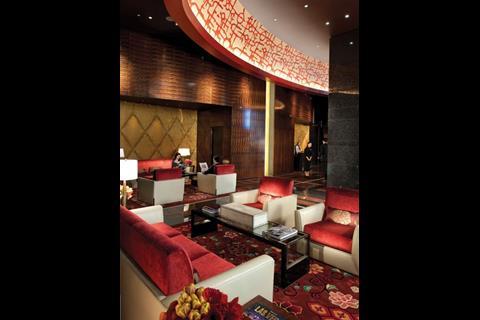
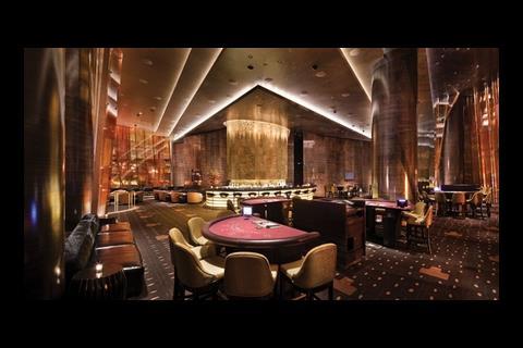
Although CityCenter is, in many ways, a single structure, with Perini a single contractor and Gensler a single executive architect, that is not to say that it is legible and easy to orientate. Like other casino resorts, CityCenter is a deceitful complex. Although it has less floor space devoted to casinos than other buildings, if you are staying at Aria you still have to pass through the gambling floor to get from the hotel door to the lifts ‚Äď that‚Äôs if you can get to the hotel in the first place; it is hard to get into by foot even by Las Vegas standards. Indoor signage is absent and you have to beat a path between the banks of slot machines to get to your room. The excessive use of earth tones in the interior also makes orientation difficult; from the meta-quartzite stone that paves the lobby to the repeated use of richly lacquered wood, the public areas are an almost bewildering swath of rich browns.
More disorientating still is the People Mover, a monorail system that snakes through the plaza behind the Veer Towers and the Mandarin Oriental. It looks like a piece of pioneering urbanism but it’s little more than a fair ride. Separate from any network, it merely takes the congenitally lazy from one side of the site to the other, without connecting into any wider system.
But nothing, perhaps, is more deceptive than the scheme’s sustainability credentials. All but one structure on the site has achieved Gold LEED certification, but Las Vegas is a city that renews itself repeatedly. The most optimistic prediction of CityCenter’s life is 50 years. It is likely to be less. Even the famous Dunes, where Sinatra played, only made it to 38 before it was demolished. Casino owners are merciless when it comes to architecture. If it no longer glitters, it goes. For all CityCenter’s allure now, and despite the current economic climate, it is unlikely to be the newest casino on the Strip in a decade. The Boyd Gaming Company says it has put the Echelon Casino, which will also be built on the Strip, on hold for only three to five years.
Of course, to accuse a building on the Las Vegas Strip of being deceptive is like accusing a ride at Disneyland of being aimed at children. Just five minutes‚Äô drive from CityCenter is a hotel and casino shaped like a pyramid, after all. Las Vegas is all about deception ‚Äď it‚Äôs a large part of its pull.
Yet even on these terms CityCenter is a disappointment. It pretends to be a real part of a city rather than just another gloriously absurd simulacrum of another city. One cannot help but be awed by the scale of the project, but the fakes that surround it somehow seem more honest ‚Äď as well as more fun ‚Äď because they are at least not pretending that they are part of a sustainable, urban environment. CityCenter is a casino resort, that‚Äôs all.
Surely it is better to be an honest fake than a dishonest one?
All the fun of the strip
In 1972, the architects Denise Scott Brown and Robert Venturi published Learning from Las Vegas, the result of an extensive field study of Las Vegas. In the book they noted the way that in Las Vegas, the casinos were simple sheds which were adorned at the front, particularly with neon signs. Typical of the many casinos of this period was the Stardust Casino which was built in 1955, but remains largely forgotten, apart from its iconic sign. This was made by the legendary Young Electric Sign Company.
At the time, nuclear testing had begun on Yucca Flats, near Las Vegas, and the cloudburst sign was a themed celebration of the event. Writing in the early seventies, Scott Brown and Venturi recorded these signs but also successfully predicted the rise of the theme hotel which came in the nineties after a decade of little development activity on the Strip. This was when the hotel and casino buildings themselves became signs of the fun that could be had within.

Treasure Island by Steve Wynn opened in 1993. In front of the casino entrance was a volcano around which were staged nightly pirate battles. Wynn professed himself to be a fan of Disney and, throughout the nineties, transformed the Strip. That same year, Luxor opened, the pyramid-shaped casino themed on Ancient Thebes.
MGM opened New York New York, a close neighbour of CityCenter, in 1997. Its facade is a representation of New York’s famous skyscrapers such as the Empire State building. A rollercoaster wraps around it, departing from a section of the hotel interior themed to look like Coney Island. Having established this precedent for Las Vegas, Wynn decided to go for simple high-end luxury with the Wynn hotel, which has set a trend that others, including Donald Trump, have followed.
CityCenter is MGM Mirage‚Äôs massive contribution to the new highly styled, glitzy urban trend in Las Vegas casinos. Scott Brown and Venturi have made it clear that they are unimpressed. Venturi says: ‚ÄúI think Wynn saw something changing in America and reacted to it, and in doing so, has done very well. I am not sure people like us can love the new Vegas. It doesn‚Äôt hit our funny bone, our crazy bone, in the same way.‚ÄĚ













2 Readers' comments