Coffey Architects won its biggest commercial job in the UK in 2016, four years after being named Young Architect of the Year. Now complete, its work on that King’s Cross development has more than justified the developer’s decision to put its faith in emerging talent, Elizabeth Hopkirk reports
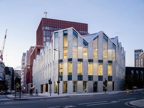
Argent’s 30-hectare King’s Cross development in central London is a compendium of fashionable architects, a reference book in built form. They have got a Chipperfield, a Heatherwick and a Maki, plus a Brooks in gestation. Into that starry anthology, the fruit of Allies and Morrison’s now 20-year-old masterplan, a few younger practices have been invited to pitch.
One of the last schemes to be completed is Coffey Architects’ shimmering 22 Handyside Street, an £18m three-storey office building that stands at the very eastern edge of the estate where it rubs up against York Way, that still-grimy artery leading north through railway badlands from King’s Cross station towards Islington.
Every architect handed a plot on this post-industrial tabula rasa faces the same dilemma. For King’s Cross to achieve its ambition of becoming a piece of the city, some of the buildings must blend quietly into their surroundings. “But, please God, not mine.”
Coffey, presented with a “gateway” site, argued that a landmark was appropriate and the practice has created something arresting and rather beautiful. Whichever way one approaches there is a moment of surprise, the gasp slightly louder on a sunny day when its aluminium facade really dazzles.
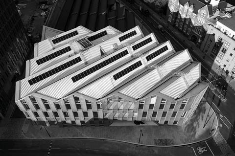
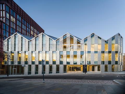
The two principal elevations, facing south on Handyside Street and north-east on York Way, have the pointy simplicity of a paper crown or a child’s drawing of mountains, but that belies the complex reality. The project is a veritable geometry puzzle, something that becomes apparent when you see the building from above or venture inside.
Coffey won the commission – which at 3,463m² is its biggest commercial job in the UK – in 2016 against a shortlist that included Henley Halebrown and Haptic. The practice’s central use of light as a material is a theme running through its work, visible in the Stephen Lawrence Prize-winning school library in north London and a more recent research centre for the Science Museum.
The driving constraint faced by the team at 22 Handyside Street was a set of listed gasworks tunnels running under the sloping site, their brick crowns in places just three metres beneath the surface. They dictated the structural grid, with the columns placed parallel to the tunnels and in between them as much as possible. Their presence also demanded a lightweight building.
Coffey set about subverting the grid, striking a diagonal across the columns on which to lay its distinctive pitched roof. The site might not have been able to bear another storey but, since air is weightless, they pushed the floor-to-ceiling height on the top floor to 6.5m, creating the jaunty peaks that fulfilled Argent’s desire for an expressive roofline.
And now the geometry gets really tricky. The building’s lacey skirt is cinched in at the eastern perimeter to create, in concert with Bennetts’ adjoining timber sports hall, a piece of public realm, all that remains of an early idea for a route through the building. The gesture is repeated at the corner, which Argent wanted to have a civic feel, and the chamfer here generates a wide pavement for lingering on.
These landscaping gifts are not entirely altruistic since sacrificing a few square feet of lettable space to make this bit of York Way appear less hostile will surely pay dividends in the long term. But they are welcome moves.
Every small push or pull of the plan had complex ramifications. Like a 3D jigsaw, each piece of the building is intricately interconnected. “If the angle of the grid is amended or the angles of the perimeter are amended, then nothing lines up,” explains Phil Coffey, the practice’s founding director. “The roof hits the corner at a point so, every time you move that, everything else moves too. It’s like the knee bone’s connected to the thigh bone…”
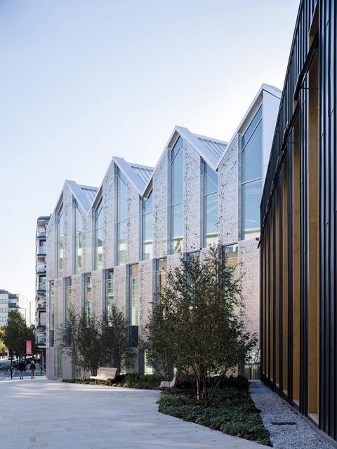
Without the setback on York Way, the north-east corner would not align with the apex. “I think this is why the form seems so effortless despite being an incredibly difficult series of alignments and relationships in reality,” says Coffey with a whiff of pride. “It’s not whimsical: it’s really tight.”
The practice worked closely with Arup and Network Rail, which owns the tunnels, to test tolerances. A BIM model, says delivery architect Stride Treglown, was critical in resolving all these riddles. The detailing is masterful and you would never suspect that main contractor Carillion went bust in the middle of the project, to be replaced by Bam in 2018.
It is also not obvious that there was a push from Argent to keep costs much lower than other King’s Cross architects have enjoyed. “They were beginning to eye sites with less value and wondering if they could still deliver buildings of merit, so they put us under pressure,” explains Coffey.
He describes it as a perfect storm: the tunnels, a relatively small building – effectively reducing the net-to-gross – and a client trying to drive down costs. The team was asked to prepare options, including one with a flat roof.
“We made those renders terrible,” guffaws Coffey. There was also a conversation about using polyester powder coating on the facades. He rolls his eyes and says: “I wrote personally to the client.”
He is actually full of respect for Argent, which has an enlightened reputation among architects, and admits that this process of challenging everything resulted in improvements to the competition scheme. “But you can’t give up too easily or they will wonder why they picked you,” he says.
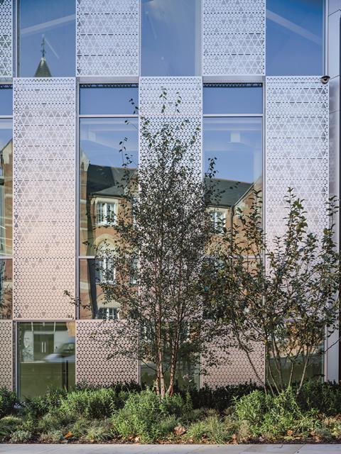
The structural materials, concrete and steel, were chosen for their lightness, with CLT ruled out as too heavy for the ceiling heights they were trying to achieve. The roof and screens that play such an important role in the building’s character are CNC-cut anodised aluminium, low maintenance and recyclable. They give it at once a jewel-like quality and a curiously light industrial feel, depending on your vantage point and the sun.
Once a decision was taken that this was a fringe building, it freed them to consider the wider setting rather than just their westerly neighbours, the most dominant of which is Morris & Company’s pair of strongly rectilinear pink office blocks next door. York Way here is a bit forgettable: some disappointing flats, a couple of handsome Victorian buildings including a disused oxblood-tiled Tube entrance, and acres of empty yards protected by metal security fencing. In this context Coffey’s filigree grilles and standing-seam roof are inspired. They pay homage to this N1 exurb while also being unashamedly part of the coming gentrification.
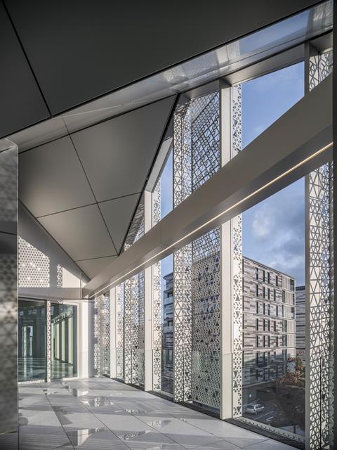
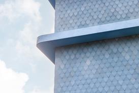
The screens, which extend six inches from the facade, are intended to protect the interiors from heat loss (now) and solar gain (in the future), reducing the load on internal services and helping the building to achieve a Breeam Outstanding rating. But they were also, Coffey says, designed specifically to manipulate and percolate light. Their randomly perforated and embossed triangle patterns are an abstraction of the surrounding trees and an echo of the roofline.
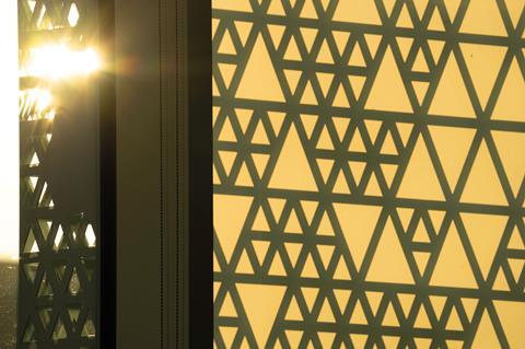
The device lends a depth and an almost handmade richness found in traditional masonry buildings but which is hard to achieve on today’s budgets. At the same time they feel strangely ephemeral. They are fixed in a regular 1.5m chequerboard pattern but at dusk, when the building begins to glow, the light pours out unpredictably as some of the panels reveal a hidden translucence.
This happens because the panels are actually an assortment of three types: solid, fully glazed and translucent glass. There are also two large terraces recessed behind the facade and each screen is perforated to a different degree, leading to great variation in the way the building leaks its light.
It is not just after dark that 22 Handyside Street intrigues. The metal and glass panels reflect changing daylight, weather conditions and their surroundings differently, making the building hard to read and endlessly engaging, almost theatrical. The base, middle and top appear to have been shuffled playfully out of alignment, though the layers maintain their regularity as they wrap around the corner – giving the building the air of having been fashioned from a single lump of metal.
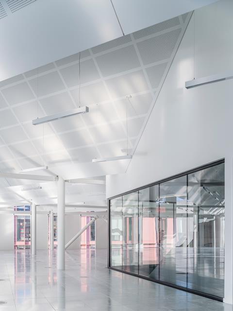
This dynamism continues inside. Standing under the vaulted ceiling on the top floor is a surprisingly disorientating experience. The eye expects the deep ridge lines to hit the walls at right angles but they do not, or at least not all the walls. They terminate obliquely at the south perimeter like sliced baguettes. At the same time the brain is reconciling the horizontals, verticals and diagonals of the slender steel frame as well as assorted other angles visible from outside.
All the while, dappled light and shadows move across the walls and floor, thrown about by the different elements of the facade. This shifting light is intended to improve occupiers’ concentration by connecting them with nature, regulating their circadian rhythms and boosting their wellbeing.
I’m loving my modern flock wallpaper of light
Phil Coffey
It was conceived before the pandemic struck but could prove to be a selling point as offices undergo a major re-evaluation. It is also very attractive. “I’m loving my modern flock wallpaper of light,” says a delighted Coffey of the translucent panels.
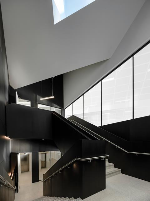
In deliberate contrast with the celebration of light everywhere else, the central stairwell is clad in black Valchromat which sucks lumens out of the atmosphere like a black hole. A triangular – what else – roof light guides your progress up the terrazzo staircase. There was only one place the core could go because the tunnels precluded a liftshaft from most of the site. Services are kept away from the ceilings, other than lights and smoke detectors, with trench heaters round the edges and two air-handling units sending air up through the risers.
We end the tour on one of the south-facing terraces looking out across Handyside Gardens – named after a Victorian engineer who solved the problem of running trains on gradients – towards the central London skyline. It is unusual for a three-storey building to have such good views. But what makes this a welcome addition to King’s Cross is ultimately less about what it gives its occupiers and more about the enjoyment it will give to people passing.
In that sense it is a much more successful building than Pritzker Prize-winner Fumihiko Maki’s Aga Khan building at the other end of Handyside Street. Both screen their windows with faintly Arabic lattice patterns but Maki’s ceramic frits present a blank and unwelcoming aspect, concealing what are in fact public spaces and gardens within.
Coffey’s approach, in startling contrast, invites curious glances right inside, while the shimmering panels enliven the neighbourhood. This YAYA-winning practice has justified Argent’s decision to include some emerging architects in its compendium.
Project team
Client King’s Cross Central Limited Partnership
Concept architect Coffey Architects
Delivery architect Stride Treglown
Contractor Bam
Structural engineer Arup
M&E consultant E3
Quantity surveyor Faithful+Gould
Facade consultant FMDC
Fire consultant Fire Surgery
CDM consultant David Eagle










No comments yet