Brick deliveries data can tell us a lot about the number of homes being built but the relationship between the two is weakening
The latest building materials and components statistics were released by the business department BIS today. So I thought it worth having a wee peek at how facing brick deliveries have been going, given the general fuss about house building.
I tweeted a few graphs earlier to show how brick deliveries had changed, which as I suggested provides a hint at changes in house-building activity.
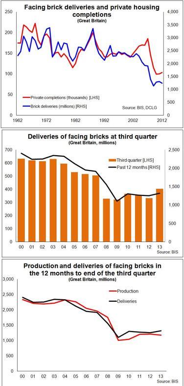
But it seems wise to add a few words of caution, since, as with all data, the brick figures should be subjected to questioning. The top graph - not tweeted earlier - shows how brick deliveries (annually) have fluctuated since the 1960s and how closely they have tracked private housing completions.


The booms in the early 1970s and late 1980s are clear. But it is interesting to note the fall in facing brick deliveries since 2003, despite the rise in homes built. This is most likely linked to the changing planning that promoted denser building on brown land and a very different mix of housing forms, notably more flats.
Urban flatted schemes are often constructed more like commercial buildings than traditional housing. Facing bricks don’t necessarily feature as the cladding, or may be used but blended with other cladding.
This weakening of the relationship between brick use and homes built in the noughties may well be why the brick figures seem to get less attention these days. If you went back 20 years you’d find those following the fortunes of house builders pretty studiously tracking the brick data. And I am sure many still do.
There is a host of factors that influence the relationship, such as where types homes are built, how large they are and whether they are flats of houses, how easy it is to get hold of bricks, how much stock is held by intermediaries, how easy it is to use an alternative, the availability and price of imports.
But for all these problems the brick figures remain an interesting piece of the data jigsaw and provide at least a hint in the short term of the change in the level of house building.
So here are a few highlights.
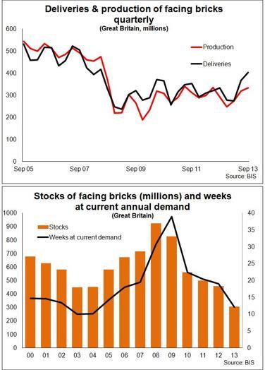
The figures show deliveries up 21% in the third quarter of this year compared with the same period a year ago. This suggests quite a rise in production. It is the highest three monthly figure since June 2008.
However, the industry would need to increase the current amount of deliveries by a quarter to get back to the level seen in the third quarter of 2007.
Meanwhile, production would have to increase almost 50% on its third quarter 2013 rate to get back to the corresponding level seen in 2007.
And as we can see from the lower graph the stock level is falling fast. There is, according to the figures about 13 weeks of stock at the level of deliveries over the past year.
If we look at the stock level in relation to third quarter rate of deliveries this drops to about 10 weeks.
Anyway, here are a few graphs looking at the data in various ways.
Brian Green is an independent analyst, commentator and consultant working in construction, housing and property


No comments yet