Christina Seilern is dreaming of a holiday - but you won’t catch her travelling out of Luton airport. Stansted, on the other hand, provides the perfect start to a journey
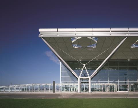
Stansted airport revolutionised airport design in that it is based on an architectural idea, rather than an image or gesture. Stansted is a precursor to other great airports, such as Rafael Viñoly’s Montevideo airport in Uruguay.
Stansted reinforces what our profession should be aiming to produce: an intelligent solution delivering an elegant proposal. It exemplifies a concentrated effort to understand the experience and function of air travel, which is successfully translated into a building.
Airport design pre-Stansted put the mechanical equipment on the roof, which demanded a heavier roof structure to deal with large spans and heavy loads. At Stansted, the roof is alleviated of this mechanical burden, allowing for greater ceiling heights and increased volumes of natural daylight.
The structure’s sculptural form announces the architecture while simultaneously letting the function and user experience dominate the building.
Additionally, the building manages people flow remarkably well - great in hindsight, given the increased demand it now faces.
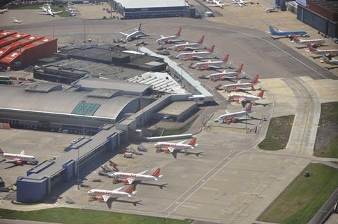
My blunder is London Luton airport: a “shed” of the worst kind for a public building. A clutter of ill-conceived additions, where decisions about function were made without any thoughtful understanding of the travel experience, making it feel no different to an Ikea expedition, where you are led from one section to the next.
The building feels oppressive: the girders weigh heavily overhead and the ceiling is remorseless in its endless repetition. One has a feeling of being processed, rather than beginning a journey. There is little sense of an external world beyond the check-in, desks, shops and cafes. Interestingly, both airports are from the same architect.
Wonder
The terminal building at Stansted was designed by Foster Associates with input from structural engineer Peter Rice. It has a “floating” roof, supported by a space frame of inverted-pyramid roof trusses, creating the impression of a stylised swan in flight. Construction completed in 1991,
five years after work commenced.
Blunder
In 1998 a £40m terminal was built as part of London Luton’s redevelopment. Made from aluminium and glass, it was designed by Foster + Partners. The new terminal, which was officially opened in November 1999 by Queen Elizabeth II and Prince Philip, houses 60 check-in desks, baggage and flight information systems and shops, restaurants and bars.
Christina Seilern is principle of Studio Seilern Architects






1 Readers' comment