For the official launch of building.co.uk/global, the webmaster examines the website of the Big Daddy of global organisations
Webmaster’s verdict
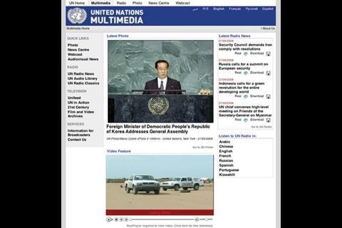
UN.org is a bit of a mess. The age old advice is "blue and green should never be seen”, but the web designers have clearly forgotten these wise words. The clashing colours are not easy on the eyes, but the content is lacking as well. Parts of the core of the site seem dated and forgotten about. It looks as though an original, now-outdated site has had mini sites bolted on to it over the years.
These bolt-on microsites are a much better prospect: each has abundant and varied content including news, video and webcasts, but inconsistent navigation doesn’t bring everything together as one. More coherent site furniture and navigation would help to encourage the user to browse through all the content and not get lost in one section.
Vital statistics
3,925th
Most popular site on the internet globally, as ranked by web information company Alexa
Google ranking 9/10
This ranking indicates how important it is to other sites that link to it
Inbound links Yahoo 2,370,000
This shows how many pages Yahoo says link to the site
Indexed pages: Google 287,000 Yahoo 1,207,260
This shows how many pages on the site have been recorded by Google and Yahoo.
Postscript
Greg Morris is an online supervisor at www.building.co.uk


No comments yet