Terry Farrell & Partners' website shows that minimalist architecture may not work as well on websites as on buildings
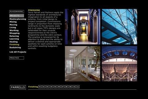
Architect Terry Farrell and Partners, famous for its redevelopment of Charing Cross station in the late eighties, hit the news this month with rumours that its £90m aquarium in London’s Docklands could be scrapped because of the credit crunch. But what’s its website like?
Webmaster’s verdict
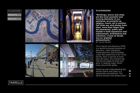
The site is minimalist with all content designed to fit tidily into a single screen, but with a lack of navigation. Good practices in architecture, such as squeezing as much as you can into one space, do not translate well to the web. Reading the site’s content is a chore using their text scroll buttons. This could have been avoided by having all the text displayed on the same page at once. The keyword optimisation works well, as it is based around the names of their projects with keywords as headings and page titles. The site will not get general Google traffic as it lacks headings for phrases such as “architecture” or “building design” that web users often type into search engines.
Vital statistics
1,892,764th most popular site on the internet globally, as ranked by web information company Alexa.
Google ranking 4/10
This ranking indicates how important it is to other sites that link to it
Inbound links: Google: 21, Yahoo: 347
This shows how many pages Yahoo and Google say link to the site
Indexed pages: Google: 138, Yahoo: 1,273
This shows how many pages on the site have been recorded by Google and Yahoo.
Postscript
Greg Morris is an online supervisor at ∫√…´œ»…˙TV.co.uk








No comments yet