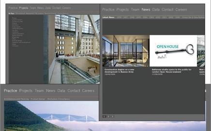
Architect Foster + Partners' website, fosterandpartners.com, scores well on usability but badly needssome search engine optimisation
Webmaster’s verdict
In terms of usability, fosterandpartners.com is great. A clean layout, clearly labelled navigation and a good choice of colours follows all the right website building practices. The only place that the site designers have placed aesthetics above functionality is with the text-scrolling tool, which hinders quick scanning of text. It looks cute, but is it necessary?
This site is in need of some heavy search engine optimisation. The main problem is that every single page has the same name, which doesn't look good in Google search results. Simply changing the page titles to reflect the content (by mirroring story headlines, for example) would benefit the site immensely.
Vital statistics
134,198th
Most popular site on the internet globally, as ranked by web information company Alexa
Google ranking 6/10
This ranking indicates how important it is to other sites that link to it
Inbound links: Yahoo 20,526
This shows how many pages Yahoo says link to the site
Indexed pages: Google 987, Yahoo 873
This shows how many pages on the site have been recorded by Google and Yahoo.
Postscript
Greg Morris is an online supervisor at www.building.co.uk


No comments yet