Student panel on the pioneering Surrey City Centre Library that takes directly from social media

This is the new ôÈ22m Surrey City Centre Library near Vancouver. Designed by local architect Bing Thom Architects (BTA), it sets to challenge our traditional perceptions of a public library in the age of the internet with a pioneering design approach that takes directly from social media. Read the full report .
This is what our architecture student panel had to say:
James Fairweatherãs verdict
The exterior of the Surrey City Centre Library is certainly imposing. The extensive curved faces contrast heavily with the pointed, sharp edges that appear aggressive rather than inviting, a sense that is only enhanced with the clash of clean, lined glass with the dull and monochrome concrete. The concrete finish resembles a high-rise car park rather than a modern, perception changing library.
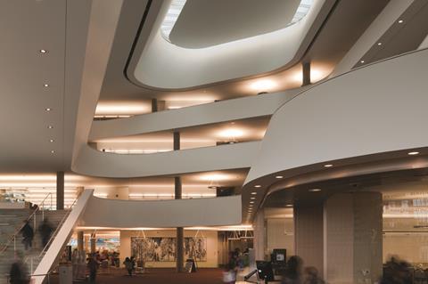
Once inside, the light, open plan interior immediately dismisses any preconceived ideas of the ãstandard libraryã, James Fairweather
Once inside, the light, open plan interior immediately dismisses any preconceived ideas of the ãstandard libraryã. With a pristine white finish that engulfs the interior space it provides a modern transformation of an old institution. The looks are clean and efficient but disappointingly appears cold, clinical and detached from the user.
It is easy to judge a design from just images, but a true reflection of such an interactive space must be experienced first-hand. If it can rejuvenate and modernise the idea of a public library then the debateable form may merely be a side note.
Andrew Stoutãs verdict
Vancouver has a fairly modern influence, yet the surrounding cities and towns have a more traditional feel in the architecture; but I must say this new bold statement by Bing Thom Architects really fits into the surroundings very well. On your first glance of this building you would be stunned it has such a beautiful design to it.
I believe this is a stepping stone for the future as this building has such a simplistic design with a feel of post-modernism; it really makes you think ãwhy canãt all libraries be like this?ã
James Fairweather and Andrew Stout are studying architecture at Nottingham Trent University.
Source
Contact Nargess.Shahmanesh@ubm.com if you would like to take part in the First Impressions series.


No comments yet