The incorporation of two schools into a residential building in King’s Cross is an example of how school designers are becoming ever more responsive to the changing physical and political environment they face. But is it any good?
According to London Councils, the apolitical representative body that lobbies on behalf of London’s 33 boroughs, 133,000 additional school places will be needed in the capital by 2018, almost a third of the figure required for the whole of the UK. Moreover, it is expected that many of London’s boroughs will fail to meet demand for school places over the next few years.
This has obviously a placed a huge amount of pressure on school development within London. One consequence has been that schools in the capital are increasingly being procured via Section 106 agreements, with traditional housebuilders now often constructing schools directly in order to satisfy planning gain requirements.
Additionally, with space for new schools being sparse, particularly in dense inner London, planners, developers and designers are being forced to become ever more creative as to where schools are located. As it happens this is a mandate that has received tacit political encouragement with the concurrent expansion of free schools which, with some controversy, has thus far placed schoolchildren in locations as improbable as airbases and fire stations.
But away from the more surrealist occupancies of the free schools programme, even London’s conventional schools are finding themselves in ever more unconventional locations and configurations. Up until earlier this year Croydon council was progressing detailed plans for the conversion of a six-storey art deco office block in its town centre into a primary school. And nearby Kingston has also been considering plans to open a community school in a converted office block.
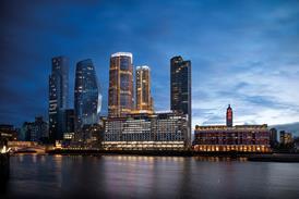
And now on the massive King’s Cross Central regeneration site in central London, the capital’s latest example of an unusually located school has just been built. The Plimsoll ��ɫ����TV occupies a large plot to the north-west of the King’s Cross Central development close to the Regent’s Canal and the site’s iconic gasholders. Like most of the northern segment of the King’s Cross development, it provides housing, with this block offering 255 luxury and affordable flats designed by David Morley Architects.
But what differentiates the Plimsoll ��ɫ����TV from its surrounding residential neighbours is that the bottom two of its 13 storeys are entirely occupied by a primary school. And not just one school but two. Because to complicate matters even further, the smaller of the two schools is a SEN (Special Educational Needs) school for deaf children, with all the onerous technical and spatial specifications that this entails.
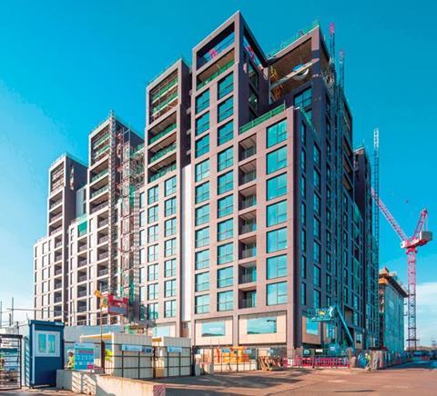
That both schools have been incorporated into a residential building on a tight inner-city site sets yet another important precedent for how school design is becoming ever more responsive to a changing physical and political environment.
The King’s Cross Academy is a two-form entry primary and nursery school that will eventually have places for up to 420 pupils. The Frank Barnes School for Deaf Children is a smaller school that caters for children aged two to 11 with a range of hearing difficulties.
Both schools were part of a Section 106 agreement secured when planning permission for the Plimsoll ��ɫ����TV was awarded. As such, they were not a later addition to the project but an integral part of the design strategy for the residential development. As David Morley explains, other design options were explored at the start of the project for how the school and housing elements of the development could be configured.
“We looked at several options for how the school and resi options could be integrated. We looked at freestanding school options as well as the idea of some sort of vertical multi-storey stack. The vertical model provided good adjacencies and opened up the possibility of using the roof as a playground. But in the end, the extent of vertical circulation proved impractical and inefficient.”
It was at this point that the idea of placing the school at the base of the residential block was agreed, a solution which, as Morley points out, presented several key advantages. “It still provided the good adjacencies prevalent in the vertical model but it also enabled us to place the school on just two storeys, which is a good configuration for a primary school.”
Not all the “adjacencies” Morley refers to are immediately apparent when studying the school’s location on the King’s Cross masterplan but they nonetheless proved to be major advantages in terms of the school’s accessibility and amenity provision.
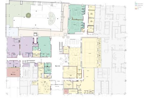
The Plimsoll Block is surrounded by three new streets, one of which is defined as a car-free, shared surface “home zone” which provides the sheltered access particularly valuable for the SEN pupils. Additionally, a new park is being built at the base of the adjacent gasholders and the neighbouring residential block incorporates an underground multi-purpose sports pitch. While these facilities are not owned by the school, pupils will have access to them and they will form a crucial part of the school’s amenity offer.
��ɫ����TV two schools at the base of a formidable 13-storey residential building presents inevitable constraints. However, the challenges have been met with innovative design solutions that often progress to become key components of the new schools’ unique identity.
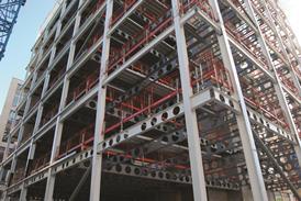
One of the first challenges is structural. The layouts of the flats are based on a standard 7.5m structural grid determined by a two-bedroom layout. Altering this grid to accommodate a school on the bottom two storeys would have required significant transfer structure at second floor slab level that would have been complicated, expensive and, crucially, might have jeopardised internal floor-to-ceiling heights due to the building’s overall height being constrained by the massing plan imposed by the wider King’s Cross Central masterplan.
But as David Morley assistant director Kristian Marjoram explains, this structural constraint was turned into an advantage. “In fact, 7.5m happens to be a good size for a classroom. Moreover, the floor plan often has one-bed flats stacked beside two-bed ones, which means that the grid provides alternate 7.5m and 3m bays. The 3m bay is utilised in the school as smaller, break-out space between the main classrooms. Threading the flats’ structural grid down through the school also means that the grid is maintained for the residential car parking in the basement too.”
Another obvious constraint is playground space. Although the school will have access to Gasholder Park and the underground sports pitch, its own private playground area is essential. As Morley explains, the building’s massing is deployed to address this problem.

“The building is expressed as a cluster of towers principally arranged on its northern and eastern sides. This leaves much of the remaining two sides, as well as the centre of the plot open. Within this zone we’ve been able to provide 1,000m² of playground space.”
In fact, this playground space is ingeniously inserted and provides one of the key design features of the school. While the school occupies a far greater footprint on the site than the residential “towers” above, it doesn’t occupy the entire site. This provides opportunity for daylight to filter down into the school’s deep plan by means of giant circular skylight shafts cut into its roof deck.
It also enables playground space to be cleverly distributed on a number of stepped terraces that weave over and around the two-storey school deck in what Marjoram describes as a “three-dimensional solution that also provides outside learning spaces”. Along the site boundary on the open south-west corner of the plot, this playground space is sheltered by a striking, perforated and planted bronze screen intended to strike a balance between privacy and permeability.
Within a constrained urban site such as this, the permeability from inside to out will be particularly important. Therefore this open south-east corner of the site provides crucial visual connections to a surrounding townscape animated by the gasholders, the evolving King’s Cross development and the passing of Eurostar trains from nearby St Pancras, stimuli that pupils will be able to enjoy from their playground.
Although Marjoram reveals that one of the biggest challenges of the floorplan was “arranging the school around the residential stairwell cores”, to the casual observer the interior of the school reveals a subtle shift in the nature of the challenge the project was faced with. Here, the constraint shifts from incorporating school and residential more to incorporating a primary and SEN school. Pedagogically this is addressed by both teachers and pupils at the academy learning sign language and making use of extensive shared facilities.
But architecturally, it is addressed by the adoption of a number of design consistencies across both schools. For instance, while both schools have separate entrance atriums, that at Frank Barnes is conspicuously configured as the smaller of the two and there is one demonstrable main entrance for both schools.

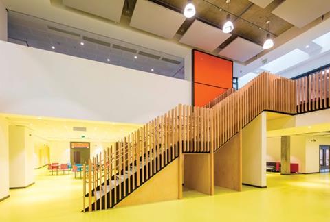
Colour coding is extensively used in internal areas to denote various sections of the building with the colour scheme intuitively matching that of the school’s logo. Each school has a principal staircase but both are configured as highly permeable single, straight flights without the returns of reverse-landings that might create unwarranted spatial complexity for children with heightened sensitivity.
Corridor and hallway corners are also expressed as wide curves rather than right angles in order to assist observation and visual connectivity. A marked feature of the interior is natural light. Along the edges this is facilitated by huge expanses of glazing that occupy the full width of the 7.5m structural grid. And the circular skylight shafts admit daylight into the centre of the deep plan.
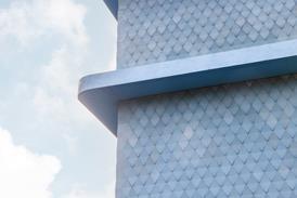
For Marjoram the key to immersing the schools into the residential development is a consistency of architectural approach. “The language has to work. Elevationally the bottom two storeys use the same brickwork as the residential floors above; we’ve never tried to shy away from the fact that this is a school beneath 11 storeys of flats.”
But beyond this, he says the challenge of combining the SEN and primary schools are met by employing design strategies that should be prevalent on all good school design. “It’s about creating distinct spaces that work together. And delivering any good school, regardless of context or type, is down to delivering the fundamental values of acoustics and daylight.”
This year’s inaugural ��ɫ����TV Live event will feature a speech on school building in 2016 which will discuss some of the issues touched upon in this article. For more information see







1 Readers' comment