Giant sphere or wafer thin canopy? Vote for your favourite past pavilion from our shortlist …
This week, ºÃÉ«ÏÈÉúTV paid a visit to the new Serpentine Pavilion by Sou Fujimoto - . This inspired us to take a look back at some of the most striking contributions to the assignment from years gone by.
Here’s our architectural correspondent Ike Ijeh’s pick of the bunch, and we’d like to know what you think. Vote for your favourite in our poll on the right, or, if there’s a particular pavilion that stood out for you that isn’t on our shortlist, let us know by commenting below.
RESULTS
Did you vote online for your favourite Serpentine Pavilion from our shortlist of six? Kazuyo Sejima & Ryue Nishizawa of the SANAA collective won 40% the vote with their 2009 aluminium canopy.
Runners up
2nd Oscar Niemeyer (2003)got 20% of the vote.
3rd/4th/5th Rem Koolhaas (2006), Peter Zumthor (2011) and Toyo Ito (2002) tied on 13% of the vote.
6th Jean Nouvel (2010) got 0% of the vote.
Toyo Ito, 2002
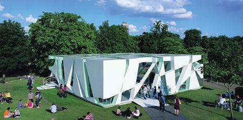
The 2003 pavilion was a complex and compelling study of geometry and motion. Based on the algorithm of a rotating cube the pavilion’s walls and roof were sliced with seemingly random glass incisions to create a cuboid structure punctured by a series of transparent triangular and trapezoidal voids. Despite the pavilion’s geometric complexity, its multiple openings created an interior whose infinitely shifting views seamlessly inserted it into the surrounding natural landscape.
Oscar Niemeyer, 2003
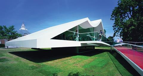
Legendary nonagenarian architect Oscar Niemeyer strayed far from his native Brazilian soil with this sliced offering in 2003. But stylistically Niemeyer was on safe ground with many of the signature architectural features that characterised much of his work on full display. This included sculptural form, precipitous massing, dynamic geometry, and of course, gleaming white surfaces. Niemeyer’s pavilion is also one of the most intimate to date and its raised terrace and billowing pitched roof set a reassuringly residential tone.
Rem Koolhaas, 2006
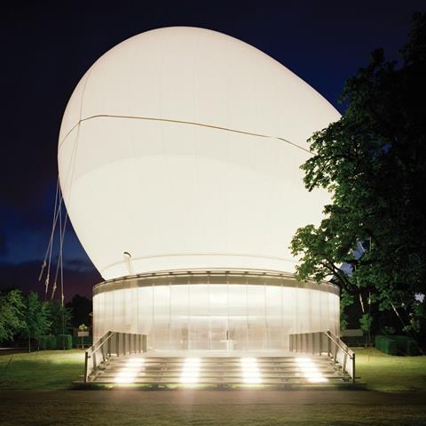
It wasn’t just the Victorians who loved launching hot air balloons in Hyde Park; it would appear that Rem Koolhaas is not unfamiliar with the practice either. His 2006 pavilion entry probably counts as one of the most eccentric and involved a giant translucent sphere inflated over a circular amphitheatre. The ovoid shaped canopy could either be raised or lowered depending on the weather. Encountering the glowing, globular mass swelling improbably over the surrounding trees was a surreal experience and Koolhaas’ work represents a weird and whimsical contribution to the pavilion programme.
Kazuyo Sejima & Ryue Nishizawa of SANAA, 2009
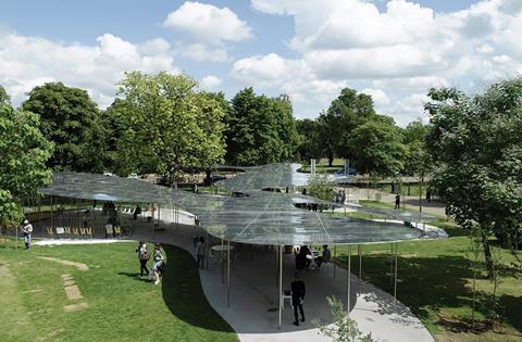
Japanese collective SANAA’s svelte 2009 pavilion was arguably the simplest and sleekest to date. A curved, wafer thin aluminium canopy was woven between the trees to seemingly drift across the park like a metallic pall of smoke. Supported by slender pilotti and completely free of walls, the pavilion provided uninterrupted views of the surrounding landscape, views that were myopically distorted and multiplied when encountered through its highly reflective surfaces. The concept of a reflective pool was one explored more literally and with rather less subtlety in last year’s floating water pavilion by Herzog & de Meuron and Ai Weiwei.
Jean Nouvel, 2010
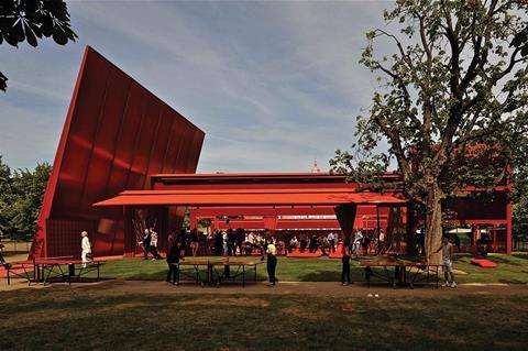
Ever since Cesar Pelli shamelessly admitted to having partially based the shape of Canary Wharf Tower on Big Ben, architectural concepts have plumbed the depths of plausibility with abandon. But even Jean Nouvel must surely have suppressed a satirical snigger when he claimed that the blood red colour in which his low-slung 2010 pavilion was drenched was inspired by that of a London bus. Spurious substantiation aside, Nouvel’s contribution was a memorably cinematic one, decadently thrusting a hazy, translucent, womb-like sanctuary deep into the rich green scenery of Hyde Park.
Peter Zumthor, 2011
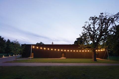
Most Serpentine Pavilions try their best to engage with their surroundings, with one notable exception. Peter Zumthor’s 2010 effort crafted a medieval walled garden into the heart of Hyde Park. In order to create an enclosure for contemplation and observation of nature it thereby did its best to disengage itself with its context. While this approach may have seemed appropriate on Oxford Street, it seems an ironic choice in the already secluded belly of a vast park. Nonetheless, Zumthor’s quiet, understated pavilion purveyed a sensory aura that probably came as close to an oasis as an urban park is ever going to get.






No comments yet