The architects tried to imagine how the ideal contemporary library might look. They chose a tower for its symbolic associations with learning, but there were also practical considerations. The library's neighbour is the Usera district's ugly town hall and the designers wanted to keep their building at a distance, with as much public space around it as possible. Stacking four floors simply on top of one another was an efficient solution.
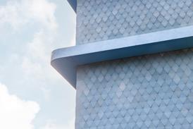
One of the building's more mysterious qualities is its constantly changing colour. The aluminium-panel cladding has a light gold finish that reflects the colour of the sky and at sunset the building turns a flaming red.
Inside the library, the spaces are as open as the architects could make them. Offices and storage rooms are pushed against the back wall and hung in galleried mezzanines. The thin windows, like arrow slits in a castle wall, have diffusers that give the interior a subtle glow without letting in any distracting brightness. Over the broader windows, sunshades open out like the leaves of a book.
From the start, Abalos & Herreros collaborated with American artist Peter Halley, who lined the interior with silk-screened texts taken from Argentinian writer Jorge Luis Borges' short story The Library of Babel. The architects had to fight to keep such an expensive feature but they felt it was crucial to the ambience.
The design of the building is so spare it reads like the sketch of an idea, and yet it evokes numerous building forms. Juan Herreros said: "It is reminiscent of Arabian towers and minarets, like the Giralda or the Golden Tower in Seville, glistening in the sunlight."
Credits
client Comunidad de Madrid architects Abalos & Herreros structural engineers José Manuel Sierra, Juan Gómez collaborating artist Peter Halley surveyor José Torras main contractor Dragados








No comments yet