Glenn Howells used advanced technology to convert a famous Birmingham landmark into flats ÔÇô and secure a piece of modern heritage in the process
Heritage has caught up with us. Not in the sense of new buildings in mock-classical style ÔÇô that vogue passed with Margaret Thatcher ÔÇô but in the sense that overtly modern buildings that could have been built today are increasingly protected by statutory listing.
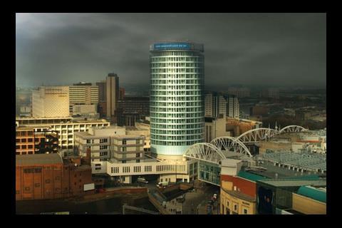
Take BirminghamÔÇÖs Rotunda. Although perhaps not as tricksy as a 21st-century skyscraper, this 21-storey drum is so bold, brash and Brummie that it dominates the city centre. It was completed as long ago as 1965 and was due for refurbishment, yet it is now grade II-listed, so had to be treated with kid gloves. On the other hand, this could be taken as a contemporary tower, so why not let contemporary technology rip on the building?
This was the dilemma facing Glenn Howells Architects, which was asked by Urban Splash, arguably the UKÔÇÖs most adventurous housing developer, to convert the tower from offices to residential.
The building forms part of HammersonÔÇÖs redevelopment of the Bullring, which it overlooks. The refurbishment, which included radical changes to the internal layouts and completely new cladding at a cost of ┬ú21m, is to be launched next week.
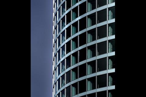
Certainly, Brummies will be relieved that their giant pillbox has not changed in size or shape. But has it lost some of its brashness and become more sophisticated? Before conversion, the cladding consisted of opaque bands of spandrel panels alternating with similarly sized bands of glazing. The new cladding, supplied by Schmidlin, makes the opaque bands narrower and the glazed area wider. The crude aluminium window mullions, which had grown dark with corrosion, have been replaced with bright anodised aluminium. They now divide the glazing into rectangles based on the golden section, as beloved by Mies van der Rohe, the supreme master of modernism.
The spandrel panels, which were mosaic, are now glazed, but with their rear surfaces are painted white to make them opaque and the front surfaces textured to distinguish them from the smooth window panels.
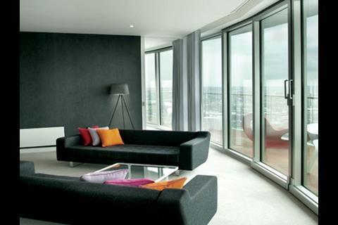
The expansion of the windows also has practical value. ÔÇťWhen I first visited the building, I said the window sills were too high,ÔÇŁ says Glenn Howells. ÔÇťWhen you were sitting down, you couldnÔÇÖt look out.ÔÇŁ The new glazing, in contrast, stretches from floor to ceiling and offers panoramic views of Birmingham.
When it came to the interior layouts, the architect again played fast and loose with the original design, with the help of advanced technology. A large chunk of the floorspace had been swallowed up by a cylindrical access and services core, and there were only two openings for access to the surrounding offices. As the the core now had to serve as many as 14 flats on each floor, you might think about wrapping a corridor around the core ÔÇô but this would have eaten into precious floor space. Instead, the architect cleared out three of the five lifts, one of the two escape stairs and the toilets, then broke through door openings in the coreÔÇÖs outer casing of structural reinforced concrete to create openings straight into the 14 flats.
ÔÇťOur structural engineer, Dewhurst Macfarlane, couldnÔÇÖt have done this without Kevlar carbon-fibre reinforcements to the structural concrete,ÔÇŁ says Howells.
As for the flats themselves, they have been neatly resolved to match the 72 glazed bays, or facets, that make up the circular external envelope. Studio flats are allocated four bays, one-bedroom flats six bays and two-bedroom flats eight bays. All the bays are paired so that the glazed door panel that occupies one entire bay can be opened and slid behind the fixed panel next to it. When shut, the frame of the door panel is concealed behind the 53mm-wide mullions, which means that all the panels appear uniform from the outside.
Inevitably, all the flats are wedge-shaped. Although this might look a bit ungainly at first sight, Davinder Bansal, HowellsÔÇÖ project architect, explains that the configuration works well. All the bathrooms, kitchens and corridors occupy the narrow inner end of the wedges, while all the living spaces open out to the perimeter glazing.
ÔÇťEnglish Heritage was concerned about the changed proportions of curtain wall,ÔÇŁ recalls Howells. ÔÇťBut I tracked down the original architect, Jim Roberts. He said it was his intention to have lower sills, but an all-glass curtain wall was too expensive at the time.ÔÇŁ
ÔÇťItÔÇÖs taken us 40 years to get back to the original concept, and itÔÇÖs given the building a second lease of life,ÔÇŁ adds Bansal. Or, to put it another way, modern heritage has been saved and enhanced by modern technology.
Project team
client and contractor Urban Splash
architect Glenn Howells
structural engineer Dewhurst Macfarlane & Partners
services engineer Buro Happold
Downloads
Before conversion
Other, Size 0 kbAfter conversion
Other, Size 0 kb










No comments yet