Caruso St John’s redevelopment of Tate Britain contains no dramatic interventions. Rather, it is a masterclass in creating modern, vibrant spaces within the context of a venerable institution
Thirteen years ago, the Tate Gallery revolutionised the British art scene by splitting its collection of international contemporary art away from its main works and moving it to the ingeniously redeveloped Bankside Power Station in then unfashionable Southwark. The move turned out to be a cultural and commercial masterstroke: with 5.3 million visitors last year, Tate Modern is now the most popular modern art gallery in the world and has spearheaded the astonishing regeneration of the formerly derelict Bankside district of the Thames.
Two miles upriver at the original gallery on Millbank, away from the glare of publicity fixed on the glamorous Tate Modern, things have progressed in a more sedate fashion. In 2001, the rebranded Tate Britain, now dedicated to housing the remaining bulk of the gallery’s British art collection from 1500, was treated to a new wing of Centenary galleries designed by John Miller + Partners.
While this successful development provided a new entrance and a suite of new and refurbished galleries, its quiet and understated character perhaps reflected that of a venerable, old institution resigned to the fact that its younger, hipper progeny was now destined to hog all the limelight.
But all that is set to change. This week, after a two-year programme of rolling closures, Caruso St John Architects’ redeveloped Tate Britain finally opens to the public. The £45m project largely leaves the historic classical exterior of the Tate intact, but the interior has been radically altered. The intervention can be split into three main areas, all of which stemmed from key technical requirements demanded by the brief.
Realising a bigger public role for the entrance building was a key aim of the project
Adam Caruso, Caruso St John Architects
The biggest intervention is the suite of 10 refurbished galleries that have been provided in the north wing. Before the renovation, these galleries were marked by a chronically poor environmental performance. They lacked humidity and temperature control and contained poorly functioning ceiling blinds that prevented daylight passing through the ornate Victorian wood and glass ceilings, which in turn led to high levels of inappropriate artificial lighting. Coupled with the fact that several of the roofs leaked, the gallery had found it increasingly difficult to present its own collection adequately, let alone convince other institutions to lend theirs.
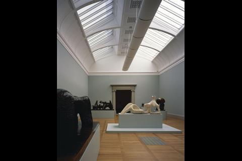
The new galleries have been transformed into spacious and fully environmentally controlled volumes flooded with natural light from above. The walls were stripped back to their original brickwork before being rebuilt to a standard that complies with modern environmental regulations.
Remarkably, by opening up the original rooflights, the galleries are now capable of being entirely naturally lit when required - a rare feature in modern art galleries. Caruso St John has also designed an eye-catching assortment of svelte, bulbous, chrome-trimmed light fixtures throughout the gallery for exhibitions that demand more controlled conditions.
The second major intervention is the provision of new educational spaces, which the Tate desperately lacked in its former incarnation. These have primarily been provided in a new suite of rooms in the lower ground floor. A dedicated school entrance has also been installed, thereby ending the former spectacle of flanks of schoolchildren crowding outside the main entrance before being herded to their classrooms deep within the building.
But the third and most architecturally significant intervention in the new gallery stems from Tate Britain’s desire to open up the upper levels around its double-height entrance rotunda and expand circulation through this key space. Caruso St John has responded to this challenge masterfully.
Designed by Sidney RJ Smith in 1897, the original building is a florid and ornate essay in heavy late Victorian classicism that also nods presciently to the exuberant neo-baroque of the Edwardian period that was soon to follow. Adam Caruso, partner in Caruso St John, contrasts this theatrical backdrop with the “cooler and more passive” neoclassical context of the practice’s celebrated Chiswick House Cafe of 2010.
It’s not about having the new directly clashing the old, it’s about establishing an ambiguity between the two
Adam caruso, Caruso St John Architects
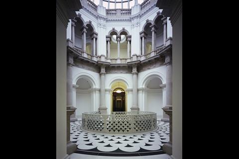
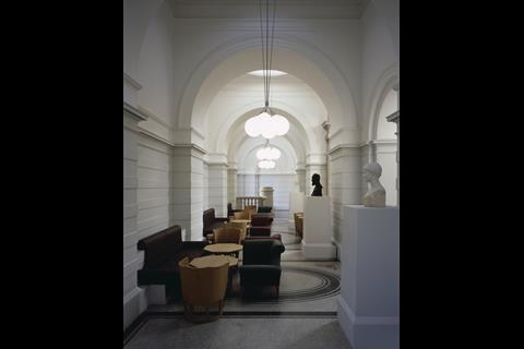
The building entrance follows a formal classical sequence of spaces and form: sweeping steps, monumental portico, single-height vestibule, double-height octagonal entrance hall. The latter space forms the heart of the public circulation in the gallery and is a richly decorated stone rotunda enclosed by swirling panoply of arches and columns, surmounted by a thick loggia and set underneath a magnificent glass dome.
Previously many of the arches had been filled with reception desks and the rotunda offered only meagre connections to the galleries around it, and none to the extensive basement areas below. Moreover, there was little in the way of a visual link from any of these entrance spaces to the river directly outside.
Adam Caruso identifies a key aim of the project as “realising a bigger public role for this entrance building and reassessing its potential to engage with the riverfront”. This ambition is immediately apparent upon entering the building, as new, glazed bronzed doors offer direct views out onto the Thames.
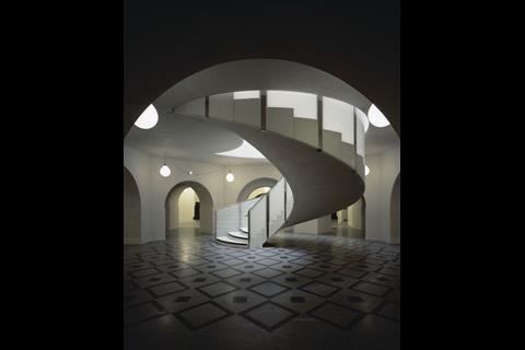
A circular staircase has also been installed to one side of the rotunda to match an original on the opposite side. This provides improved access to the new basement cafe and the members’ gallery that has been deftly inserted into the upper floor gallery around the rotunda - space that was previously inaccessible to the public.
Also, the desks have been removed from their niches and replaced with sculpture, a simple decision that dramatically enhances the sense of occasion felt when entering the gallery. The final move was to open up several of the walls around the rotunda to improve circulation and provide clearer access to the sequence of galleries that flows from it.
But the physical and symbolic centrepiece of the entire redevelopment is the new helical staircase that has been cut into the floor of the rotunda to provide clear access, for the first time, to the basement. The staircase has been intricately crafted out of polished concrete and terrazzo and a tracery pattern of cusped, interlocking, mosaic-like arches has been cut into its baluster. This monochrome motif is repeated on the flooring pattern and is cleverly combined with glass infills at its lower levels to comply with safety regulations.
Caruso reveals that the design is based on a pattern that the practice’s research discovered was probably originally incorporated into the rotunda floor. This contextual reference, as well as the new central stair itself, encapsulate perfectly Caruso St John’s design approach to the building. The practice’s architecture is not characterised by dramatic formal invention but rather is anchored in an intrinsically academic and exhaustively considered contextual approach; this then generates a hyper-controlled palette of responses to everything from materials to decoration. The result is a restrained but convincing rejuvenation of the gallery.
As Caruso says: “It’s not about having the new directly clashing against the old, it’s about establishing an ambiguity between the two. We never wanted to impose a vision for a new piece of architecture, what we were far more concerned about was investigating context and history and having the architecture come out of that.”
Project Team
Architect: Caruso St John
Construction manager: Lend Lease
Structural engineer: Alan Baxter & Assoc.
Services engineer: Max Fordham
Cost consultant: Turner & Townsend







No comments yet