The redevelopment of London’s Royal Albert Dock site has been a long time coming and fraught with difficulties. But digital and offsite techniques have unlocked the latest masterplan.
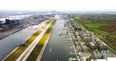
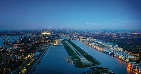
London masterplans rarely come more challenging than the regeneration plans for the Royal Albert Dock. Once one of the engine rooms of the largest docks in the world, chronic mid- to late 20th-century industrial decline led to their permanent closure to all commercial traffic in the 1980s. While the powerhouse development of nearby Canary Wharf surged ahead and adjacent London City airport opened in 1987 along the dock’s southern edge, the Royal Albert Dock itself was left derelict and abandoned, its majestic 1.3-mile stretch humbled by the rowing clubs and weekend regattas that sporadically used it.
By the 2000s, developer Development Securities and the London Development Agency had devised a masterplan for the site’s regeneration but financial difficulties and the proximity of the airport became millstones around the project’s neck. So much so that only one section of the masterplan was ever completed, a vast and solitary dockside office block known as ��ɫ����TV 1000. It was controversially purchased and refurbished by Newham council – one of the UK’s poorest – for £111m in 2010.
The digital BIM twin model developed for the project is crucial to this process; it enables you to introduce variety within fixed parameters
Peter Barbalov, Farrells
The dock’s future remained uncertain until 2013 when Chinese developer Advanced Business Park (ABP) purchased the site and announced an ambitious £1.7bn masterplan, which is now being realised. This will see its 35 waterfront acres transformed into 4.7 million ft² of commercial and residential space interspersed with new public squares and gardens. Farrells drew up the masterplan and has also been in the unusual and privileged position of designing all the buildings in the first phase. This comprises five office blocks providing around 700,000ft² of accommodation with ground-floor retail areas.
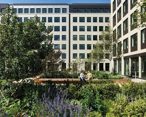
Phase one, which includes associated public realm, roads and infrastructure, has since been completed by Multiplex and provides an intriguing glimpse into what the future Royal Albert Dock development might be like. Five future phases will be planned over the next 10 years. But having got this far already after several false starts, it raises the question: why has the current masterplan development succeeded when previous attempts have failed?
There are several answers. Former London mayor Boris Johnson took it upon himself to champion the redevelopment of the Royal Albert Dock as a central part of his broader strategy to woo Asian businesses (and investment) to the capital. It is indisputable that this fulsome municipal support helped indemnify much of the long-term risk associated with the site.
Equally, shrewd financing by ABP has undoubtedly played a role, with the scheme being bankrolled by China’s five biggest banks. Even the Chinese government was convinced enough to take a £100m equity stake in the project in 2015, effectively kick-starting its financing process.
But there are also two familiar, long-established and construction-related reasons why this scheme has succeeded where others failed. It’s worth exploring them in assessing how difficult masterplans can be unlocked by innovative approaches: prefabrication and design.
Prefabrication
Unusually for a commercial masterplan, all phase one’s buildings were prefabricated and built using modular construction. This is in marked contrast to the previous proposals for the site and marks the relatively rare deployment of prefabricated, modular design and construction on a large commercial development.
For Farrells design partner Peter Barbalov, the choice of prefabrication was partially informed by the site’s tempestuous development history and presented obvious advantages.
“For a variety of reasons the former owners and design team couldn’t make the old masterplan work. So because of this we were always especially committed to finding a solution that offered build speed and certainty. Prefabrication offered this right from the start.”
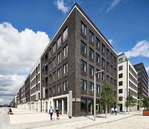
Accordingly, all phase one’s five commercial buildings have been built using the same modular prefabricated construction system and were all delivered to BIM Level 2. The principal in-situ elements on the buildings are the twin wall slip-form concrete cores and the post-tensioned in-situ concrete floor slabs. Most of the remaining building elements were constructed offsite. Chief among these were the facades, which comprise concrete panels with brick slips fixed to the outer face.
The panels are tied back to the concrete frame and measure 9m x 4m, approximately the structural height of a floor and the width of an elevational bay. As the one range of buildings faces directly onto the dock and is straight opposite the airport, tower cranes were not permitted on this part of the site due to adjacent flight paths. This meant the panels arrived by barge and were hoisted into place using a rigger and pulley system.
The prefabricated facade construction system enabled up to 10 panels to be installed per day, which in turn allowed full phase one construction
to achieve a 98-week delivery programme. For Barbalov, this is one of the system’s obvious benefits, but he insists these are achievable only through a wider digitalisation programme.
“There are the standard familiar advantages to prefabrication, namely speed, volume and the ability to have a greater control of quality before the components reach the site. But these have always been the benefits of prefabrication; what’s changed is that we now have the tools to test and experiment with the design from the earliest possible stage.
“The digital BIM twin model developed for the project is crucial to this process; it enables you to introduce variety within fixed parameters and ensure that flexibility can be managed and delivered within a cost-efficient environment.
“This is also important for refuting the traditional accusation that all prefabricated buildings look like prefabricated buildings.
The BIM model easily allows us to evaluate and specify all manner of elevational finishes. Prefabrication hasn’t changed, but digitisation has unlocked its potential.”
Design
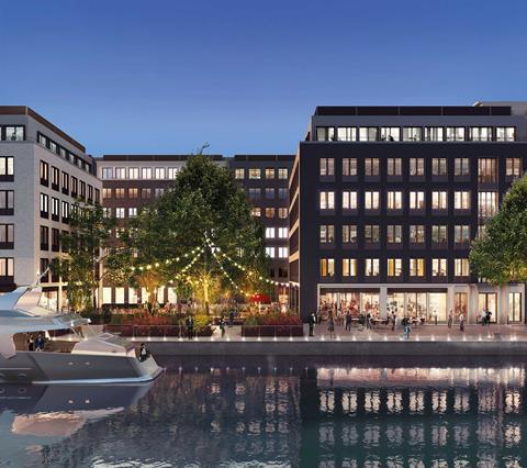
As Barbalov suggests, these new digitalisation techniques also present design opportunities and these have been reflected architecturally by the use of different elevational finishes on the building. Brick is the primary material used to evoke the character of the traditional London dockside warehouses that once stood on the site. The brickwork comes in several colours and finishes, carefully alternating from cream glazed ceramic to a dark buff to subdivide the massing of the blocks.
The blocks themselves are arranged in an angular grid and are separated by a series of new streets parallel to the docks. At various points the block formation is broken by public spaces or gardens inserted into the masterplan.
The overall design concept for the buildings seeks to “develop a new dockside typology” inspired by the historic warehouses associated with the area but adapted for commercial office use. The design also tries to do something else: to attempt to harness the architectural and elevational language of the London residential terrace and apply this to a commercial typology.
Accordingly, commercial blocks along the dock are expressed as long terraced ranges broken down into individual vertical facades in the manner of a Georgian street, a concept expressed through the alternating black and white brickwork. Each individual facade refers to a townhouse office block behind it, separated from its neighbouring office by a party wall and with its own individual entrance, just like a residential townhouse would have. To further emphasise the residential theme, stacks of Juliet balconies are lined above the entrances.
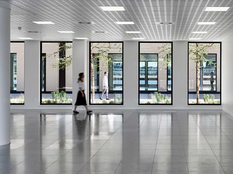
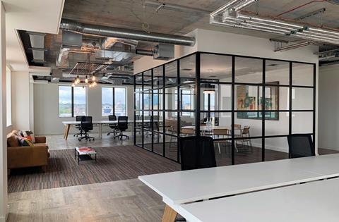
To achieve tenant flexibility internally, party walls can be removed as per tenant requirements. In theory, the full length of the dockside block could be hired by a single occupant if needed. Equally, flexibility in the type of internal office environment is achieved by tenants being given a choice of fit-out themes. These range from spartan shell and core to industrial exposed services and concrete, to a more manicured corporate aesthetic. The client is able to choose whichever layout they like within a format that Barbalov describes as a “modularised terrace for a transformable and adaptable new office typology”.
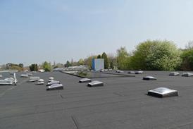
The biggest constraint to the masterplan design is, of course, the airport that lies just opposite. Architecturally, this has imposed strict height limitations on the buildings, which get successively higher the further away the terraced blocks are from the docks and runway. It also meant green roofs were not possible on the site as the airport regulations insist that the gathering of birds is explicitly discouraged. But the location presented opportunities too. Ground-floor units are kept as open plan as possible and designed with adjacent glazing on either side so that the view of planes landing or taking off on the adjacent runway is maintained even deep into the site.
By adapting traditional residential typology to a commercial setting, Royal Albert Dock has potentially established a pioneering office model that combines London’s past and future. But its real technological legacy comes in its harmonisation of digitalisation techniques and established prefabrication systems. This has delivered the construction certainty and efficiency that has allowed a difficult masterplan site to finally be successfully developed.
Project team
- Architect: Farrells
- Client: Advanced Business Park (ABP)
- Development partner: Stanhope
- Main contractor: Citi Construction UK
- Main contractor (phase one): Multiplex
- Structural engineer: AKT II
- Services engineer: Hilson Moran
- Cost consultant: WT Partnership
- Landscape architect: Gillespies
- Project manager: WT Partnership







No comments yet