Conran and Partners has converted Richard Seifert’s landmark Centre Point into luxury flats, completing the transformation of the central London tower from rejected pariah to paragon of sixties chic
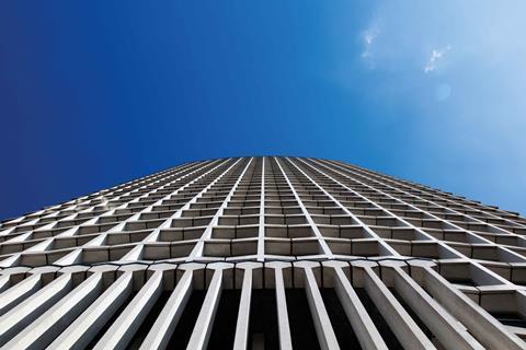
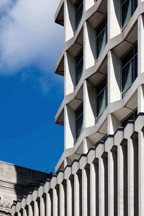
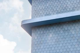
Like all truly iconic buildings, Centre Point, which stands at the cross-section of Tottenham Court Road and Oxford Street in central London, earns the accolade not solely because of what it looks like but because of what it represents. Completed in 1966 by buccaneering heritage antagonist Richard Seifert and famously described by artist Eduardo Paolozzi as London’s “first pop art building”, the jazzy angles and geometric playfulness of its distinctive honeycomb facades give it an air that is as much mannerist as it is brutalist-lite.
But what it represents is even more powerful. Culturally its height and articulation epitomise the carefree irreverence of 1960s Swinging London. But it became “carefree” in another sense, as it was kept empty because its developer, Harry Hyams, was determined to let the building only as a whole – turning down all offers to rent separate floors. Its resulting vacant state degraded it in many people’s eyes to a symbol of commercial greed. Indeed, it once maintained so pernicious a hold on the public consciousness that it is still widely (and incorrectly) assumed that Britain’s leading youth homeless charity was named after it.
Today all this has largely changed. Grade II listed in 1995, its slow transformation from pariah to paragon has been completed with its radical conversion from offices to flats. For the past seven years Centre Point has been at the centre of a massive neighbourhood transformation. Rick Mather Architects has been responsible for designing the refurbishment of its lower-rise buildings and exorcising the abysmal public realm that formerly existed around it. This process will reach a touchstone conclusion at the end of this year when the new Tottenham Court Road Crossrail station opens at its base.
Meanwhile Conran and Partners has designed the conversion of the 32 storeys of the tower itself, turning offices into flats. Eighty-two units have been created, with prices for one-beds starting at just under £2m and peaking at almost £60m for duplex penthouses. While there is no affordable housing in the tower itself, this has been provided in the lower-rise annexe building whose redevelopment is being designed by Rick Mather.
Tower residents have started moving in already, even though the project will not be fully complete until early summer. Such has been the clamour in fact that half its units have already been sold. It is a measure of how far London, the tower itself and society at large have changed that a building that once provoked public outrage for being empty for a decade should now spark public excitement for being filled with luxury flats.
How do you even begin converting a building as high-profile and architecturally, culturally and socially significant as Centre Point? For Conran and Partners chief executive and senior partner Tim Bowder-Ridger, the answer is simple: “Our role as architects on a project such as this is to enhance the existing spirit of the building by addressing its problematic elements and putting in place new uses and design features that will enable the building to thrive.”
What Bowder-Ridger diplomatically refers to as “problematic elements” become evident at the new entrance. Incredibly, Centre Point was built with no ground floor, its base instead being allocated to a car park and a mercifully unrealised gyratory in the inexplicably inhospitable 1960s Seifertian tradition. Two identical external staircases on either side of the building enabled bewildered visitors to reach a mezzanine floor that formed the entrance to the tower proper.
Inserting a ground floor
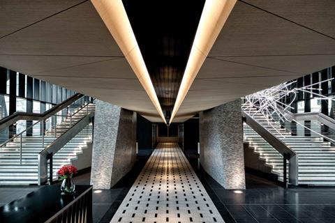
In the only external alteration to the tower, this car park space has been enclosed by a curtain wall to form an entrance lobby and the two external staircases have been symmetrically relocated inside. One forms a grand stair entrance to the retained mezzanine level above and the other, now unnecessary for escape purposes, is deftly repackaged as a tiered stage for a hanging neon art installation.
This dramatically reconfigured lobby space is the undoubted highlight of the interior, and Bowder-Ridger summarises Conran’s efforts here as “a tall building meeting the ground in a human way”. With its axial severity, dark tones, ceramic surfaces and monochromatic rigour, it offers a moodier and more sultry version of the heavily stylised sculptural energy of the facade.
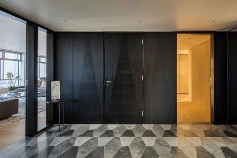
This process is of course greatly helped by Seifert’s original features: his magnificent scissor columns, for instance, so distinctive a feature on the tower’s exterior base, are here intricately reclad in tiny mosaic-like grey ceramic tiles. But the new architecture skilfully judges the feel and character of the old and repackages it in a manner that remains stylishly sympathetic.
There is of course a common word for all this: retro. It’s a term that can often have simplistic and superficial connotations, but it does convey the particular manner in which the new internal design sought to relate to the old, as Bowder-Ridger explains: “While this building was once considered dated, in a way fashion has caught up with it, and the sixties chic it perpetuates is now a prized asset. So two of its key features we’ve used as inspiration for new elements are the graphic drama and monochromatic contrast evident on the building’s facades and interiors.”
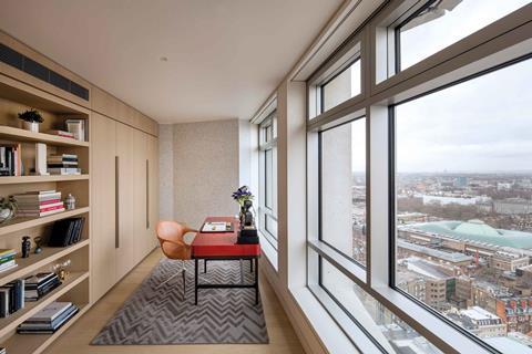
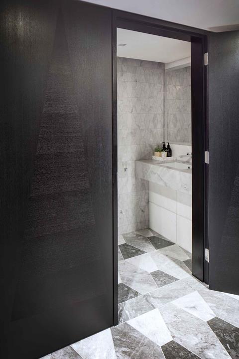
Carefully and rigorously, these twin elements are subtly on show throughout the building and they form a powerful visual anchor that gels new and old together. In the new lobby they are evident in the geometric precision of the terrazzo marble floor and even the angular manifestation of a feature window. And in the flats they are present again in intricate tiling patterns, angular ironmongery and in the subtle modulation of darker and lighter tones.
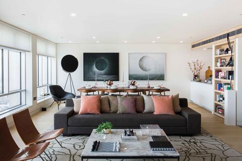
With their plush wooden panelling, brass fixtures and marble sanitaryware, the flats themselves are efficient and largely unsurprising exercises in the kind of standardised London luxury living now found from Bloomsbury to Belgravia. They become interesting when this unstoppable corporate object meets the immovable reality of the building fabric itself.
First, all the tower’s famously single-glazed windows have been replaced with thick acoustic double glazing. Also, in order to preserve the rhythmic harmony of the exterior, subdividing windows with partitions or bulkheads was forbidden. As a single 2.5m window bay would have been too small for a habitable room, each such room is treated to at least two windows, leading to the creation of some extraordinarily spacious bedrooms and living spaces.
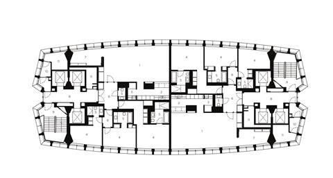
There are other instances where the original building’s constraints aided the new design. The most significant example is the building plan itself. At only 30m x 16m wide with two retained cores at either end, its shallow footprint works far better for residential than it ever did for offices, with no core serving more than two flats per floor. In fact, one imagines that were Seifert not so determinedly indisposed to city centre residential development and amenable public realm, he might have come up with this scheme himself.
And this, as with so much of the refurbishment, is the point. Much of the retrofitted building, particularly the lobby, looks as if it has always been there and Bowder-Ridger proudly attests to being “comfortable with this still being considered a Seifert building”. In their placement, scale and articulation, most of Seifert’s architecture displayed a level of autonomous arrogance that is almost spellbinding in its conviction. But by adopting the kind of empathy and humility Seifert himself would in all probability have abhorred, this well-judged scheme brings his most famous work back to life.
Project Team
Architect (tower): Conran and Partners
Architect (low-rise building): Rick Mather Architects
Client: Almacantar
Main contractor: Multiplex
Structural engineer: Pell Frischmann
Mechanical engineer: Grontmij
Cost consultant: WT Partnership








No comments yet