The redevelopment of the iconic Television Centre in west London by AHMM has created a mixed-use scheme of offices, broadcast studios and flats – as well as opening up the structure to the public. But there are too many stairs for certain cyborgs. Ike Ijeh tunes in. Photography by Tim Soar and Mike O’Dwyer
Much has been written in recent years about the gradual rebalancing of London’s cultural and economic nexus from west to east. Historically, as with most western cities, prevailing westerly winds concentrated London’s pollution to the east, making this the natural location for concentrated industrial activity – and all its attendant poverty and grime – while the wealth headed west.
But in the past three decades all that changed and the gargantuan regeneration projects that have taken place in Docklands, Greenwich and most recently Stratford and the Olympic Park have ensured that London’s civic pendulum has inevitably swung eastwards.
However, a city as old and tribal as London rarely conforms to neat, static classification and if there is any part of west London that is putting up a fight against the resurgent east it is White City. The west London suburb is itself currently in the throes of a massive £8bn, 15-year regeneration scheme that will create 2,500 homes and 2 million ft² of office space and already includes the expansion this year of Westfield London, which was once the largest urban shopping centre in Europe.
But despite the success of Westfield, arguably the jewel in White City’s crown is the Television Centre on Wood Lane, historic home of the BBC and now being converted by Stanhope into a massive mixed-use development. Some 950 homes are planned on the 14-acre site as well as offices, a new Soho House hotel and spa, shops, restaurants, cafes, cinemas, landscaped gardens and new public routes.
Additionally, three of the historic BBC studios have been retained and refurbished and leased back to both the BBC and – oddly – ITV for the filming of daytime favourites such as Loose Women and Lorraine. Once ITV’s London Studios on the South Bank closes for redevelopment later this year, Television Centre will also be home to the morning ITV staples of This Morning and Good Morning Britain. In a city awash with mixed-use developments, sometimes with questionable levels of genuine functional diversity, this is a committed mixed-use scheme in the truest sense of the word.
BBC History
The site has been separated into several plots on which a number of prolific architects are working. These include dRMM, Maccreanor Lavington, Mikhail Riches and Duggan Morris. But without question the showpiece building on the site is the iconic BBC Television Centre itself, its instantly recognisable doughnut-shaped silhouette beamed into millions of living rooms at the start of news bulletins or chat shows for the past 60 years. This is being converted into 432 homes by AHMM. Phase one fully completes later this year, but the first new residents started moving in last month.
Television Centre was designed in the late 1940s by BBC house architect Graham Dawbarn. Like contemporary rival Stratford, its White City site was also home to an Olympic Games (1908) as well as the dilapidated remains of the once gleaming white pavilions of the huge Franco-British Exhibition of the same year. Construction of the studios started in 1951 and the building opened in 1960. At the time of its creation it was the largest purpose-built television studios in the world, and both Dawbarn and the BBC proudly billed it as a “factory for television”.
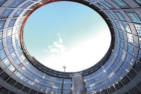
Its distinctive shape was crucial to this “factory” concept. In actuality it is more a question mark than a doughnut, with the block that curves around the central courtyard extending beyond it to the street. While a question mark may seem an appropriate symbol for a new medium that in its fledgling 1940s years held a host of possibilities, it actually had a very practical purpose.
The inner spool of the question mark was lined with offices, which faced on to the circular courtyard and street. These then fed into studios, which were radially arrayed on to the outer edge of the spool and were served by a service road that wrapped around the full outer curvature of the building.
For over half a century after its completion, Television Centre played host to the production of hundreds of popular household favourites ranging from Doctor Who and Blue Peter to Fawlty Towers and Only Fools and Horses. But in 2013 a cost-cutting drive and the regional north-south equivalent of the east-west recalibration that has taken place in London compelled the BBC to decamp to new premises in Salford, freeing White City for the redevelopment we see today.
BBC ��ɫ����TV
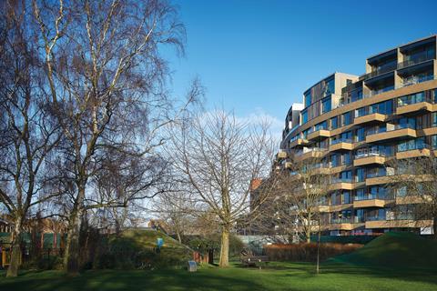
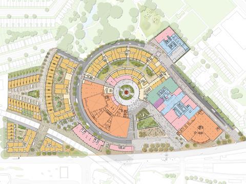
In construction terms, AHMM’s redevelopment masterplan involves four primary physical interventions. The first is removing the outer ring of studios that straddle the question mark. The second is to then extend the remaining curved office structure outwards to create a new, wider floorplate capable of accommodating flats.
The third is to construct an outer crescent of flats that is separated from the widened question mark block by a curving ribbon of new landscaped residential gardens. And the fourth is to replace the lower “tail” of the question mark with a 25,000m² nine-storey office building that contains retail units and a cinema on the ground floor and the new Soho Hotel and spa on its upper floors (see diagram below).
But despite the wealth of iconic television material the BBC’s heritage offers, AHMM principal and co-founder Paul Monaghan was determined not to necessarily use it as a source of design inspiration for the new scheme.
“We didn’t really want to go down the road of paying homage to daleks, tardises and the like. We were far more interested in reinterpreting the materials and colours of the existing architecture. So we’ve used brickwork on the office and crescent buildings to mirror the original building. We’ve opened up new public routes through the ground-floor spaces where previously none existed and there’s a new public route right through the base of the office building.
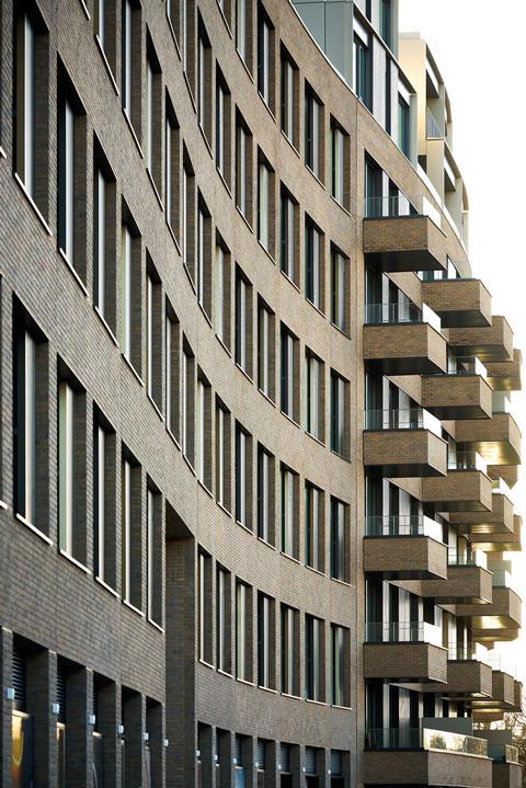
“And we’ve created a genuine mixed-use scheme with a wide range of typologies for the public, residents and workers to enjoy. This includes restoring the TV studios, which are the core of what the site has represented historically. It’s very much a scheme that respects the past and celebrates British design of the past and present.”
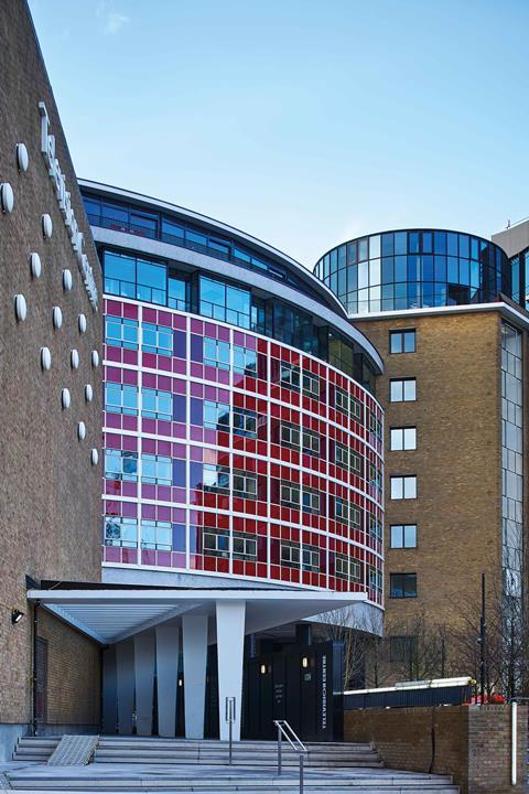
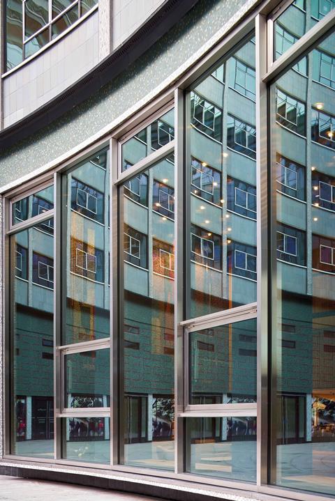
The British design Monaghan refers to becomes immediately evident when approaching the forecourt that straddles the outer area where the “tail” and the loop of the question mark converge. A building that looked functional and somewhat anodyne when captured on television in endless aerial shots is actually a grade II-listed structure that appears significantly more textured and dynamic on closer inspection. The colonnade in particular that separates the forecourt from the courtyard conveys masterful detailing and proportions and an impressive array of mosaic finishes, which soften what could otherwise have appeared an overtly utilitarian building.
Also, the distinctive red glass fascia of the curved block is again picked up through the original mosaics’ colour scheme. Its red tones are visible throughout the new buildings, most noticeably on the striped “baguette” infill panels that form part of the office block windows.
The inner courtyard itself is the focal point of the redevelopment; its famous gold-leaf Helios statue now hoisted high above a new obelisk that springs from a new saucer fountain. Cleverly, this also forms the entrance to the gym that has been created below. Once inaccessible to the public, this courtyard now forms a calm civic rotunda that, as well as containing the residential entrances, crucially offers a new public through route out to the wider White City area, securely embedding the development within its context.
But, with the grade II listing ensuring that the exteriors are more defined by restoration than alteration, it is inside where the most engaging differences lie. There are essentially two categories of new accommodation created here: converted flats in the existing building, and new ones in the crescent building. Inevitably, perhaps, it is the former which are far more interesting.
BBC Lifestyle
The internal plan of the existing block is relatively simple, curving communal corridors flanked by largely single-aspect flats with recessed balconies. But Monaghan and his colleagues speak of the “headaches” involved in threading new flats through the old structure, and the challenges of extending the structure by approximately 3m on its outer rim in order to accommodate the wider residential floorplate.
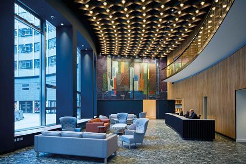
But the result makes for endearingly idiosyncratic and charismatic flats with columns and bulkheads sometimes protruding unexpectedly but in ways that add a spontaneous sense of intimacy and enclosure to new living spaces rather than rendering them awkward and unusable. The relatively lofty floor-to-ceiling heights of the lower floors also help, as do the polished concrete floors and mosaic-effect worktops, which add an appropriately retro feel.
Less successful perhaps are the bedrooms that face on to the lower sections of the courtyard and which only benefit from two narrow slits of horizontal windows – imposed by the listed exterior. No amount of stylised lifestyle marketing makes up for the feeling of cellular claustrophobia these inevitably create.
Equally, while the flats in the new building also benefit from generous glazing and spacious rooms, the relatively narrow exterior crescent on to which they face also veers towards the oppressive and over-scaled – nine storeys of repetitive, sheer facades evoking a production-line ethic which, while fine for TV studios, perhaps sits a little less comfortably within a residential format.
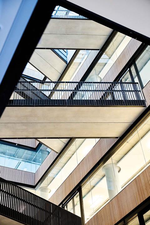
Which makes the task of the office block – essentially a new-build bookend stuck on to the courtyard block – an easier challenge. With its stacked facade of rectangular windows, one wouldn’t exactly call the exterior thrilling. But inside the lobby is an extraordinary full-height vortex of bridges flying overhead in all directions, like the webbed strands of a giant masonry cobweb. The shuttered and exposed concrete surfaces also reveal AHMM’s perennial preoccupation with concrete in an office context, here revealing the honed and statuesque finishes also memorably evident at its Angel ��ɫ����TV and White Collar Factory.
Phase one of the Television Centre bodes well for the overall completed scheme, and there is now a palpable sense of excitement and anticipation at what this rejuvenated corner of west London is set to deliver. On a bigger scale, the scheme is conceived with the kind of ambition and determination west London will need if it is indeed to see off its easterly rivals.
But with regard to the invaluable heritage and legacy of Television Centre itself, the skill and ingenuity with which new and old are woven together in terms of both uses and fabric is a fitting tribute to the longevity of this significant cultural site.
Project Team
Client: Mitsui Fudosan / Aimco / Stanhope / BBC Studioworks
Architect (phase one): AHMM
Main contractor: Mace
Structural / mechanical engineer: Arup
Cost consultant: Deloitte
Landscape architect: Gillespies












No comments yet