How do you design an extension that can live up to the heritage of the coronation place of kings and queens for the last thousand years, and whose previous architects include Christopher Wren? Ike Ijeh looks at how Ptolemy Dean’s Weston Tower fits into Westminster Abbey
In recent years, the Palace of Westminster has hogged the limelight when it comes to the refurbishment of landmark historic buildings around Parliament Square. But an even older and more sacred institution right next door has also been undergoing a major 21st-century upgrade.
Westminster Abbey is one of the world’s most famous religious buildings and is a venerated spiritual seat for more than 85 million Anglicans around the globe. But while the abbey may be well over a thousand years old, it has just received its first new architectural addition in 273 years.
The Weston Tower has been designed by the practice of Ptolemy Dean, the current incumbent of the ancient role of surveyor to the fabric of the abbey. The tower, which is named after a major donor, contains a staircase and a lift, providing external access to the new Queen’s Diamond Jubilee Galleries. This is a new exhibition space in the abbey, designed by McInnes Usher McKnight Architects (MUMA).
The exhibition space is located 16m above the nave floor in the abbey’s medieval triforium, a wondrous, previously hidden void above the vaulted arches of the abbey’s aisles and below its clerestory windows. The combined project cost £22.9m to build, which was met entirely by private donors and trusts.
The project is historically significant for a host of reasons, not least the fact that Dean’s new tower is the first external addition to the abbey since the completion of Nicholas Hawksmoor’s west towers in 1745. Westminster Abbey is a grade I-listed building and part of a Unesco World Heritage Site. It is also one of Europe’s finest examples of gothic religious architecture and presents an incomparable fusion of the French gothic and English decorated gothic styles.
Conservation of architectural heritage normally involves restoration or addition but it rarely involves alteration of the original historic fabric. Equally, it is not every day you see a major addition to a piece of architecture that is woven into the very fabric of a culture – imagine, for instance, a new dome on the Taj Mahal.
Historic significance
But Dean declares that in order to complete the project, it was essential that he wasn’t daunted by the awesome historic significance of his task. “You can’t think in those terms; you just have to block it out of your mind. As with any project, it’s simply a case of looking at the brief, coming up with an idea and just sitting down and drawing something.”
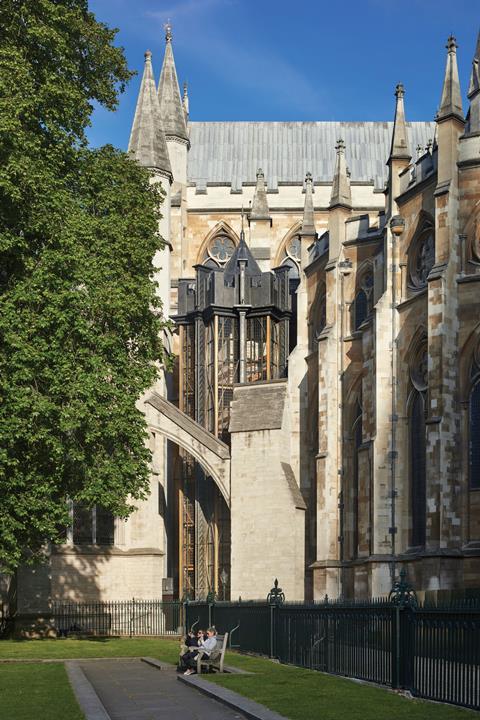
What Dean drew has now evolved into an elegant lantern-like tower located in the south-east corner of the abbey known as Poets’ Yard. It was the former site of a small 1950s annexe that had served as the abbey’s public toilets.
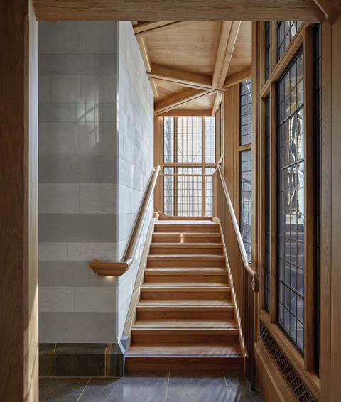
An external tower was unavoidable because it would have been impossible for the members of the public to access the triforium in large numbers using the steep, narrow and twisting internal staircase embedded in the abbey wall and dating from the 1250s.
So, instead, the new internally accessed external tower is tucked between the abbey’s south transept and the Henry VII Chapel, partially obscured from view by one of the flying buttresses that extend from the Chapter House. This ensures the tower has as minimal an impact on the abbey exterior as possible.
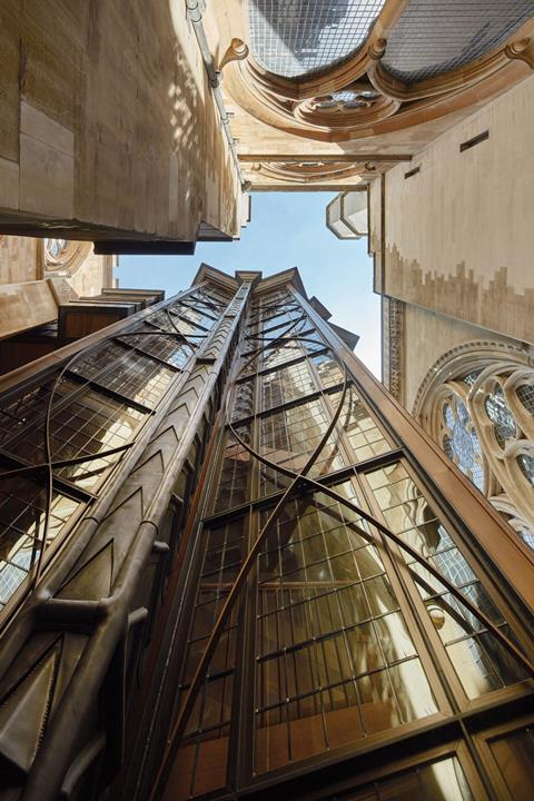
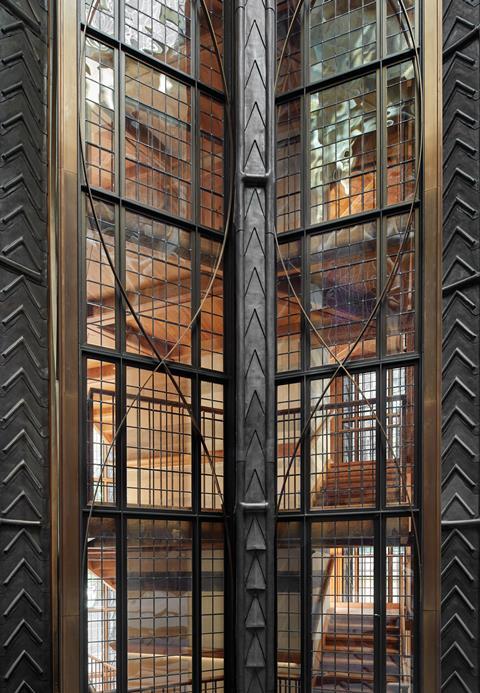
But while dwarfed in scale by the rest of the abbey, the tower is still 27m high – roughly the height of an eight-storey building. The glass and steel structure has vertical strips of mullioned windows separated by slender, decoratively patterned lead piers. These were inspired by the famous octagonal lantern at Ely Cathedral, whose tower was built shortly after much of the present abbey was constructed.
The tower’s plan is formed of two squares rotated against each other to form a star shape, a common medieval motif found throughout Westminster in both parliament and the abbey. But while the tower is heavily laden with gothic references, its structure speaks of modernity too. Inside an oak staircase (with the shallowest, 150mm tread the building regulations allow) wraps around a concrete lift core. The core is crowned externally by a short steel steeple from which its glass and steel exterior skin hangs.
Unique and eccentric
The tower makes for a unique and endearingly eccentric addition to the abbey, a graceful lantern whose lightweight construction and structural dexterity manages to say something to both the modern and medieval worlds it is forced to inhabit. Cladding the core in layered bands of the various stones used in the construction of Westminster Abbey over the past millennium is one light-hearted way in which the design bridges the gap between old and new.
But the amount of glass used does this far more intuitively. Dean explains that it would have been impossible to encase the tower in stone as the amount of load-bearing structure required for its base would have been too great to have been accommodated in the tower’s tight location.
The result is a lighter, leaner structure, which prioritises the glass and light revered by architects in both the 13th and the 21st centuries. Its glazed verticality also recalls the French gothic precedents that so inspired Westminster Abbey’s medieval phase, and the tower calls to mind the sumptuous cage of light of Paris’ Sainte-Chapelle being pressed and steamrolled into a sturdy English tube.
Inevitably, the tower’s geometric precision and gothic styling boldly and happily reflect the abbey it appends. But nods to modernity ensure the tower skirts well clear of pastiche while remaining true to the medieval ecclesiastical spirit of its host. At such a sensitive and high-profile location this is no mean feat.
‘The best view in Europe’
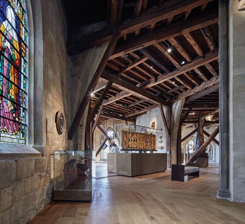
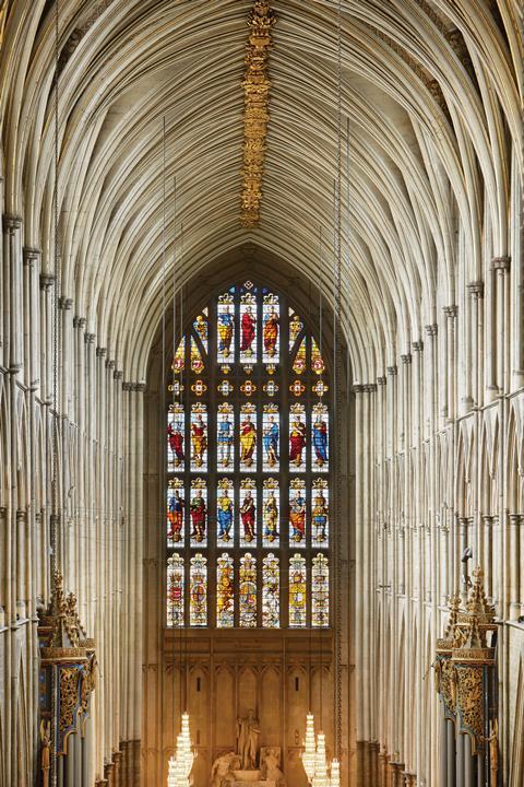
Inside, a walk up the staircase reveals ever more spectacular views over Westminster, alongside a parade of voyeuristic, close-up glimpses of the surrounding arches, buttresses and gargoyles we have to crane upwards to see from street level. At the tower’s summit, a short bridge leads into the new triforium galleries, where a spellbinding sequence of clustered, arched attic spaces is unfurled. The undoubted highlight is the spectacular elevated view down the full extent of the nave available from the centre of the triforium, a prospect poet John Betjeman gushingly described as “the best view in Europe”.
Initially designed for upper chapels that were never built, Christopher Wren first refurbished these spaces in the 17th century, adding timber beams and cross bracing, as well as a new mono-pitch timber roof. Over the centuries, the abbey has used the triforium for storage and additional seating for coronations and royal funerals; consequently its arches were left unguarded and open to the nave.
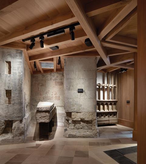
Dean has added an ornamental balustrade to the nave arches and unified the floor level where necessary, with the addition of new oak boards. But MUMA is responsible for the design of the permanent gallery exhibition that occupies this space. At present it contains 300 artefacts ranging from replica crown jewels to Edward III’s impressive but ludicrously impractical 8ft sword.
While MUMA is perhaps best known for the Stirling prize-nominated Whitworth Art Gallery in Manchester, it has also completed the V&A’s Medieval and Renaissance Galleries – a commission that probably helped lead it to winning this one. And wisely in so surreally enigmatic a set of spaces as the triforium, MUMA co-founder Stuart McKnight explains, the practice was happy to let the abbey take centre stage.
“Without question, the most important exhibit is the abbey itself. We wanted to work with the nature of the space to keep this incredible, otherworldly sense the triforium has intact. So we’ve been very careful to expose the fabric of the building as much as possible and we’ve worked hard to ensure that the light-sensitivity requirements of many of the artefacts doesn’t interfere with the special quality of light the spaces have at various times of the day,” he says.
“This is perhaps the advantage that architects who design exhibitions might have over exhibition designers. Exhibition designers tend to see the surroundings as part of the interpretative process for the exhibits. But we’re much more interested in responding to the nature of the space.”
It is the nature of both space and setting that the tower and gallery respond to so effectively. “Gothic is all about geometry,” explains Dean. “The tower’s location is axially determined by the plan of the abbey and its surface and setting-out is based on the tradition of pattern-making that the gothic age was all about.”
The whole, not the parts
These are observations that perhaps sit uneasily with the current fashion of ensuring that new additions to old buildings are just that – new elements with a clear demarcation between what has been added and what was there originally. But this is an obsession that Dean passionately dismisses as “nonsense”. He uses the abbey itself to support his case.
“Look at the difference between the nave arches between the choir and the nave. In fact, there is virtually no difference between them but they were built 150 years apart. It’s so important to remember that the compositional value of the whole is of greater importance than being overtly assertive about individual moments in architecture.
“In other words, this current obsession with articulating the new when dealing with historic buildings is just an excuse for architects to add rude and brutal extensions without any due consideration for the nature and character of the original building. In St Paul’s Cathedral, Wren designed one of the greatest domes in the world but when he was commissioned to renovate Westminster Abbey he proposed a gothic tower three centuries out of date.
“In the big scheme of things nobody will care about whether something was added in 2018 or 1718 – what matters is what it contributes to the whole. And it is places like Westminster Abbey that show us exactly how to do it.”
Dean’s position here clearly swims against the prevailing currents when it comes to the relationship between heritage, conservation and contemporary architecture. But in this instance his argument is irresistible. The extraordinary breadth of history offered by Westminster Abbey proves that even the most celebrated architectural interventions of their day are ultimately judged by time rather than trend. And if this is the case, then Westminster Abbey’s impressive Weston Tower and galleries may well become indivisible from their venerable host. In heritage terms, that is the biggest compliment you can have.
Project team
Client: Westminster Abbey
Architect: Ptolemy Dean Architects
Exhibition design: MUMA (McInnes Usher McKnight Architects)
Main contractor: Daedalus Conservation
Structural engineer: Price & Myers










No comments yet