Pollard Thomas Edwards has made a north London square whole by filling in its missing fourth side with a residential scheme that sensitively reinterprets its traditional context
For the past 400 years, the London square has been one the city’s most potent civic symbols. London’s most famous squares have become iconic public spaces, but the remainder still retain the qualities of cultivated, private domesticity on which they were founded.
The four terraced frontages, central gardens and sprawling trees that are the key components of these squares are some of the most familiar aspects of London’s urban streetscape - which is why Islington’s Arundel Square, built with only three sides, has always been something of a curiosity.
Until recently, that is. Pollard Thomas Edwards Architects’ eponymous new residential scheme has filled the void and belatedly given the square its fourth side.
An ambitious piece of urban improvement, the development’s remedial objectives are undeniably impressive. But two further aspects make Arundel Square particularly noteworthy. First, the enormous engineering challenges involved in overcoming the reason it was never built as a four-sided square. And second, the architect’s response to the perennial problem of reconciling modern architecture and a historic context.
An unlucky start
Arundel Square was developed in the mid-19th century and its substantial five-storey terraces bear all the architectural hallmarks of its period. Stucco ground floor facades, brick upper storeys, ornamental railings, rendered dressings, projecting cornices and rusticated quoins are common Victorian details present on squares across London.
What was unique to Arundel Square was what occupied its fourth side: not a terrace but a railway. Arundel’s Square’s misfortune was to have its construction coincide with that of the North London Railway. The Victorians’ voracious appetite for railway expansion often overwhelmed the aesthetic requirements of residential development, so for decades the square was forced to contend with a deep railway embankment along its southern edge.
As such, despite its dignified architectural character, Arundel Square never evolved into the kind of exclusive residential address found in similar squares in neighbouring Barnsbury and Highbury. Over time, most of the houses were sub-divided into flats, several frontages fell into disrepair and the central garden grew worn and neglected. To cap it all, the noise from passing trains afflicted every property on the square.
During the 20th century the narrow strip of land to the southern side of the embankment was occupied by a depot and builders yard, which did further damage to the visual unity of the square.
In a rare example of architect-led development, Bill Thomas, joint founder of Pollard Thomas Edwards, purchased this strip of land with the intention of developing it into mews housing. However, he would still have had to contend with the problem of the adjacent railway and the limited commercial return provided by the small residential plots available. By the end of the nineties, something altogether more radical was being considered.
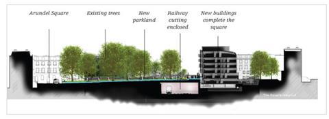
The proposal was to deck over the embankment and conceal the railway in a new underground tunnel. The additional expanse of space this would release would then be occupied by an expanded central garden and a residential block of flats. This would completely occupy the southern side of the square and complete its architectural composition for the first time in its history. This ostensibly simple proposal is what has now been realised by the new development - although it was more complex than it sounds.
Job architect Judith Marshall sums up the process as “labyrinthine”. First, as with practically every major development project in London, the site is beset by complex ownership hierarchies. Islington council owns the gardens, Network Rail owns the railway tracks and Family Mosaic (which purchased the square’s southern strip of land from Bill Thomas) owns the new deck.
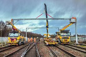
Network Rail demanded that the line remain fully open throughout construction, imposing structural and logistical constraints on the programme and process. Remarkably, throughout construction, the line only closed for three 24-hour periods.
The second source of problems was the several changes of level that take place across the square.
But by far the biggest challenge was engineering. Marshall explains that “the concrete deck structure had to be entirely independent from that of the new building above to minimise transmission of sound or vibration to the block of flats”. Anti-vibration measures were also integrated into the basement superstructure of the new building. Furthermore, care had to be taken to ensure that new landscaping features in the enlarged gardens above the new tunnel did not impose disproportionate loads on the deck.
How does it look?
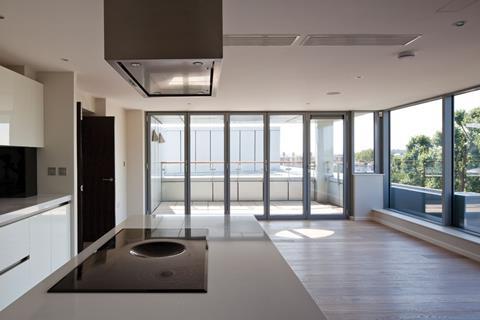
The new six-storey block of flats contains 117 private sale flats and a further 29 affordable units owned by Family Mosaic. Properties range from studios to two-beds, with duplexes on the ground and lower-ground storeys and a series of penthouse flats on the top floor. Fifty-nine parking spaces have been provided in the basement.
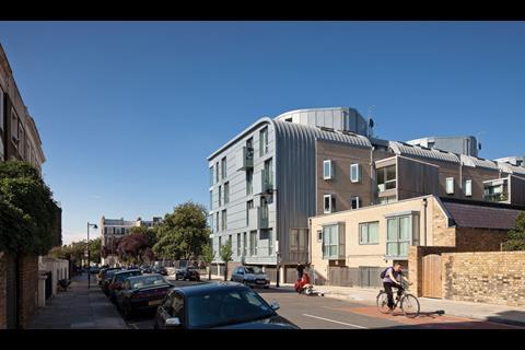
According to Marshall, the design concept for the building was that of a long metal box clad in different materials on each side. At various instances, such as the side elevations and the roof, the metal box “pokes” through its outer skin to reveal itself. Each elevation therefore is treated almost as an independent facade designed to address its immediate context. The rear elevation is composed of light buff brickwork, which matches the shade and texture of existing neighbouring properties. Its windows and its series of full-height vertical timber projections are all aligned diagonally to minimise overlooking into opposite properties.
The side elevations fully reveal the ends of the “metal box” and, accordingly, are entirely clad in zinc rainscreen cladding. The roof junction with the rear elevation is treated as a curved barrel profile, which relates obliquely to the rounded edges at the back of the roof-top penthouses, just visible at ground level from a distance. Even so, it is a curious addition to so rigidly orthogonal a building.
Although the presence of metal here may well be a conceptual nod to the depot buildings that once occupied this part of the site, these side elevations are the building’s weakest. When viewed independently they appear mean and flat, with the attempt at randomly dispersed windows and balconies merely installing the kind of tepid monotony that often characterises large developer housing. And when viewed in conjunction with the rear elevation, the whole composition exhibits so many different profiles, materials and geometries that it appears fussy and disjointed, as if it were trying to do too many things at once.
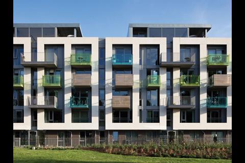
The principal Arundel Square elevation, however, is an entirely different story. Here the facade is conceived as a contemporary reinterpretation of the historic elevations on the square’s three other sides. Consequently, it is clad entirely in white render, picked out from the painted dressings and stucco ground floor facades of the existing terraces. Also, its height and continuous roofline - occasionally punctured by the penthouse “dormers” - effortlessly anchor the block into the overall massing of the square.
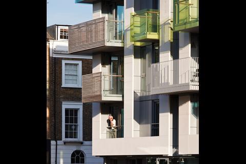
But its boldest features are the sweeping vertical bays that extend over the middle four storeys of the building. These paired rectangular openings contain balconies and windows and form dark, dramatic recesses that contrast sharply with the white render that surrounds them. The effect is both formal and repetitive and is an inspired combination of modernist modularity and the classical rhythm and proportions of the historic terraces across the square.
The potential monotony of the bay arrangement is broken by the variety of colour and materials employed on the projecting balconies. Marshall describes these as “random elements of joy” and treatments include steel railings, timber screens and coloured glazing. The gesture is a perhaps a little contrived, but nonetheless achieves its goal of animating the facade. It is also yet another contemporary twist on the very English classical practice of incorporating diversity on minor decorative facade elements, such as lunette windows or doorway surrounds, while maintaining the uniformity of the whole.
Today, Arundel Square is a far cry from its former state. The central gardens have doubled in size. Banishing the trains underground has made it much quieter. Encouragingly, up to 90% of the properties sold in the development have been bought on an owner-occupier basis, thereby minimising the potential for the fragmented residential communities that are often the consequence of investment purchasing. And with 90% of flats already sold, perhaps for the first time Arundel Square now has the key ingredient on which the success of any speculative property venture depends: desirability.
But none of these changes reveal what will be Arundel Square’s enduring legacy. And that will be the example it sets of how bold engineering and sensitive design can dramatically enhance the urban environment and provide architectural atonement for a historic wrong.
Although the level of variation between each of its four facades does not necessarily make for a unified building, it reveals an acute awareness of the multiplicity of streetscape conditions that pervade any urban site. While this level of empathy is not always translated into convincing architecture, the principle of grounding new design in a detailed understanding of local urban context is beyond approach.
Similarly, its successful principal elevation proves that sympathy for a historic context need not mean subjugation to it and that history is never a finished product, but can be constantly reinterpreted. Arundel Square is neither spectacular nor dramatic. But it is a solid and sensitive piece of urban surgery that has cured a deformed square and, for the first time, made it whole.
Project team
Client United House Developments
Local borough London Borough of Islington
Architect Pollard Thomas Edwards Architects
Structural engineer Knapp Hicks and Partners
Services engineer ME Engineering
Landscape architect Remapp
Contractor United House
Interior design Target Living












No comments yet