FosterŌĆÖs latest academy in Berkshire is based around the idea of learning through museum exhibits ŌĆō which makes for some unusual interior decor
There has been a long and glorious history of educational fads, from the Montessori method to multisensory learning, by way of leftŌĆōright brain strategies. The latest, imported from the US, naturally, is called museum learning. Although I canŌĆÖt vouch for its educational benefits, it certainly looks impressive.
The concept is being piloted in the UK at the ┬Ż23m Langley academy in Berkshire, and what it means in design terms is apparent the minute you open the door of the entrance lobby.
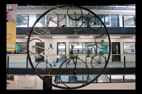
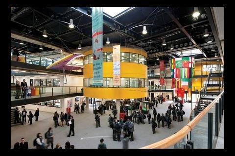
Designed by Foster + Partners, it feels more like science museum than a school. A large steel hoop hangs from the ceiling and serves as a frame for a collection of bicycles, ranging from the Penny Farthing to a modern carbon racing cycle. Elsewhere, thereŌĆÖs a hang glider and the UKŌĆÖs gold medal winning rowing boat from the 2000 Sydney Olympics.
The idea is that the exhibits can be used for teaching, but also to quietly inspire pupils through their mere presence. Most are periodically changed ŌĆō apart, that is, from the biggest and most important exhibit of all: the building theyŌĆÖre housed in.
Sustainability is a key theme here and Langley is probably the UKŌĆÖs greenest academy. Its array of technologies includes solar panels, a biomass boiler, natural ventilation, rainwater harvesting and a ground-source heat pump.
All of this is on display. Service runs are exposed to show off how the building works; these have the bonus of saving on build costs.
The plant room has a large glass panel through which students can see the kit, as well as displays that show water consumption and the amount of heat being produced by the boiler, heat pump and solar panels. After a yearŌĆÖs operation, students will be able to use this data for projects.
As a science academy, the labs take centre stage. There are 10 of them, housed in three big drums on stilts, where they give added prominence in the largely monochrome interior by being painted bright yellow.
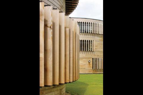
The rest of the building follows earlier Foster academies, from the elegant exterior, which is a smaller, timber clad version of the practiceŌĆÖs Thomas Deacon academy in Peterborough, to the two ŌĆ£fingersŌĆØ housing other classrooms. There is also an area that can be shut off from the rest of the school so it can be used by the community after hours. This contains a performance space, gym and restaurant.
The architectŌĆÖs theme of transparency has been taken on a stage here. In earlier academies, classrooms had glass panels, but somewhat disconcertingly, at Langley these are also used on the toilet blocks, the idea being that this will cut down on bullying.
So is this another short-lived educational fad or a valuable new style of learning? The short answer is it helps make what is already an appealing building even more interesting and should prompt studentsŌĆÖ curiosity. And if it channels that curiosity into the direction of the construction industry then all the better.
Project Team
Client Department for Children, Schools and Families and the Langley Academy Trust
Sponsor The ARBIB Foundation
Architect Foster + Partners
Structural and M&E engineer Buro Happold
Contractor Wates
QS Davis Langdon
Downloads
First floor plan
Other, Size 0 kb







No comments yet