Zaha Hadid’s Pierresvives council building in the French city of Montpellier relies on concrete to solve a range of structural and environmental challenges, as well as providing a spectacular geometric facade
“Concrete made a lot of sense for a number of different reasons.” So says Sophie Le Bourva, associate director at consultant Arup and structural engineer for the spectacular Pierresvives building in Montpellier, France. Designed by Zaha Hadid Architects (ZHA), this giant, £100m rhomboid-shaped edifice relies on concrete for its structural, aesthetic and environmental properties. Even the building’s name Pierresvives, which translates from the French as living stones, was inspired by the concrete of the architectural concept.
ZHA, working with engineer Arup, won the competition to design the scheme back in 2002. Montpellier is the capital of the department of Hérault and the project was instigated to provide a new home for three departmental functions: its archive, a multimedia library and the sports administration offices. Most of the competition entries proposed a campus-style solution to the brief, but ZHA’s was very different. “We suggested that the three functions could be contained within one, very large, building envelope,” says Stephane Hof, project architect at ZHA. “That is why we won the competition.”
Concrete is fundamental to the architecture of this huge rectilinear block. From the outside, stripes of warm-grey concrete line the facade. Between these pale striations, streaks of azure curtain walling add colour and help to accentuate the concrete’s geometric forms. “We knew that in France the material of choice is concrete – contractors prefer it and it is the cheapest way to build,” Hof adds.
As if to make his point about the ubiquity of concrete, Hof’s design even has the public enter the building beneath a mass of the material cantilevered out from its western facade. As well has sheltering the entrance, this lozenge-shaped projection houses the building’s auditorium.
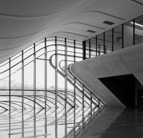
Once inside, the foyer opens out into a zig-zag shaped void. This opening rises up through the heart of the 24m-high, 46m-wide building to reveal the accommodation for all three of its functions. North of the foyer is the three-storey archive, its first-floor entrance facing the auditorium lobby; the library is to the south, with the sports offices beyond.
Each area required a different structural solution. The building sits on 480 bored piles, each approximately 12m deep, which support a reinforced concrete frame. Five concrete cores are lined along the central spine of the three-storey building. The cores slot between five evenly spaced rows of square columns and these run the length of the 195m-long building.
The rows of 600mm x 600mm columns are set 8.1m apart. While the spacing between rows remains constant, the distance between the columns in each row varies in response to loads imposed by the building. “The structure is defined by the different uses – archive, foyer, library and offices,” says Le Bourva at Arup.
The closest column spacing, at 5.4m, lies in the area north of the lobby, where the archive is located. At 1.5 tonnes per m2, the floor load here is six times that of a typical office. Archive material is stored on wheeled racks, and successful operation is only possible by limiting deflections in the floor. The columns are linked by 800mm-deep downstand beams, to form a regular orthogonal grid.
We knew that in France the material of choice is concrete - contractors prefer it and it is the cheapest way to build
This grid supports the concrete floor slabs. These are cast in situ on precast concrete shells, or “biscuits” as Le Bourva terms them. The shells act as formwork for the floor slab above. Once positioned, the shells are propped to support them during construction. Steel reinforcement is then positioned on top of this layer before the concrete is poured to form the 150mm-thick structural floor slabs.
Main contractor Vinci proposed this precast formwork solution to ensure that the exposed concrete soffit had a consistent finish. Using the pre-cast shells also helped to reduce the amount of formwork and propping needed for the floor construction, which reduced the build programme. The exposed soffits also added thermal mass to the archive to help with environmental control.
The southern half of the building housing the library and office areas was constructed in the same way. The only difference between the two halves is that the lighter loads at this end of the building enabled a larger structural grid of, typically, 8.1m x 8.1m to be used.
But the real structural gymnastics take place in the full-height foyer that fills the void between the archive and the library. “Once you’ve created the idea of a big entrance void, then you want as little structure as possible in that void,” Le Bourva says. As a result, the only structural elements above the foyer are a series of 25m-long, 3m-deep steel trusses, which span the length of the foyer to support the roof. These trusses are the only structural steel on the project.
Beneath this series of colossal trusses is another impressive piece of structural engineering: the cantilevered auditorium. This projects a spectacular 10m from the glazed facade so that its bulk appears to float above the building’s entrance. Le Bourva says one of the key objectives of the structural design was “to achieve an impression of lightness and levitating blocks of concrete”. With this element in particular, there can be no doubt that the engineers have succeeded.
This enormous cantilever is supported on two giant 600mm-thick reinforced-concrete walls, one of which is pre-stressed to limit its deflections. Le Bourva calls these 10m-span cantilever beams “megawalls”. The walls are the only large structural elements to run perpendicular to the spine of the building. Together these beams enclose the auditorium with north and south-facing vertical walls and enable this projecting element of the building to be supported from the structural grid. They also support the additional sloping side walls that cantilever out north and south of the auditorium beyond the megawalls.
Movement joints separate the lobby from both the archive and the library structures. Two additional movement joints also subdivide the longer archive section of the building. The joints are 20mm wide – the same width as the joints between the precast concrete elements forming the facade. This careful attention to detail has ensured these joints merge seamlessly.
The facade itself is constructed from giant precast concrete sections interspersed with areas of glazed curtain wall. The precast elements are suspended from cantilevered beams supported by columns typically set back 2,700mm or 5,400mm from the panel’s face. The feat is all the more impressive given that some of the 1,153 precast cladding elements weigh up to 21.5 tonnes and measure 13m high, 2.7m wide and 0.6m deep. “When you look at the facade, you can see that every single precast concrete element is cantilevered over the curtain walling,” says Le Bourva.
Originally Arup had proposed that the facade be cast in situ. The contractor, however, argued that precast concrete would ensure the best possible finish. As a result of the change, the structural engineer had to modify the design of the primary reinforced-concrete structure. “The solution had a few drawbacks because the original intention was to use the cast-in-situ facade as part of the main structure, particularly for some of the larger cantilevers,” Le Bourva says.
The challenge in using such huge precast sections is in positioning them accurately. Vinci developed an innovative jig specifically for the project. The device comprised a series of angled jacks, which allowed movement in every possible direction to ensure the precast elements were properly aligned. Once in place the cladding was attached to floor slabs.
With concrete forming the bulk of the facade, a flawless finish was essential. A number of prototype panels were produced by the panel contractor, Delta Prefabrication, to enable the designers to check the uniformity of colour and quality of finish. The prototypes also enabled the architect to ensure the panels matched the colour of the exposed structure inside the building. Uniformity of colour was maintained throughout construction by carefully controlling the origin of the cement and other materials. The manufacturer even painted the panels with a water-repellent finish so that when it rains, the facade will retain its pale, flawless appearance.
Clearly this attention to detail has paid off. The building looks spectacular. In fact it has attracted such attention that a surprising number of the burghers of Hérault have developed a sudden interest in visiting the archives. “Many more people have visited the building than we anticipated,” says Hof. “It has been a very big success.”
Safe storage: Why the archive had to be concrete
Concrete is fundamental to the environmental strategy for the archives at Pierresvives, which contain valuable and delicate materials and need to be maintained in a stable environment.
The archive has been designed with circulation corridors around the perimeter to act as buffers to the external climate. Inside, the archive’s temperature and humidity are carefully regulated. The concrete surfaces provide inertia by absorbing and releasing heat and moisture to minimise fluctuations. The mass of the concrete also helps to reduce the cooling and heating loads on the mechanical services, saving energy. “One of the big advantages of using concrete for the construction of the archives is that its thermal mass enables the environmental solution to be as passive as possible,” says Sophie Le Bourva, associate director at consultant Arup.
Perfecting the panels
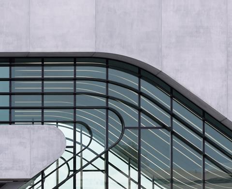
Great care was taken to ensure that the 1,153 precast cladding elements were finished to the highest possible standard. For the moulds, both steel and wood (particle/laminate) were used, along with polystyrene for the double curvature elements. About 155 elements required specially manufactured double-sided moulds. The most complicated elements to produce were the three-dimensional corner units.
High-strength concrete, mixed with super-plasticizers, was used to accelerate the manufacture and improve the concrete finish, and the colour of the precast elements was derived using pale-coloured cement and limestone aggregates. No pigments were used. A number of samples were produced at the outset to develop and agree the concrete mix and colour.
To achieve a flawless finish, moulds were carefully prepared. Preparation included the application of the paint inside the mould to mask the surface texture and ensure a smooth, consistent finish. Careful preparation also ensured the panels did not need to be mechanically polished.
In most locations, the panels are fixed using reinforcement projecting from the precast elements; this is lapped and grouted on site. However, on the inclined facades or where the precast elements are supported on a steel structure, cast-in fixings were used.
The joint between panels is 20mm to cater for thermal movement. Each joint incorporates two waterproofing barriers: one within the depth of the precast unit, the other at the outer surface. The colour of the mastic was selected to match the colour of the concrete.
All elements were treated with a hydrophobic solution to prevent water staining. In addition, anti-graffiti paint was applied on site to all exposed concrete at ground floor level.
Project team
Client Département de l’Hérault
Architect Zaha Hadid Architects
Structural and building services engineer Arup
Main contractor Vinci
Structure and floor slab contractor Groupement Sogea Sud/Dumez Sud/ GTM Sud
Prefabricated concrete facade Delta Prefabrication












No comments yet