Cuboid buildings may be all the rage but Jakob + Macfarlane’s provocative office block in Lyon is one of a kind
It would seem that cubes are the height of architectural fashion. Make’s Cube opened in Birmingham last autumn. Corby’s Cube by Hawkins Brown is set to complete this spring. And now Lyon in France has got a cube of its own too, confirming that the most simple architectural form of all has become the ultimate civic accessory.
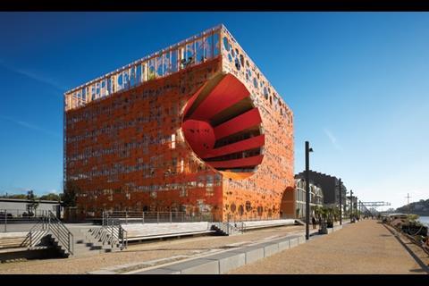
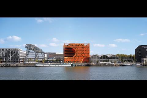
But Lyon’s Orange Cube, a £10m office block by Paris-based architects Jakob + Macfarlane, differs from its predecessors in two key and very obvious ways. First, as its name suggests, it is bright orange. And secondly, it has a giant hole cut right through it. Both features give a clue to the complex conceptual programme that drove the building’s design. They also help the Orange Cube establish a unique architectural character that has a powerful impact on its quayside location and its surrounding urban townscape.
Lyon’s tradition of bold design
France’s third largest city is familiar with bold contemporary architecture. The city’s 19th century opera house, with its distinctive new barrel drum, was extensively redesigned by Jean Nouvel between 1985 and 1993 and remains one of his most celebrated works. And construction has started on Coop Himmelb(l)au’s Musée des Confluences, a sliced, twisted heap of glass and metal in the architect’s trademark deconstructivist style. So the Orange Cube maintains the tradition of provocative contemporary design.
Dramatically located on the peninsula site of former docks close to where Lyon’s two rivers converge, the Orange Cube sits beside the Halles des Salins du Midi, a building whose distinctive arched roofs contrast sharply with the Orange Cube’s stark orthogonal form.
The theme of separation was paramount to the Orange Cube’s design. The architects were keen to give their building a visual autonomy that would identify it as a unique and individual presence within its surrounding context.
Orange all over
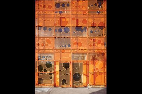
The Orange Cube itself is a 6,300m2 office block of seven storeys. Its external envelope is clad entirely in perforated aluminium sheets lacquered with orange lead. The use of metal is a historic nod to the site’s industrial past. Although the bright orange colour appears to be a wilfully contemporary gesture, this too is derived from the industrial colour formerly used on local harbours.
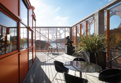
The random perforations applied to the outer surface give the elevations a distinctly abstract character. They appear like pixelated film that mirrors the fluidity and motion of the river beside them, particularly when viewed from afar.
The openings also allow only a faint glimpse of the more rational window patterns concealed behind and enable the Orange Cube to appear like a solid object wrapped in a thin metal tracery.
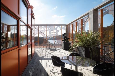
The effect is an alluring paradox; the defensive, geometric precision of a cube protected by the irregular fragility of a permeable metal cage inserted into set-backs on the top storey. These provide spectacular panoramic views of Lyon. Crucially, these terraces are not allowed to distort the external geometric form of the cube, they are submerged behind the metal envelope that encloses the remainder of the block.
Into the void
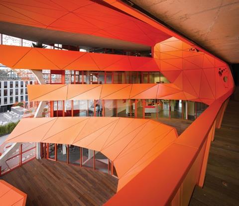
The paradox theme continues with the giant curved hole carved through the corner of the Orange Cube. The architect describes this alteration to the cube form as a “volumetric perturbation”. Jakob + Macfarlane says the hole “generates spaces and relationships between the building, its users, the site and light”.
In total there are three “pertubations”. The second is a shallow arched recess cut into a bottom corner of the cube. The third are the roof terraces.
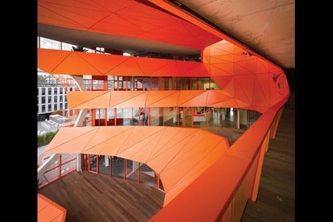
But the first is the most significant because of its size and the fact it is linked to an inner, elliptical void which acts as an inner atrium surrounded by overhanging office platforms and balconies. The hole provides a geometric contrast with the regularity of the cube.
It is also curiously, and presumably unintentionally, reminiscent of the Feng-shui inspired architectural motifs of Far Eastern cultures, where holes and openings are regularly cut into the tower blocks to let spirits pass through.
In the words of the architect, the void “creates an extremely dynamic relationship with the building that changes geometry according to the geometry of the spectator”. It is certainly a dramatic and inspired reinvention of the tedious monotony normally associated with office atria. Its multiple effects on light, surface and form also create a compelling series of spatial and visual conditions that undeniably adds to the Orange Cube’s unique character.
Therefore it acts as the perfect metaphor for a building that uses the most traditional visual tools - colour and shape - to create an architectural language that is both conceptually radical and unmistakably contemporary.
Project team
Client Rhône Saône Développement
Cost consultant Michel Forgue
Electrical engineering Alto Ingénierie
Acoustic Avel Acoustique
Structure RFR GO+
Facade T.E.S.S














No comments yet