Architecture that delights the upcoming generation of construction professionals: four of our guest editors pick buildings that either inspired them to waork in construction or have impressed on them the importance of design quality early in their careers
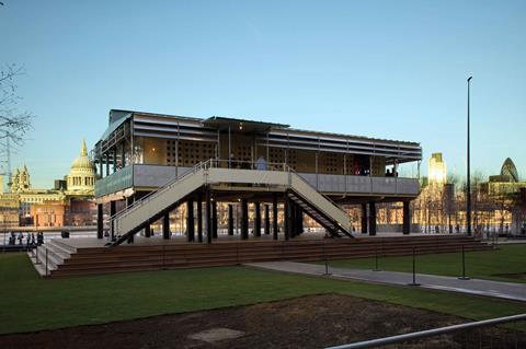
Maison Tropicale, Jean Prouvé
The first building I thought of as a choice for an “inspiring building” was the Maison Tropicale in London, designed by Jean Prouvé. This building really inspired me when I visited a prototype in front of the Tate when I was younger.
It’s not necessarily the most aesthetically pleasing or – in terms of engineering – pushing the boundaries of height, size and complexity, but it’s been designed by really concentrating on the environment it would create and how it could solve the constraints of the environment it would be built in for those who would be using it. For example, the design of the elements was sensitive to the climate and conditions of Africa, and the aim was to make it a mass producible lightweight, flatpack construction.
It is very easy to celebrate or be in awe of the tallest building or the longest bridge (which are amazing) but sometimes it is the less obvious features of design which are less appreciated but should be recognised.
Emily Scoones, Ramboll
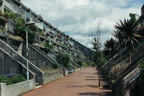
Rowley Way, Alexandra and Ainsworth Estate, NW8
This development in south Hampstead was designed and built by Neave Brown between 1972 and 1978. Neave Brown recently won the RIBA Gold Medal, shortly before
he passed away. I’ve chosen this building because it shows that high-quality design for all, especially when designing people’s homes, is so important. We should be more experimental with our housing now, because a lot of it is so far away from this standard of joy and delight.
Sarah Beth Riley, Studio Egret West
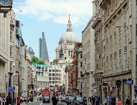
Protected views
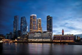
For me, it’s not necessarily a specific project, but more the way traditional and modern architecture interact. Take St Paul’s cathedral and 122 Leadenhall Street (the Cheesegrater), for example. I recently discovered about London’s protected views planning rules, creating viewing corridors towards buildings such as St Paul’s, Monument and the Tower of London from various points around London. In addition, there is a local planning condition stating that from below the sign of Ye Olde Cheshire Cheese pub on Fleet Street you must be able to see the full dome of St Paul’s plus half a dome’s width either side. I understand this is why the Cheesegrater is shaped as it is .It’s great the way the industry has recognised the importance of heritage buildings, ensuring the designs of our modern tall buildings do not have a detrimental impact on those we have long admired. This is something we must continue, appreciating once-modern buildings as they become heritage and not getting lost in the fast-paced industry we work in.
Victoria Caines, Mace
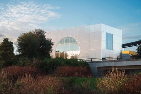
MK Gallery, Milton Keynes – 6a architects
The newly renovated and extended MK Gallery sits proudly at the top of Campbell Park in central Milton Keynes, providing a stunning addition to the skyline with a bold yet unencumbering design. Having been on a hard hat tour of the site in the later stages of its construction, it was impossible not to be inspired by the design vision that this building has followed. Throughout the fabric of the design, there are features that represent the founding principles of Milton Keynes, for example the enfilade through the galleries flanked by two giant windows mimics the feeling of looking down one of the famous MK boulevards and illuminates the galleries with natural light.
These expansive windows also create viewpoints for passers-by to catch glimpse of the exhibitions, drawing the community towards the gallery and creating a hub of activity. The new cafe area also harks back to Milton Keynes heritage being designed in the same colours of the building where the original architects of the new town drew up their plans, fondly known as the “Custard Factory” due to its vivid yellow paint, with black pipework and a red door dissecting the sea of yellow.
The manner in which the gallery encapsulates the essence of Milton Keynes, provides a distinctive feature for the skyline and most importantly captivates local people, is truly inspiring. As a relatively new resident of Milton Keynes, and an emerging professional in town planning, being able to experience and appreciate a building like this on my doorstep has invigorated my eagerness to work alongside architects and urban designers to integrate local features into projects.
Annabel Le Lohé, WYG






No comments yet