Renzo PianoŌĆÖs Paul Klee Centre in Berne, Switzerland, takes inspiration from the rolling scenery behind it ŌĆō a response to nature of which the Swiss artist would heartily approve

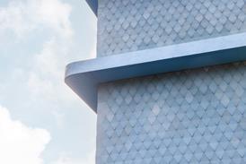
Three large metallic vaults emerge out of a field of winter barley, echoing three wooded hills in the background. Each vault is made of a projecting zinc-cased arch separated by recessed strips of glazing and sun blinds.
ŌĆ£When I came to the site, I saw the hills and the furrows made by the tractors,ŌĆØ says Italian architect Renzo Piano. ŌĆ£The building was designed by the eyes.ŌĆØ
The building in question is a ┬Ż48m museum devoted to Paul Klee, SwitzerlandŌĆÖs greatest artist, which opens this week on the outskirts of his home town of Berne. The disarmingly straightforward response to nature by Piano, who designed the building with ArupŌĆÖs London office as structural and services engineer, is entirely in the spirit of the early 20th-century pioneer of modern art, whose captivating doodle-like drawings fused natural representations with abstract forms.
As you approach the building, it fills out into an alluring sculptural essay in bold curves and gentle undulations. The arches over the three vaults, which Piano naturally describes as ŌĆ£hillsŌĆØ, turn out to be linked together at ground level in three smooth-flowing waves. Each of their clear-glazed facades is set back behind two of the arches and opens to reveal a lofty lower-ground floor. And the hills are not regimented in a straight line, but strung along a barely perceptible crescent that sets each hill at a slightly different angle.
Enter the building across one of the wavesŌĆÖ three troughs, and you find yourself in a spacious concourse that passes through the three hills. Here the effect of the curve in plan is more pronounced, as the 150 m concourse gradually disappears around a bend.
The building turns out to be larger than it lets on, as much of its 16,000 m2 capacity is hidden in the lower-ground floors set behind the raised footpath and at the rear of the hills, where they merge into the sloping barley field.
The capacity reflects the fact that the Paul Klee Centre is much more than a gallery displaying 4000 paintings. It is, says its director, Andreas Marti, a multimedia cultural centre ŌĆō albeit one inspired by a single artist.
ŌĆ£Klee should be regarded as more than a painter,ŌĆØ says Marti. ŌĆ£He was just as gifted musically, he was involved in theatre and dance, he was a man of letters and he was, more importantly, an exceptionally able teacher.ŌĆØ As a universal modern man, Klee was the embodiment of GermanyŌĆÖs avant-garde Bauhaus, where he taught for 10 years.
Accordingly, art galleries make up only the central hill of the building. The hill to the left contains a tiered 300-seat auditorium for music, dance and drama, a childrenŌĆÖs creative centre and a restaurant. The hill on the right contains offices, archives and a seminar room.
In the central hill, the main collection of KleeŌĆÖs work is housed in a huge, gentle vault without windows or rooflights, just like an aircraft hangar. Artificial light is subdued to just 50 lux to preserve the delicate watercolours and crayon drawings, yet there is no sense of gloominess.
The artworks are hung on lightweight screens that are suspended from the arches and leave open vistas into the upper void, making the whole extent of the gallery visible in one glance. Directly below the main gallery lies a smaller gallery for temporary exhibitions.
The project, which started off as a proposed extension to BerneŌĆÖs 19th-century art museum, was able to explode into its expansive new site and enlarged cultural remit thanks to the vision and generosity of surgeon Maurice M├╝ller, who donated a full ┬Ż30m from the proceeds of his invention of the artificial hip.
As an inspired fusion of architecture, technical design, sculpture and landscape, PianoŌĆÖs new museum is a fitting tribute to the modern polymath, Paul Klee. It also progresses the art of museum design into the 21st century.
Project team
client Maurice and Martha M├╝ller Foundation
architects Renzo Piano ║├╔½Ž╚╔·TV Workshop; ARB
structural and services engineer Arup
steel contractor Zwahlen & Mayr
facade contractor Tuchschmid
Complex geometry and low-energy design
Structure
Each of the three hills is supported on nine steel arches that rise to 19 m, span up to 65 m and invert into troughs to link them together. They curve in plan on a 500 m radius and are inclined in section. They were fabricated of double-curved steel plates up to 1200 mm deep and welded together on site. The arches progressively reduce in height and curvature towards the rear.
Energy consumption
Energy consumption is estimated at no more than 115 kWh/m2 per year, which is only a quarter that of a typical modern museum. High thermal insulation and external shading to the facade and roof contribute to energy efficiency.
Internal climate
In the main gallery, a displacement ventilation system maintains temperature and humidity with only four air-changes an hour and imperceptible noise. Air enters through slots in the timber floor boards, exhausts through ceiling vents, and is recycled through hollow partitions at the front to basement plant rooms.
Lighting
Because of the delicate artwork, the illumination in the main gallery is kept at just 50 lux. ŌĆ£Since this amounts to just 0.001% of natural daylighting, we would have had to throttle down nature so much it would look quite grey,ŌĆØ says ArupŌĆÖs lighting designer Andrew Sedgwick. ŌĆ£So we opted for artificial lighting.ŌĆØ













No comments yet