Instead of making a neglected building look brand-new, why not refurbish it to preserve and showcase the damage worked by fires, damp, squatters and the passage of time? Ike Ijeh explores the advantages of growing old gracefully
Decay is rarely a condition sought when restoring old buildings. The very idea of preserving decay as part of a renewal process seems to verge on the absurd, as since the conservation movement began in earnest around 50 years now its entire purpose has been to eradicate decay rather than keep it. Walk around Windsor Castle today and all trace of its devastating 1992 fire has been obliterated, and it would have been a foolhardy architect indeed to suggest otherwise when reconstruction proposals were sought in the disaster’s aftermath.
But while a hypothetical fire at Windsor today would probably receive similar restorative treatment, elsewhere attitudes towards decay and conservation have changed. The hipster movement’s reclamation of disused buildings in the likes of Shoreditch and Brooklyn from the 1990s onwards had much to do with this, with a new generation of bars, studios and boutique hotels choosing to expose the decrepitude of their once-abandoned premises rather than conceal it.
While undeniably trendy, this kind of generic “shabby chic” approach remains both cosmetic and carefully contrived. But in recent years a new and more authentic generation of refurbishment projects has arrived, which encompass a much broader cross-section of building types and ambitiously experiment with the principle of incorporating decay into both the fabric and the character of restored historic buildings.
In so doing, these projects explore a fascinating array of technological challenges and solutions that tread a fine line between meeting modern safety, fire and structural standards and achieving historic authenticity in its most literal form – warts and all.
The reopening of Alexandra Palace Theatre last month provides arguably the most recent example of this trend. In the following pages this scheme, and three others that have sought to dramatise decay rather than discard it, are explored.
Alexandra Palace Theatre
London, 2018
Architect: Feilden Clegg Bradley Studios
Contractor: Wilmott Dixon
“The general concept for the walls was to remove anything loose but beyond this to touch as little as possible”
Tony Dowling, Willmott Dixon
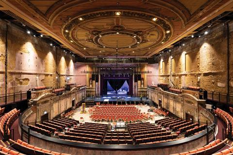
Historic buildings don’t come much unluckier than Alexandra Palace. Completely burnt down just a fortnight after opening in 1873, a second devastating fire in 1980 again destroyed much of the complex. The famous north London public recreation, entertainment and exhibition centre was largely rebuilt after both tragedies but a stubborn pattern of piecemeal occupation and reconstruction ever since it was built means that few historic buildings have as much evidence of the gradual decay and catastrophic events that can affect even the most loved of landmarks.
Which is why the reopening of Alexandra Palace Theatre just before Christmas makes for such a fascinating case study in the “arrested decay” concept. The term was coined by the design team there and they devised it to describe an approach that sought to make the building fit for modern habitation standards but one that also proudly bore the scars of its unfortunate history.
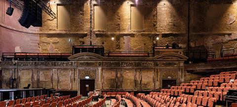
Feilden Clegg Bradley Studios associate Matt Somerville summarises the thinking that lies behind the entire decay concept, saying: “If we restore the theatre to a pristine condition, we will destroy the very quality of the space that makes it so intriguing and unique. The challenge faced by our team is to preserve the special character of the space while making it safe for public access, and addressing its inherent design defects.”
The result is essentially a gloriously atmospheric evocation of a working Victorian ruin in a section of the building that has remained disused and unoccupied for an astonishing 80 years. Crumbling plasterwork has been maintained on both walls and ceilings, but hidden behind these lies an ingenious array of discreet structural stabilisation methods. For the walls, Willmott Dixon construction manager Tony Dowling reveals that “we repaired any structural cracks in the brickwork but all cosmetic ones were retained and closed with a lime plaster sealant. The general concept for the walls was to remove anything loose but beyond this to touch as little as possible.”
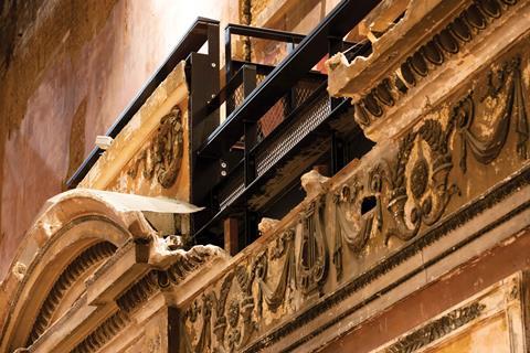
And on the riotously ornate auditorium ceiling, bowed and pockmarked after years of water erosion and disrepair, rigidity is achieved by the clever application of a steelwork grille on its upper surface that is fused together with the ceiling below by a lime mortar mix. Other challenges included the insertion of a new auditorium floor and the reinforcement of timber roof joints dampened by rainwater. While the contractor is reluctant to compare costs between the intricate strategies employed here and a conventional restoration, the project proves without question that it is far more challenging to repair rather than replace a ruin.
Middleport Pottery
Stoke-on-Trent, Staffordshire, 2014
Architect: Feilden Clegg Bradley Studios
Contractor: William Anelay
”Sometimes there’s a lot to be said for maintaining beautiful scruffiness and doing as little as you can”
Tim Greensmith, Feilden Clegg Bradley Studios
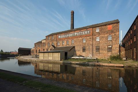
Middleport Pottery has huge historic significance as it is one of the last working Victorian potteries in the UK. The grade II*-listed building was built in 1888 but while it has enjoyed continuous usage since that time, many of its key historic and industrial features have been demolished, including six of its extraordinary oast house-like bottle ovens. These tapering brick kilns are central to the heritage of the surrounding Staffordshire industrial landscape. The pottery was placed on the Heritage at Risk register in 2010 and only restored after the intervention of the Prince of Wales, whose Prince’s Trust initiated its recent restoration. The restoration retains much of the building’s worn and faded features, with the highlight arguably being the memorable transformation of its remaining bottle oven into a somewhat surreal meeting room.
For Feilden Clegg Bradley Studios associate Tim Greensmith, the philosophy of the refurbishment was more about repair than restoration. “Decay tells part of the story; it allows us to sympathise and empathise with the experiences of the building and its workers. There’s more character in decay and it invites people to make up their own minds about the past, present and future. Dirt and decay give a sense of texture and history: wipe that away and there’s a risk people are alienated.”
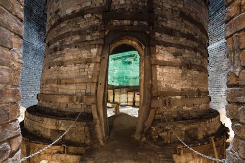
But while this ambition seems highly conceptual, Greensmith says it was also grounded in hard engineering reality. “Engineers were central to this process; we were constantly asking questions about what we could keep, why we should keep it and how. It was a very pragmatic and academic process and it was guided by what we called “conservation primers”. These were condensed philosophical statements that identified the building’s USP or key heritage characteristics then constantly reinforced them throughout the project.”
As Greensmith explains, these primers also helped the project stay focused and kept to a tight budget. “For us it was actually cheaper to preserve elements of decay where we could: if you start painting, where do you stop? Also this approach helped establish a more realistic maintenance plan where refurbishment is an ongoing process and you’re not limited by a comprehensive ‘renew and restore’ overhaul cycle every 10 years. Sometimes there’s a lot to be said for maintaining beautiful scruffiness and doing as little as you can.”
The Department Store
Brixton, London, 2017
Architect: Squire and Partners
Contractor: Stoneforce
“We wanted the refurbished building to be read like an open book that reveals all these raw and hidden layers of history”
Tim Gledstone, Squire and Partners
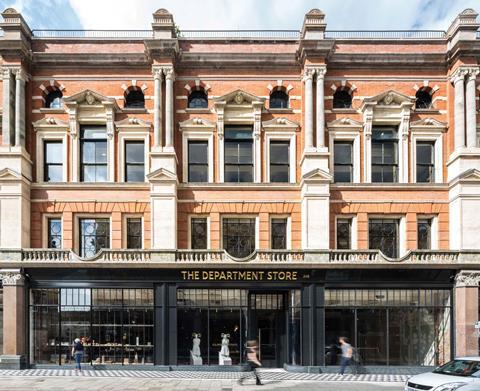
While Brixton’s recent gentrification has ushered in a wave of rising prosperity and improvement for the south London neighbourhood, it is still difficult to imagine the bourgeois respectability it enjoyed in the late 19th century as one of the capital’s plusher suburbs. So much so that one of London’s first purpose-built department stores opened here, in 1876, in this instance named and modelled after the Parisian Bon Marché original. However, such elevated origins were not enough to withstand Brixton’s cycle of post-war decline and the emporium closed in 1975.
The department store’s ornate but long-disused 1905 furniture annexe reopened two years ago as a result of an extraordinary renovation scheme where decay took centre stage. Squire and Partners’ ambitious reworking saw the practice acting as owner, architect and developer and the refurbished building now houses its head office. And while the monumental Edwardian exterior has been maintained, so too has all the visual evidence of historic wear and tear within the building, including peeling paintwork, chipped plasterwork and even colourful graffiti from the building’s extended tenure as a squat.
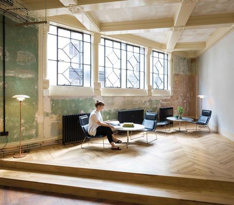
“We deliberately left things in an imperfect state and had no intention of reinstating perfection,” explains Squires partner Tim Gledstone. “We wanted the refurbished building to read like an open book that reveals all these raw and hidden layers of Brixton history; it’s a romantic and almost emotional decision. We’d also taken an office trip to Havana and were all struck by the ruined beauty of the dilapidated buildings. Brixton’s Caribbean heritage made this choice all the more appropriate.”
So how did the team arrive at a balance about what to keep and what not to? “If it was loose or dangerous or if it peeled off, we’d take it off. If it wasn’t, we wouldn’t – it was as simple as that.” The process, however, did not come without its challenges, central to which Gledstone describes as the need to “understand the building thoroughly and then decide where you can spend and save”. To achieve this, the team employed a series of live samples, prototypes and models on which remedial work would first be tested before being applied across the building.
But for Gledstone, there is no question the process was worth it. “Yes, it would have been much easier and cheaper to do a complete ‘white wall’ refurbishment with no need for our sampling process. But that wouldn’t have delivered the ‘decayed decadence’ I think we’ve achieved. And I think people like seeing great buildings that aren’t perfect, we like ‘warts and all’”.
Wilton’s Music Hall
London, 2015
Architect: Tim Ronalds Architects
Contractor: Fullers Builders / William Anelay
“Water erosion, crumbling plaster, flimsy structure and to top it all the entire builDing was in a highly flammable state”
Tim Ronalds, Tim Ronalds Architects
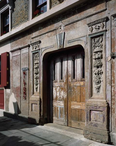
Wilton’s Music Hall may be a far cry from the glittering theatres and opera houses of London’s West End but it enjoys the historic accolade of being the only surviving mid-Victorian music hall in the entire country. Music halls were the entertainment hubs of Victorian working-class society, and if there was any one part of the country where they positively thrived it was London’s impoverished East End. The current version of the hall was completed in 1859 but after a typically diverse East End back catalogue of fires, storage and religious uses, it was earmarked for demolition in the 1960s before being saved and elevated to grade II*-listed status in 1971. An uncertain period of sustained dereliction ensued, before the concert hall reopened in 1997 and saw its painstaking restoration completed 18 years later.
So rich was the theatre’s cycle of destruction, dilapidation and adaptation that for architect Tim Ronalds there was no question of not keeping some trace of it in the rejuvenated scheme. He says: “So many old buildings endure restorations which lose all sense of their age and time. Here we were determined not to spoil this very special atmosphere where you have the thrill of discovering what appears to have been retained in an untouched and derelict state.”
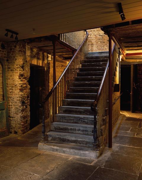
Accordingly, Wilton’s Music Hall appears to have been left in a battered and worn condition, where bannisters and doors are left unsanded and unpainted and brickwork and plasterwork have visibly chipped away. But in so doing it leaves one of the most charmed and haunting evocations of time-capsule Victoriana visitors are ever likely to come across. To achieve this, Ronalds explains, the team evolved a philosophy of “doing as little as possible but making the premises safe and viable”.
But of course in technical if not in cosmetic terms, an architectural makeover is exactly what the theatre has received. And as Ronalds explains, it came with significant challenges. “There were a host of problems. Water erosion, crumbling plaster, flimsy structure incapable of taking additional loading and to top it all the entire building was in a highly flammable state. It took a lot of good engineering solutions to solve these problems in a way the public don’t notice.
“For instance, new plasterwork is doing a huge amount of work in concealing masses of new servicing, often removable behind a historic material that is in line with the building’s heritage. By adopting new fireproofing and alarm systems we were also able to avoid having to partition spaces with fire doors, which would have challenged historic authenticity. It may look as if not much has been done but the opposite is the case.”




2 Readers' comments