After 15 years the Serpentine has added four summer houses to its series of single pavilions. Is it enough to revive an ageing format? Ike Ijeh is in no doubt
It was perhaps fitting that the press preview of this yearŌĆÖs Serpentine Pavilion included a quote from the late Zaha Hadid, the designer of the inaugural pavilion back in 2000. The Serpentine GalleryŌĆÖs co-director Julia Peyton-Jones, herself due to conclude her trailblazing 25-year tenure shortly, revealed that Hadid, with a typical lack of equivocation, once advised her that ŌĆ£there is no end to experimentationŌĆØ.
Now in its 17th year, the celebrated Serpentine Pavilion Architecture Programme has taken this principle to heart in a big way. The programme, which invites an architect who has never designed a UK building to create a temporary pavilion in the galleryŌĆÖs frounds in Kensington Gardens, has cleverly widened its scope by also inviting another four architects to design temporary summer pavilions.
The four pavilions are located around William KentŌĆÖs 1735 Queen Caroline Temple, a petite neo-classical park pavilion located just yards from the gallery which exudes the stern elegance that is the hallmark of KentŌĆÖs work. Each one provides a contemporary reinterpretation of the templeŌĆÖs form and function.
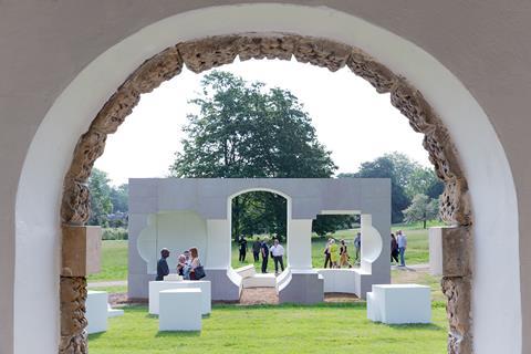
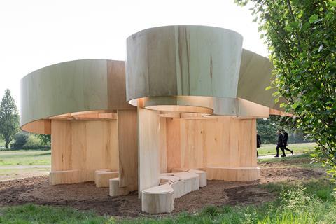
Nigerian architect Kunl├® AdeyemiŌĆÖs dislodged prefabricated sandstone blocks seek to evoke the templeŌĆÖs role as parkland refuge of shelter and relaxation while US/German architect Barkow LeibingerŌĆÖs woven coil of looping plywood sheets recalls the mechanically rotating sister pavilion that once stood on the site.
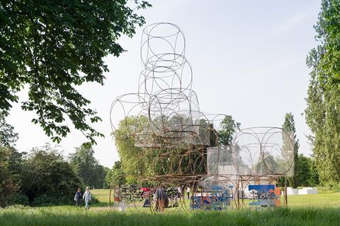
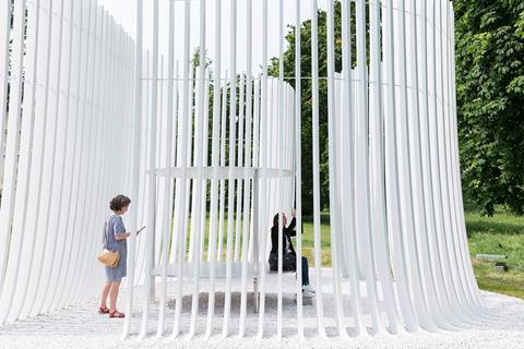
Nonagenarian Hungarian architect Yona Friedman creates a freely assembled modular structure comprising a grid-like stack of chamfered steel spaceframe cubes which allow views towards and around the temple. And British architect Asif Khan completes the quartet with a circular metal platform encased within a series of curving timber screens. The enigmatic composition is conceived as a sundial that catches light and views and is wistfully aligned towards the nearby Serpentine Lake.
With all four summer houses situated within view of each other and all improbably and rather amusingly clustered around the prim sobriety of KentŌĆÖs temple, the effect is similar to the kind of cacophonous creativity that one might find at a school of architectureŌĆÖs end of year show. Abstract, whimsical and high concept, they represent a welcome and canny expansion of the pavilionŌĆÖs architecture mandate.
They also represent something else that is interesting in relation to this yearŌĆÖs main pavilion designed by Bjarke Ingels Group (BIG) which, with greatest respect to the four summer houses, remains the star of the show. In their own way each summer house embodies art, here in the form of architecture, grappling with context, an age-old friction. This is a battle which Bjarke Ingels alludes to directly when describing the concept and inspiration behind this yearŌĆÖs pavilion.
ŌĆ£Architecture is normally saturated with existing constraints. It often ends up being more about the place than a manifestation of the architectŌĆÖs artistic ideas. We conceived our pavilion in the form of an artist working in a big park. We wanted something that was a purer manifestation of the artistŌĆÖs ideas.ŌĆØ
For all those who believe that architecture should respond to, or at least acknowledge, context such sentiment might be seen as bordering on heresy. It also chimes with those who levy that IngelsŌĆÖ work, for all its uncontested visual glamour, is rather more concerned with objectification than integration.
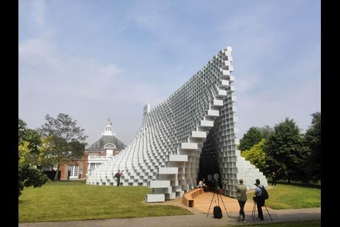
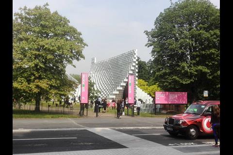
But this is too simplistic an interpretation of IngelsŌĆÖ words, or for that matter his portfolio, for what BIG has in fact created is arguably the most spectacular pavilion in years and possibly in the programmeŌĆÖs entire run. With brazen decadence, this yearŌĆÖs pavilion essentially casts a soaring, miniaturised cathedral in the middle of Kensington Gardens.
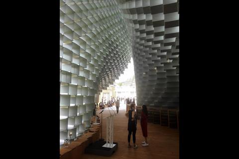
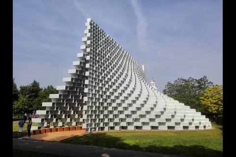
BIGŌĆÖs design is constructed from hundreds of hollow and open-ended fibre-glass boxes stacked on top of the other. Each box is connected to the other with a series of slick, machine-cut aluminium plates neatly riveted with sunken bolts. In the words of Ricardo Baptista, director of structural designers AKTII, ŌĆ£the boxes and bolts form the rigid structural envelope that ensures that the structure and architecture work together as oneŌĆØ.
The boxes in themselves form a neat structural solution but what truly elevates this project is not its individual components but the sum of its parts and how those parts are manipulated to form the whole. Ingels describes the inspiration for his stacked boxes as a simple and very traditional brick wall. But the pavilion is formed by creating two walls beside each other and then pulling them apart to form a space in the middle with an entrance at each end.
The ŌĆ£pullingŌĆØ is achieved by each box being stacked in an offset position to the one underneath to form a longitudinal envelope that gradually opens like zip. But by shifting the length and offset of the boxes, what is in fact created is a series curved winged surfaces that elegantly swerve and gyrate as they morph from modular orthogonal box to a sumptuous parabolic arc seemingly poised to take flight.
It is an extraordinary transformation that recalls the cube to parabola metamorphosis that takes place as Nervi and BelluschiŌĆÖs spectacular 1971 San FranciscoŌĆÖs St Mary of the Assumption Cathedral. Moreover, it is a transformation rendered all the more dramatic by the further contradictions embedded into the structure. The thickness and opacity of the individual boxes shift as they rise higher in order to evoke a greater feeling of lightness as the structure rises higher.
Equally, while each individual box features solid sides, their open ends allow the pavilion to become virtually transparent, creating the strength of connection between park and pavilion that virtually every previous commission has sought but rarely captured.
Ingels is right to summarise his pavilion as ŌĆ£a wall that becomes a gate that becomes a spaceŌĆØ. It is the ultimate architectural shape shifter, revelling in the ŌĆ£unscripted architectural possibilitiesŌĆØ that Ingels implies his liberation from context and his evident indulgence in a ŌĆ£purer artistic manifestationŌĆØ allows. In the hands of a lesser architect, such contextual licence might have led to a pavilion that held more awkward relations with its surroundings. But the sheer force of BIGŌĆÖs sculptural imagery and structural transparency ensures that this seminal pavilion fits into the park like a glove.







No comments yet