Amanda Levete’s £48m expansion of London’s V&A connects the museum with the public realm through a superb porcelain-paved courtyard. But it’s the sheer immersive power of its vast subterranean exhibition hall that will make visitors stand and gawp. Ike Ijeh reports
Architectural history is littered with abandoned projects. The Eiffel Tower planned for Wembley. The biggest cathedral in the world that was started but never finished in Liverpool. The glass wave that was once earmarked to encase London’s South Bank. Over the past two decades, one of the most notorious London examples of these forsaken forgettables was Daniel Libeskind’s Spiral proposal for the Victoria & Albert Museum in London’s South Kensington – a colossal tower of modestly scaled galleries.
Inevitably, the controversial plans set outraged forehead veins pulsating across the royal borough and were finally abandoned in 2004. But the only way to truly exorcise the ghost of a vanquished project is to build something else in its place.
And this is what the V&A along with Amanda Levete’s practice AL_A have finally and most convincingly done.
The more prosaically named Exhibition Road Quarter opened last week and is London’s most eagerly anticipated cultural project since the opening of the Tate Extension and new Design Museum last year. And before the inevitable clamour about ripe London money trees begins, the ambitious £48m scheme was 95% funded by a substantial charitable donation.
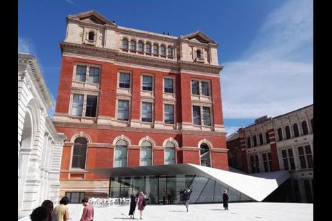
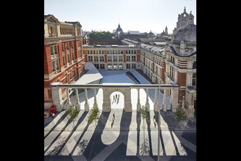
Located in the new Sackler Courtyard that stands to the rear of the 165-year-old museum’s Aston Webb and Henry Scott buildings of 1899 and 1867 respectively, the new scheme comprises three parts. First, a newly formed public space constructed in the formerly publicly inaccessible rear service area that was once known as Boiler House Yard.
Second, a sequence of above and below ground internal spaces that weave through the existing building and a new structure visible in the courtyard and containing new foyer, cafe and bookshop areas.
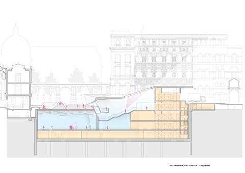
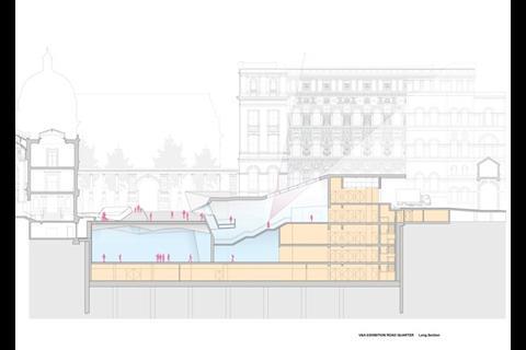
And last but not least, the Sainsbury Gallery, a gigantic underground hall built beneath the Sackler Courtyard that offers 1,100m² of exhibition space for temporary shows.
The most obvious part of the scheme from a public realm perspective is the Sackler Courtyard. It is this more than anything that encourages Levete to passionately assert that this is an “urban as well as cultural project”. The basis for this claim is not only the creation of a superb public space but its interaction with the street.
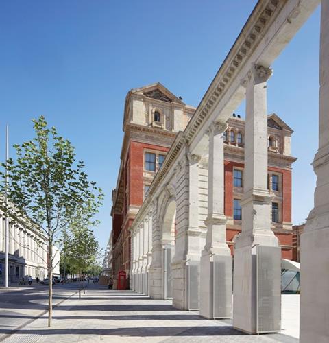
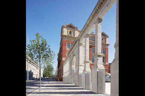
Since the abandonment of Libeskind’s scheme, the biggest change to the surrounding area has been Dixon Jones’ hugely successful part-pedestrianisation of Exhibition Road which runs alongside the new courtyard. The two are separated by an august neo-baroque screen added by Webb as part of his 1899 Cromwell Road extension to the museum.
Courtyard
Wisely, Webb originally intended this screen to lead into a public courtyard in the manner Levete has now finally realised. He was prevented from doing so by the sudden decision to place the museum’s boilers above ground rather than below ground, hence the former name of this courtyard.
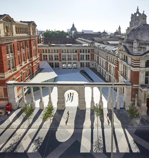
The move meant that Webb’s elegant classical screen became a solid wall at ground level with the columns still rising above. But the relocation of the boilers carried out as part of this latest project now means that the screen can be reconfigured as Webb originally intended, as a porous veil between square and street.
For Levete this move offered three “fantastic” opportunities. “To see the museum as part of the street and vice versa. For the museum and new square beyond to engage with public and contemporary life. And to offer a new graphical representation of the site.”
The latter is achieved by mapping the screen by laser survey, removing it while construction took place, reconstructing it and then replacing the gaps left by the removal of a solid wall between the ground level piers with perforated solid aluminium plate gates.
In their pixelated perforations, these gates offer an abstracted, graphical imprint of the shrapnel damage inflicted during the Second World War, much of which, eerily, close inspection reveals is still evident on the reconstructed screen and on the adjacent facades. Only the central gates offer a perforated representation of the royal crest.
“It was our way of using the shrapnel damage to memorialise absence,” explains Levete, “and also using the royal crest to remind people that first and foremost this is a public institution open to all.”
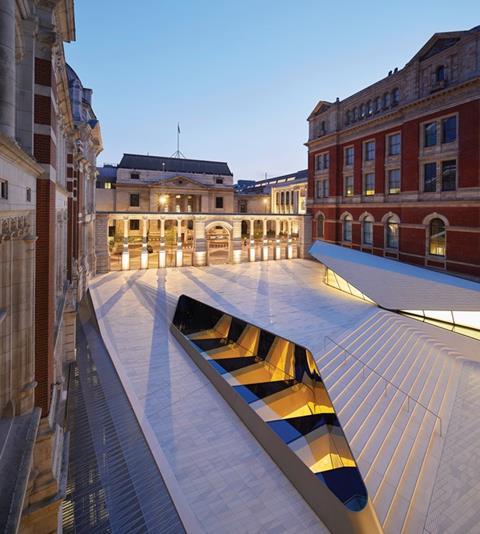
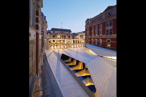
The screen opens out onto a superb new public space built over the exhibition hall below. Overlooked on three sides by the cleaned brick and stone facades of the Webb and Scott buildings, the ground is laid in jazzy strips of porcelain tiles, which, despite being treated for slip resistant public use, still retain the glazed ceramic quality that was conceived to echo the porcelain masterpieces within the museum’s collection.
Levete’s claim that this is the “first porcelain courtyard in the world” fails to detract from the real triumph of this space, its role as a powerful civic and spatial mediator between public realm and cultural institution. This is a vibrant external foyer, a dynamic public forecourt rich in its mix of colour and materials and in the energy and movement of the public life it so eagerly embraces.
Cafe
Levete points out that the character and patterns of the courtyard are inspired “by what is happening below”. So in a way it is addressing the same challenge as the shrapnel damage memorialised gates: how do you make visible the invisible?
This is a challenge rendered all the more testing by the fact that Levete’s principal accommodation spaces are underground. This presents an immediate subversion of the hierarchical conventions we normally attach to public buildings, particularly large classical ones like the V&A. We subconsciously expect to ascend steps to reach a building of gravitas and importance, such as a courthouse or a town hall. Even Libeskind’s Spiral was preoccupied, in a highly abstracted way, with the sequential process of elevation. But by being a primarily subterranean affair, Levete’s project is doing the opposite.
Which is what makes the public space so important; it is not only a conduit between civic and cultural but between what lies above and below ground. But Levete cannot resist the temptation to add a further surface level protrusion and so we have a cafe in the north-western corner.
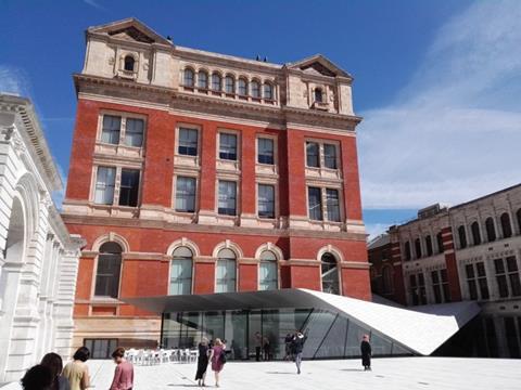
This breaks the historic, orthogonal backdrop offered by the Victorian elevations by being a distinctively modern and asymmetrical affair, complete with abstract form, inclined surfaces and swooping tessellated, porcelain, abstracted roof. It also reverberates elsewhere in the square in the form of a rhomboid glazed oculus set in the ground that lights the hall below and helps frame a short flank of steps that lead down to the entrance.
As a contemporary intervention the cafe is distinctive enough. Moreover, it forms the base of a sloping roof that playfully pours down from the corner gap between the Webb and Cole buildings like larva down a ravine.
But do both the cafe and the oculus need to try so hard to be different? The sequence of undulating, sloping courtyard surfaces might have been enough to suggest the presence of activity underneath. Moreover, the public space itself already establishes a strong enough ground level presence for Levete’s interventions below and beyond. The Pyramid in the Louvre suggests activity underground because it appears like an angular pustule of glass and light that has bubbled up from below the surface. But with its heavy lid-like roof and compressive, contorted geometry, the cafe does not so much suggest something rising from below as it does something falling, discordantly, from above.
Hall
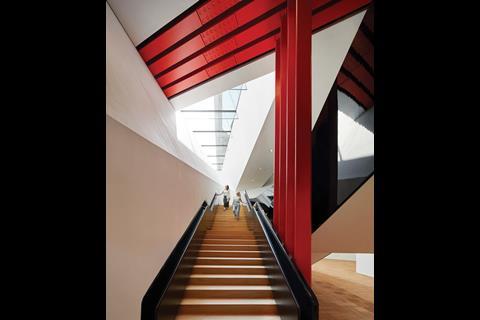
But the scheme returns to surer footing once we step inside. Significantly, the stairs to the underground hall are located within a new foyer formed in the Webb building. By locating the entrance in a historic block and not the cafe or the courtyard itself, the scheme embeds itself within its historic fabric and cannot, like so many museum extensions, be considered an autonomous appendage.
The descent down the new stairs into the basement allows the visitor to embark on what Levete calls a “theatre of descent”. It does indeed offer a dramatic sequence of splaying angles and zig-zagging surfaces where the classical formality of Webb’s ground floor spaces peels away as the visitor moves down into a spatial vortex trimmed with a kaleidoscope of red and black colours. These spaces prove that one need not go up to be uplifted.
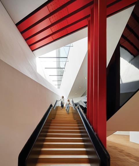
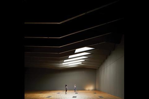
The journey ends in the cavernous underground Sainsbury Gallery. In engineering terms alone, this space is undeniably impressive. With 14 4m deep triangulated trusses spanning 38m and with a height ranging from 6.5m to 10.5m in line with the falls of the courtyard above, a hole in the ground this large required foundations to be dug 18m below ground and tension piles to be sunk 50m into the earth (see Digging deep, above, for more on construction of the underground space).
But even if the millions of visitors who will eventually pour into this space know nothing of its engineering prowess, they will not fail to be moved by the sheer immersive power of its spatial impact. Scale is undoubtedly part of this, but it is also the incredible architectural expression of the ceiling. The 14 trusses sway and swerve their way across the ceiling as if manipulated by giant invisible scissors, folding into a serrated ribbon of miniature peaks that dance overhead.
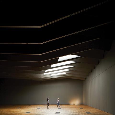
Curatorial requirements did not prioritise daylight here and an eminently flexible and malleable black box environment was what was required. Yet the skylights visible in the courtyard pour ethereal chasms of daylight into the space, a surreal, immersive reminder of their subterranean state.
The hall is a triumphant metaphor for Levete’s heroic reworking of the V&A for future ages to come. Not only does it see the ghost of the Spiral put to bed once and for all, but it shows how public realm and spatial melodrama can be dizzyingly propelled deep below the surface.
Digging deep
The construction of the vast underground exhibition hall underneath the new courtyard at the V&A was a pioneering feat of engineering. Matters were complicated by the fact that the build was taking place underneath a historic and highly regarded Grade I listed structure that is in parts almost 170 years old.
The excavation beneath the square and the building was required to accommodate a 1,100m² hall that spanned 38m and was almost 11m high. The direct structural challenge presented by digging an underground hole of this size was that the retaining walls around the void would buckle inwards as a result of the enormous pressure being exerted by the earth they are attempting to contain.
To mitigate against this, tension piles were embedded 50m deep into the ground. So ambitious was this design that scientists from the University of Cambridge, working in conjunction with engineers Arup, inserted fibre optic monitors onto the piles to test how well they performed in handling the enormous ground forces bearing down upon them and the new underground structure.
It is hoped that the experiment will shed new light on, or possibly even disprove, the elastic theory, the physics principle that predicts the level of geotechnical settlement and displacement among materials.
Project team
Architect AL_A
Client Victoria & Albert Museum
Main contractor Wates Construction
Structural engineer Arup
Cost consultant Aecom
Project manager Lendlease






No comments yet