In their scale and singularity these flagship buildings designed by Herzog & de Meuron in Battersea strike just the right balance, Richard Gatti writes. Photography by Iwan Baan
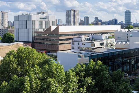
Designing a new art and design building for the Royal College of Art is a balancing act. On the one hand, the RCA is an outward-facing institution, looking to showcase its facilities, students and their work – in part to attract the very best students of the future and to give its many funders (including the government) something to boast about. On the other hand, it is all about experimentation and safe spaces: trying out ideas, testing them until they break.
Successful studio spaces give their occupants licence – licence to screw things into the walls, paint the ceiling, take an angle grinder to the floor. Experimentation, and the inevitable failure that goes with taking risks, requires a degree of introversion, ownership and control, rather than picture windows to Battersea Bridge Road. Similarly destructive transformations of space are not obviously welcome activities in £135m flagship buildings.
>>Also read: Inside Google’s global HQ: a temple to post-covid working culture
>>Also read: The Procurement Bill – the key impacts for construction
Herzog & de Meuron’s solution to this dilemma is essentially a shell and core: the practice has designed a strong, urban figure wrapped in a decorative facade and a simple, robust interior with an emphasis on flexibility. Studio spaces are raised above the ground floor, and windows are arranged to prioritise light and air rather than views in.
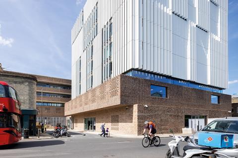
The elevation to Battersea Bridge Road has a strong, almost graphic quality that you can imagine being adopted as a logo for the campus in years to come. Five thick bands of brick, all in plane, slightly offset from each other.
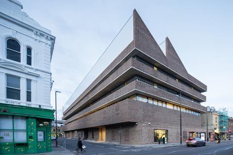
The first two are a generous storey height, with the ground floor interrupted by two large picture windows. The next two are deep balconies, while the fifth, also in plane, describes the roof.
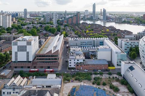
To the south the roof is flat, and the same thickness as the balconies, whereas to the north it rises to form a pair of great saw-toothed northlights, perhaps a nod to Haworth Tompkins’ adjacent Dyson and Woo buildings.
Our working environments have a powerful influence on the way we create and collaborate, and I am so excited for this new chapter in the life of the college and the inspirational work its graduates will bring into the world
Sir Jony Ive, chancellor, Royal College of Art
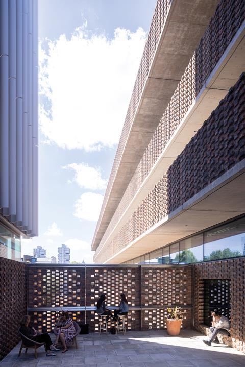
Ribbon windows are set back well behind these brick elements, providing light and views, but also giving occupants a degree of privacy. The brick is a pinkish grey-brown stock brick in a Flemish bond and, continuing Herzog & de Meuron’s experimentation at the Tate Modern extension, the horizontal positioning of the bricks shifts.
Above the ground floor the headers protrude by approximately 10mm. This serves to emphasise the bond and give a three-dimensionality to the facade, especially as it is repeated in the brick soffits to the first floor; but it also draws attention to the scale of the brick itself – a monumental skin built out of simple repeating elements.
The slight shadow from each header has the cumulative effect of making the upper storeys look as if they are formed from a slightly darker brick. And that, barring a hit-and-miss brickwork detail to both the ground and first floors, forms the entire elevation to the main road.
The north and south elevations to the Studio ��ɫ����TV are even simpler – simple extrusions of this form for the entire length of Howie Street – approximately 100m in all. At ground-floor level this length is traversed by three cross-cutting passageways, while two of these are semi‑internalised.
The central one leads to what will be a cafe courtyard at the rear of the site, drawing in students from across the campus, and perhaps even members of the public.
Windows have been located to reinforce the idea that the RCA is a place of making – a place where art and technology intersect. So the plate glass to Battersea Park Road showcases the timber and metal workshops, while the route to the cafe is animated by views of a robotic arm.
This wonderful new building embodies all that is best and most vital about the RCA – open, collaborative, interdisciplinary and bold
Dr Paul Thompson, vice-chancellor, Royal College of Art
The studios above are thus literally and metaphorically built on a foundation of workshops, emphasising a culture of making that is central to both the RCA and Herzog & de Meuron.
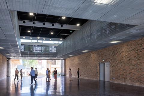
Another of these cross routes (previously Radstock Street) has been largely internalised and forms the new entrance and gallery space for the building, the Hangar. This is a double-height, brick-lined volume with sliding folding glazed doors to each end, enabling it to be returned to a street-like status. This is a robust space. You could drive right onto the black terrazzo floor, and indeed the dropped kerb of the old road has been retained.
This is the closest the building gets to a front door – the security lines that demarcate most university campuses are pleasingly absent. As well as an entrance of sorts, this is a place of assembly or exhibition, a place that could host very large work or product launches.
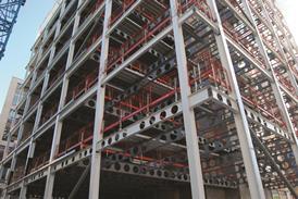
Vice-chancellor Paul Thompson noted that Herzog & de Meuron won the competition not just on the strength of its architects’ vision for the building, but also on the depth of their understanding of the Darwin building in Kensington and the neighbouring Dyson building, where routes through the buildings encourage the intermingling of disciplines. Here the singular building form and the simple structure (thick concrete slabs supported on concrete-filled steel columns) allow for big spans, with each floor of the Studio ��ɫ����TV effectively comprising two giant rooms. Each of these rooms has its own core and toilet block as a central element, with the studio space wrapped around.
The studios are effectively open plan – internal partitions, designed in conjunction with LTS Architects, provide different levels of separation on different floors.
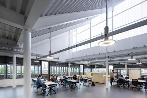
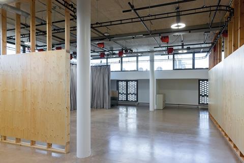
On the first floor, the sculpture studios are defined by Douglas fir plywood on timber studwork. The studwork spans from concrete floor to concrete ceiling – but the boards are standard 8ft and 10ft boards stopping short at the base to give a negative skirting, and finishing in line with the clerestory windows, some way short of the 4.5m high ceilings.
This is a careful balance – how to maintain a sense that this is one room, and allow the free exchange of light, students and ideas, while at the same time creating sufficient separation to allow different activities to take place in different areas of the room. Herzog & de Meuron talk about recreating the atmosphere of a street – yes, there is noise, dust and smells; but equally there is sufficient privacy to get stuff done.
This seemed plausible on a press day with no students in situ, but a list of the measures taken to ensure the space is sufficiently robust gives pause. The partition walls are sacrificial. The ceilings have pre-established load points and scaffolding bars for fixing work to the ceiling – but just in case, no services run through them (power sockets are instead suspended above head height).
Likewise the floor has an additional 100mm of concrete – a layer designed to mitigate damage should a student go “all Gordon Matta-Clark” as the vice-chancellor would have it. There is little by way of acoustic mitigation here – all surfaces are hard, and while there are curtain racks, what curtains there are seem more designed to contain sparks than dampen noise.
The top floor (contemporary art practice and design) follows a similar pattern. The floor is marginally softer – grey linoleum rather than concrete; the windows are more prominent, including a wraparound balcony that forms an alternative circulation route.
On the balcony, the heavy brick facade is revealed to be just half a brick thick, and the advancing headers emphasise the fragility of the structure, which is stabilised by steel fins and a structural balustrade.
Sustainability
It is telling that, when asked about the building’s sustainability, vice-chancellor Paul Thompson’s first response is to mention that the college anticipates using it for 120 years. This is illuminating in two ways.
Firstly, because it points to an aspect of sustainability that is often ignored: just how long will this building be here and be used for this purpose? Or in other words, over what period will the sunk cost of all that concrete and steel be amortised? Secondly, it hints that environmental performance was not a key client driver.
Nonetheless, this is a building that achieves BREEAM Excellent. It does this through bold architectural gestures such as the deep balconies that reduce overheating paired with exposed concrete floors that act as a heat sink for low-angled sun, and the open-plan floorplates that allow passive cross-ventilation throughout.
Attention is also paid to detailed technical specification – so the amount of GGBS in the concrete mix is varied by the season in which it was poured, in order to reduce cement use to an absolute minimum. This, and reusing the formwork “to the point of disintegration”, should result in noticeable variations in the fair-faced concrete – but nonetheless the exposed concrete is of uniformly high quality.
Could more have been done? Possibly. Not covering the rear sides of the saw-toothed rooflights with photovoltaics feels like a missed opportunity. These face south by south-east, and are pitched at roughly 25º – or in other words, pretty much exactly what you would do if you were designing for maximum solar efficiency.
Instead, a smaller number of solar panels have been arranged on the adjacent portion of flat green/blue roof – sufficient to meet planning and BREEAM requirements but providing a mere fraction of the electricity that the building will consume in use.
Again, all the services are overhead, which feels counterintuitive in a room where the ceiling is pitched to accommodate a giant high-pitched northlight. It turns out that the second northlight sits largely above the core, and so is simply blocked out for the majority of its length.
Despite this, and like the building as a whole, this space is impressive in its singularity: a striking volume defined by its relationship to daylight. The challenge will come when these spaces are occupied; and here the school worked with Vitra to design new partition and storage systems, designed to be demounted and reassembled in under 20 minutes.
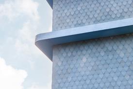
The Studio ��ɫ����TV is complemented by the Rausing Research and Innovation ��ɫ����TV. The skin here is aluminium aerofoils, designed to emphasise the verticality of the eight-storey block in contrast to the horizontal extrusion of the student facility.
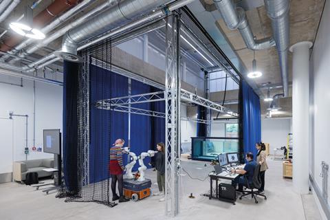
Although this faculty block houses very different functions from the studios, interior details, finishes and fittings are repeated to the extent that sometimes only the floor finish changes. A pragmatic solution for a sculpture studio (moving the power to a ceiling-mounted rack) is clunkier in a seminar room or the offices of InnovationRCA, the RCA’s business incubator – but serves as a physical reminder that the college is first and foremost a place of making.
This feels like a significant building. Herzog & de Meuron founding partner Jacques Herzog described the design as not flashy, claiming that “the flash should come from inside”; and how the use of brick grounds the building in its context. He is being modest – the brick is somehow both heavy and delicate at the same time, and its scale and singularity is deeply weird and intriguing in a London context.
He also talked about how the practice’s previous work in the capital – the Tate Modern and the Laban cance centre – helped to shift the global centre towards London in their respective fields. The RCA will very much be hoping for a repeat.
Project team
Client Royal College of Art
Architect Herzog & de Meuron
Structural and services engineer and cost consultant Mott MacDonald
Fit-out design LTS Architects
Contractor Kier
Fit-out QS Aecom
Fit-out contractor ISG







No comments yet