It was never going to take a lot to improve on the squalid eyesore of the 1960s incarnation of Birmingham New Street Station. But the newly opened £750m reconstruction gives the station a distinctive street presence for the first time in over 50 years. Shame though, says Ike Ijeh, about the whiff of fakery
Birmingham plays a pivotal role in international railway history. The disused Curzon Street station of 1838 is the oldest surviving railway terminus structure in the world. Charged by this proud civic accolade, when nearby Birmingham New Street opened in 1854, it boasted the world’s largest single-span arched roof, a title eventually usurped by St Pancras.
Today, New Street remains Britain’s busiest station outside London and serves an average of 32 million passengers a year. But up until very recently, all other traces of its former glories had been obliterated by an appalling spate of rebuilding and redevelopment over the past 50 years. Such was the callous tirade of reconstruction wrought on the interchange that a 2014 poll by independent passenger watchdog Passenger Focus voted it the worst station in the country.
The original New Street station was a palatial Victorian pile complete with arcades, turrets and its record-breaking glass and iron barrel-vaulted roof. So naturally it was demolished in 1964 under the spurious pretext of severe Second World War bomb damage and decades of soot and grime discharged by its idling steam trains. What replaced it was a horrific dystopian eyesore nurtured by a typically catastrophic infusion of 1960s mis-planning.
The station lost virtually all street level architectural identity when its concourse and platforms were plunged underground in the first UK rendition of the “air-rights” developments that were to be resurrected with such vigour during the terminus redevelopments of the 1980s.
A grim NCP car park was built above the newly submerged station, as well as a shopping centre called the Pallasades, a cheap and charmless concrete emporium whose sickly artificial luminance and committed lack of daylight summoned up all the allure of an expansive public convenience.
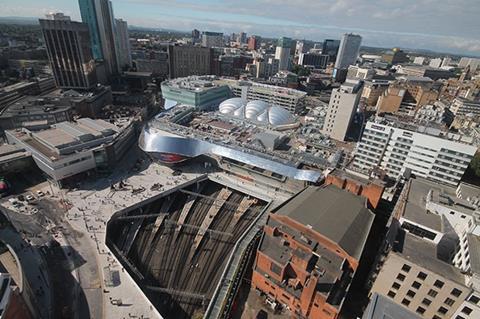
Throughout, New Street had become defined by the pernicious combination of appalling architecture and punitive planning. Low, dingy passageways, dark, bunker-like spaces, poor connectivity, squalid character, impoverished public realm and a squalid passenger experience.
Across England and America there is a tragic triumvirate of major 1960s railway terminuses that replaced architecturally superlative predecessors; Euston in London, Pennsylvania Station in New York and New Street in Birmingham. Of Penn Station US architecture critic Vincent Scully once wrote: “One entered the city like a god, one scuttles in now like a rat.” He could as easily have been describing New Street.
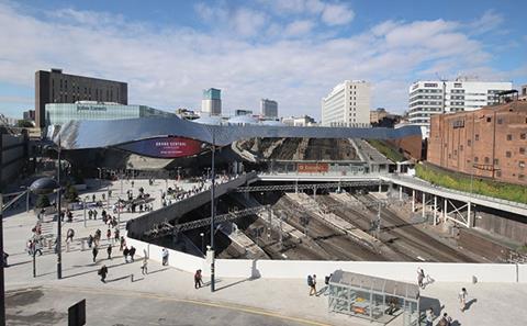
Until now. Late last month New Street’s massive five-year, £750m reconstruction completed and the new station opened to the world. Built by contractor Mace with concept architect AZPML (formerly Foreign Office Architects) and Atkins and Haskoll acting as executive architects, the new scheme marks the most radical transformation of the station since its 1964 rebuilding.

The reconstruction itself has not been without its controversies and complexities. Construction had to proceed while the station remained fully opened throughout serving up to 200,000 passengers per day. Foreign Office Architects disbanded shortly before construction began. Former lead architect Alejandro Zaera-Polo was involved in a bitter row last year over “destructive” design changes. Construction revealed a far higher-level of structural corrosion on the original station building than originally thought. And halfway through the project a 250,000ft² John Lewis department store, Birmingham’s first, had to be incorporated into the scheme.
But there is little evidence of these traumas now the project is complete. Virtually any alteration of the old station could have been considered an improvement. But does the new station provide that sense of wonder, anticipation and excitement that should enrich railway terminus architecture and was so sorely lacking from its predecessor?
The new station has three principal architectural features. The first is the stainless steel skin the entire building has been encased in. The second is a vast concourse that has been built at its centre. And the third is the station’s incorporation into a large new 43-unit shopping centre known as Grand Central – a somewhat self-conscious nod to Birmingham’s geographical position and arguably the world’s most famous train station. (During construction there were plans to rebrand the entire station Grand Central – luckily these were abandoned.)
In urban terms, the stainless steel skin makes the biggest impact. Some 8,000 highly reflective mirrored panels have been wrapped around the new station, ensuring that for the first time in half a century New Street has a distinctive street presence and clearly discernible external architectural identity.
With typical architectural verbosity, AZPML describes the steel encasement as a “dynamic” response to both city and station. “The geometries of motion and the distortion of perception produced by movement have been the inspiration for the architectural expression of the project. The bifurcating, undulating, smooth forms of the track field have been transferred and embedded into the geometry of the building to ornate the city and to convey its historical character as a transportation hub, where various traffic systems – such as the famous canals, the Roman roads etc, converge and overlay.”
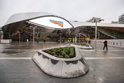
Its high reflectivity is also justified in the following terms. “By turning the external rain screen into a warping, reflective stainless steel surface, Birmingham New Street Station will be designed to produce controlled reflection of the surrounding urban field to reflect the once dark, now bright Birmingham sky, the crowds of passengers, the trains entering and exiting the station, the hues of the sunset and sunrise, and other dynamic regimes present at the site.”
The new skin is undoubtedly dramatic. It swerves and swoops around the building edge like frenzied whorls across a molten eddy creating a bulbous, pulsating form that makes an unmistakable impact on the Birmingham streetscape. Crucially, it also single-handedly and theatrically establishes a decadent architectural identity for the station when previously there was none.
But it also has the whiff of shallow and strenuously contrived artifice which is disconcerting in itself but will one day, one suspects, collapse into dated gimmickry. Part of this is because the skin is so conspicuously an applied surface treatment that, upon entering the station, is revealed to have virtually no relationship with the building interior.
AZPML addresses this point by claiming that the “cladding [could not] be related to the interior of the building for practical reasons” among which it cites original building structure and the new shopping centre. But the superficiality of the cladding is not the exterior’s only flaw; it also falls into the trap encountered by several other “iconic” new Birmingham buildings such as the Library of Birmingham, Selfridges and the Cube, of not being able to properly articulate an entrance.
The four main entrances have been submerged underneath large “eyelets” containing digital screens. This is certainly effective in terms of access and legibility but elevationally it is a glib and awkwardly applied gesture that marks a further diminution in the architectural integrity of the metallic skin. When they built their railway stations, the Victorians didn’t need signage to help identify an entrance architecturally; it’s a pity that we do.
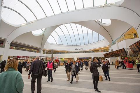
Once inside, a series of single-storey concourses lead to the centrepiece of the station, its sprawling central concourse. Some 6,000 tonnes of concrete was removed from this location as a result of the demolition of the Pallasades shopping centre and the NCP car park. And in their place a spectacular new atrium has been built that acts as both station concourse and shopping hub.
According to Network Rail, the concourse is five times bigger than Euston Station’s and three times larger than the original. Two storeys of retail are surmounted by a soaring elliptical roof comprising giant, curving trusses separating vast ETFE skylights. In arguably the biggest triumph of the project, where once New Street’s concourse was a dark, sunken bunker, it is now an expansive internal courtyard flooded with natural light.
There is an engaging organic and ergonomic quality to this space, as if its arched trusses were like a set of pale, preying tentacles greedily encroaching upon a crystalline shell or, more surreally, a series of raised eyebrows marching chaotically across a whitewashed Dali-esque moonscape. While such whimsical biomimicry is clearly and discordantly at odds with the mechanised metallic armour of the exterior, generous observers might find visual parity between the digital eyelets of the exterior and the arched skylights here.
As it happens, the arched trusses of the atrium were the source of former lead architect Zaera-Polo’s aforementioned ire. The steel trusses of which they are formed were originally supposed to be clad in plaster in order to maintain a “seamless whole” between roof and base. But when technical problems led to cracking and stability issues or, depending on your contractual sympathies, value engineering led to cost-cutting, the plaster was replaced with tensioned fabric sheets as built.
In reality, while one can understand Zaera-Polo’s artistic indignation, the fabric is tensioned to such a degree that from the ground it appears to be a sinuous, solid surface at one with the piers from which it springs. One suspects that the thousands who pass underneath it will hardly spot the difference in material and even if they do, it hardly detracts from the drama or impact of the space.
But for all its drama, the new concourse quite literally conceals a major flaw of the project. The platforms underneath it are unchanged and have been retained as essentially underground spaces that ensure that despite all the effort above ground, the new station mirrors the sectional composition of its predecessor.
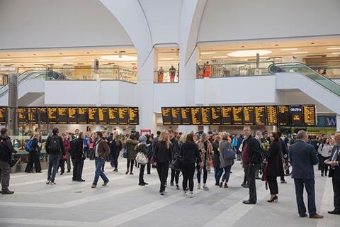
So despite the new concourse and the undoubted improved accessibility provided by the banks of lifts and escalators that link it to the platforms below, the passenger experience of boarding and alighting trains, the sensory and spatial essence of any railway terminus and the key to their romantic gateway status as places of expectation and excitement, remains unchanged.
There are undoubted logistical reasons for this; extensive as the reconstruction has been, raising the platforms would probably have necessitated the closure of the station and an even more fundamental (and expensive) reworking of its layout. But it seems a pity that the opportunity for this core rethink was not grasped.
There is of course one iconic train station that manages to get away with underground platforms, New York’s Grand Central. But here the sublime concourse and facade provide more than adequate compensation, and for all of New Street atrium’s swirling melodrama, it is by no means in the same league. Particularly as the profusion of retail suggests as much a shopping destination as a railway terminus.
But it is perhaps churlish to focus on what New Street isn’t without celebrating what it is. And that is a heroically reinvented station that thankfully consigns the dank misery of its spiteful predecessor to the past.
Project Team
Client: Network Rail Ltd.
Concept architect: AZPML
Executive architect: Atkins
John Lewis interior architect: Haskoll
Facade and atrium structural engineer: AKTII
Main contractor: Mace
Structural engineer: Atkins
Mechanical engineer: Atkins / Hoare Lea
Quantity surveyor: Faithful & Gould
Day 2 of the Ecobuild 2016 show will be all about architecture, and will now feature the awards. Clear for the latest updates and conference programme.

Learn more about this topic at the ‘Future of commercial development’ session at this year’s ��ɫ����TV Live event on 26 November. For more information and to book tickets go to:






1 Readers' comment