The City’s tallest skyscraper is the ultimate in lavish office space for ’boutique’ finance firms. But its design is a huge let down for Londoners
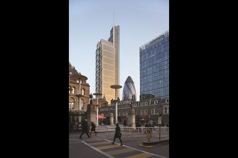
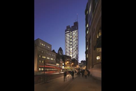
After a development process that began 12 years ago, the completion of Heron Tower is a landmark event for a number of reasons. At 230m high it replaces Tower 42 as the tallest building in the City and becomes the UK’s second tallest completed skyscraper.
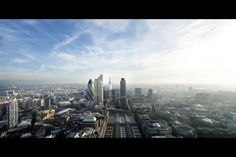
But its most enduring legacy is its pivotal role in planning history and the indelible impact it has had on London’s skyline. Its victory in a bitterly contested 2001 public inquiry paved the way for the biggest transformation of London’s cityscape since the sixties and seventies.
If it wasn’t for Heron Tower, then it is virtually unthinkable that we would now have the Shard, the Pinnacle, the “Cheesegrater”, the “Walkie Talkie” or any of their phallic doppelgangers. Heron Tower therefore is not just another office block. It is a gauge by which the effectiveness of London’s planning system can be measured and it marks a new frontier in London’s contentious relationship with tall buildings.
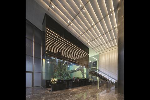
Internally, Heron Tower has all the seductive sheen and glamour that one would expect of a development pitching itself as the City’s first “six-star advanced business life environment”. Its triple height lobby is lavishly encased in marble and mosaics and its vast aquarium (Europe’s largest) perfectly captures the sense of surreal theatricality and corporate decadence that characterises the interiors. Materials are finely honed and precision cut; even the cogs and pivots underneath the escalator are on display, noiselessly embalmed behind a glass screen like precious mechanical stones.
Behind a sheer wall of crystallite marble mosaics, six scenic lifts whirr visitors up to their desired floor at an impressive speed of seven meters per second. They provide spectacular views of the City and transform the normally mundane act of vertical circulation into a captivating visual voyage through the city’s unfolding landscape.
Arguably Heron’s Tower’s greatest asset is what lies at the top of these lifts, a three-storey public restaurant and sky bar. Not only do these again provide stunning panoramas but they also lead to outside roof-top terraces, all of which will be accessible to the public via two dedicated lifts from Bishopsgate. This is a rare feature in London and one that deserves unreserved praise.
Significantly the core is placed at the south side rather than the centre of the tower to optimise space and views, plus provide solar shading, within what are relatively small office floor-plates, of about 1,200m2. Impressively, office floors benefit from naturally ventilated, triple-skinned facades on the east and west sides. They also reveal another of Heron Tower’s key innovations: the stack of triple-height atriums that extends across its full height.
These form a major component of the development’s core concept of splitting office accommodation into “villages”. These are designed to make the tower more intimate and attractive to the smaller “boutique financial and commercial institutions” that the developer, Heron International, has identified as the tower’s key market. The atriums are accessible on the bottom floor but can either be partially open or fully enclosed on the upper two, depending on the extent of tenant ownership.
Commercially, they are certainly a bold move as they cut into two-thirds of the tower’s lettable space. But they also provide an innovative layout solution that gives tenants the flexibility to personalise their accommodation and, if they wish, adopt cellular layouts that still benefit from daylight, even at the centre of the floor-plan.
But Heron Tower’s problems begin externally. The first warning signs are visible from the entrance. In comparison with most City towers, Heron meets the ground well with a lofty entrance colonnade framed by a noble screen of steel columns. Commendably, this enables the public realm to punch deep into the tower’s bulk. But inexplicably, the columns are surmounted by a pitiful glass canopy, whose weak projection and fussy articulation appears to be little more than an apologetic, ill-conceived afterthought.
Things worsen as the elevations proceed upwards. Heron Tower is essentially a glass and stainless steel box whose four facades adopt a different treatment to relate to each aspect. The south (the worst) is largely covered in a blotchy meringue of photovoltaic cells (at 3,200m2 it’s the UK’s second largest installation) and looks all the messier for it - particularly as they only supply 2.2% of the building’s total energy consumption. East and west comprise glazed curtain walls and north (the best) has a more muscular and defensive elevation featuring thrusting steel-cross bracing.
In theory, this variety of treatments should be a welcome contextual gesture. But it fails for two familiar reasons: scale and massing.
In appropriate conditions, a low-rise building that weaves in and out of the city’s grain can get away with autonomous responses to diverse urban settings. But a high-rise building can have multiple aspects visible at any one time across a much larger area and therefore must be unified by a single idea.
Heron Tower’s elevations are too disjointed to command a coherent architectural composition yet lack the subtlety to truly reflect the rich multiplicity of context that surrounds them.
But the weakest element of Heron Tower should be its strongest: its top. While the first 37 storeys of the tower engage in pugnacious repetition, without warning the upper storeys suddenly surge in and out, frenziedly cutting away the building envelope until it vanishes entirely up a comically superfluous spire.
Once again the gesture fails to convince. The boisterous geometric choreography of the upper storeys is so alien to the dogmatic form and proportion established in the main body of the tower that, at best, it appears to be another add-on and at worst, a dislodged component of an entirely separate building. All it achieves is to consolidate the aura of discord that enshrouds the tower.
Tall buildings can make an exhilarating and dynamic contribution to cities and views, as the Shard is already demonstrating. But when they are in historic contexts they have a particular responsibility to be exceptionally well designed and sensitively located. Despite the obvious innovation and character achieved in its interiors, in urban terms at least, Heron Tower fails on both counts.
But it also represents a failure of planning, as well as design. In 2002, Peter Rees, the chief city planner, inexplicably hailed as a saviour of the City’s architectural integrity, stated: “[We] do not have a vision of how [London’s] skyline should be, but any attempt to say one is good, one is bad, is doomed to failure.”
Well, the fruits of this hands-off approach are now plain for all to see. Until the capital develops a sensible and coherent strategic policy to guide the development of its tall buildings and consistently encourage quality, the mediocrity that characterises Heron Tower will corrupt its skyline and streetscapes for good. London deserves better.
Project team
Client/developer Heron International
Architect Kohn Pedersen Fox
Project manager Mace
Structural and civil engineers Arup
∫√…´œ»…˙TV services engineers Foreman Roberts
Cost managers Davis Langdon
Strategic consultants KKS Strategy
Letting agents CB Richard Ellis, Cushman & Wakefield
Main contractor Skanska








No comments yet